A well-thought-out and well-chosen typography is key to achieving an aesthetically pleasing and, most importantly - easily readable website. But do you know how to make the text on the website clear and consistent with your brand's identity?
Don't worry. I have collected the 8 most crucial typography rules that will make the entire process of creating the perfect typography for your website easy and effective. Make sure to follow all the rules, and you will be rewarded with a transparent typography system that will make your project look professional and improve its UX.
Start Today!
8 principles of typography to follow
1. Choose the right font
The most important thing is that your typography should reflect the true nature of your industry. Therefore, choosing the right website typography cannot be a matter of chance. Just because a font is popular and you like it doesn't mean it will be appropriate for your brand. Pay attention to what the font communicates and whether it matches your brand's style.

Pay attention to what the font communicates and whether it matches your brand's style. If you run a children's store, you will not use simple and elegant business fonts and vice versa. Always match fonts to your brand communication to be consistent with it.
2. Select font size
The font size on the page matters! If you choose a font that is not too small or too large, you will make reading much easier for your users. A special unit typographers use to describe fonts is "pt" or "point".
The preferred range of standard font sizes for websites is between 14-25pt. Larger fonts can be reserved for headings - 20pt and above, and for plain text, the best range is 14-18pt.

Regardless of the font size you choose, make sure that the font size:
a) makes the text legible - font size of 12pt and below can significantly hinder readability;
b) matches the typeface - for example, for its system font Roboto Google recommends a minimum of 16 pt. On the other hand, San Francisco - the font used, among others, in Apple devices, should be at least 18pt size;
c) reflects the website's purpose - if the page is not dominated by text but by design, you can use a smaller font. Also in the case of interactive pages that encourage the user to click at every step, this solution can be afforded. If, on the other hand, you are dealing with a website where text dominates, and the user's main task is reading (e.g. blog area, information portal) - it is better to choose a slightly larger font.
How to choose the size of the header?
Have you decided on the font size of your body text but don't know how to keep the size of the headings in proportion to the rest of the content? There are several best practices for this:
a) The H1 header should be 300% of the font size used in the body text. For example, if your website uses an 18pt font for your body text, the optimal size for your headings is 54pt.
b) The H2 header should be 200% of the body text font size. In this case, with a base font size of 18pt, the ideal H2 heading would be 36pt.
Fonts in the mobile version

When choosing the font size, you must answer the question on which devices the text will be displayed. The font size will look different on laptop monitors than on mobile devices. If you prefer to focus on the appearance of the website in mobile devices, remember these two important rules:
a) On smartphone screens, a large font will not look nice,
b) The headings should not take more than two lines.
Therefore, when designing a mobile website, it is worth checking how the text looks and making sure whether the font is too large.
3. Use the principle: Less is more
When designing websites, it is best to follow the principle of minimalism. Using more than two types of fonts in one project may disturb the project's aesthetics. The safest solution is to choose two font types: headings and plain text.
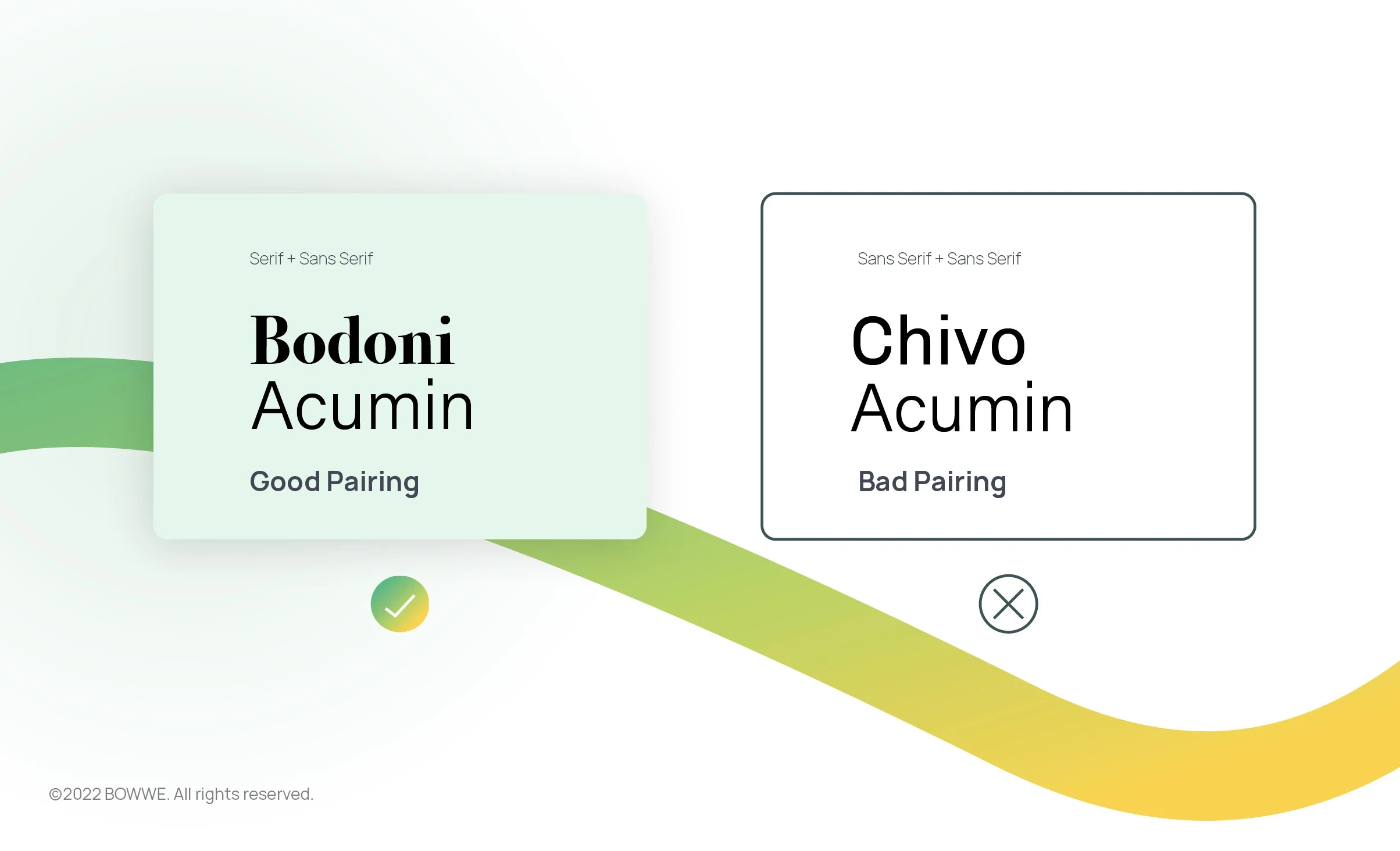
However, you also need to keep in mind the contrast. If you use two fonts that are too similar, they will not wholly draw users' attention. Try not to choose two Sans Serif fonts but instead choose a combination of Serif and Sans Serif, making your content look even more attractive.

Also, keep in mind that not all fonts can work together. There are pairs of fonts that like each other better, and some are incompatible. It's worth getting acquainted with them before making your final choice!
4. Develop the structure of the content
An equally important aspect of typography as choosing the font is the layout and structure of all content on the page. It doesn't matter if it is a short description of your business or an extensive article in the blog section - the structure of each type of content dramatically impacts users' perception of your website. What are typography rules for better readability?
Line height or leading

Maintaining sufficient line height (or leading) and the space between the lines is essential. Too short a distance will make the lines of text practically overlap. On the other hand, too high a reader will be "exploded". So it's best to find a golden ratio.
Paragraphs and line length

It has been known for a long time that short text fragments are much better read. Too long lines or paragraphs can be tiring for the eyes and disturb the reading rhythm. The line length should be around 50-75 characters to not exhaust the user. The same applies to paragraphs - they make longer texts easier to read.
Alignment

In typography, alignment is the positioning of the text relative to a margin, the edge of a page, or another reference point.
5. Match the colours

The font color is an element of typography closely related to your brand's visual identity on the Internet. However, as with combining fonts, you should also be careful when choosing their colors. Here are the most essential standards for font color:
Limit the number of colors
You already know that it's better to follow minimalism in typography. The same goes for the colors. Try not to use more than three colors in the text because more can cause chaos on the website and make it look infantile.
Design dream website!
No coding experience required.
Take care of contrast
The text should have adequate contrast to the background. Of course, the safest combination is black font color on a white or light gray background. It is the most natural color combination and does not tire the user's eyes while reading.
Only match the matching colours
Remember that some colors, such as red and green, don't go together. Breaking color schemes in the case of fonts usually doesn't work.
6. Stand out
With a hierarchy of importance in your text, you can emphasize that one word is more important than another. Therefore, the most critical words on your website should be highlighted. You can make them bigger, color or use bold or italics.
7. Create your font scale

Font scaling is the process of increasing or decreasing the size of text on a website.
You might want to create a font scale for a few reasons. One reason is to ensure that all of your page's text is the same size. This can be important for usability, mainly if you use text to convey important information to your visitors. It can also make your page look more uniform and professional.
Another reason to use a font scale is to make the text easier to read. You may find that some fonts are too small or too large when you view them at their default size. By scaling the text, you can make it more comfortable to read.
There are a few things to remember when creating a font scale.
a) Make sure that all of the text on your page is the same size. This includes both the body text and any headings or other text elements.
b) Choose a font size that is comfortable and easy to read. You may need to experiment with different font sizes to find the one that is right for you. Some fonts may look good at a large size but become difficult to read when they are scaled down.
8. Do research and look for inspiration

Find the best website designs with examples of exciting typography. On websites like Dribbble you can find tons of inspiration. You can also use platforms like Pinterest that allow you to create so-called Boards where you can collect anything that inspire you and share it with your friends or coworkers.
It is also worth doing research among websites similar to yours or your competitors. Then you will learn how others implement the best typography principles and how you can do this too!
Best rules of typography - summary
Remember that typography is key to the success of any successful website design. By following typography principles, you can be sure that the text will not only be legible but, above all, create the right mood and faithfully reflect your brand's style.
By following the best practices of good typography found in this article, you can quickly improve the appearance of your website and, most importantly, the user experience.
Start Today!

Karol is a serial entrepreneur, e-commerce speaker m.in for the World Bank, and founder of 3 startups, as part of which he has advised several hundred companies. He was also responsible for projects of the largest financial institutions in Europe, with the smallest project being worth over €50 million.
He has two master's degrees, one in Computer Science and the other in Marketing Management, obtained during his studies in Poland and Portugal. He gained experience in Silicon Valley and while running companies in many countries, including Poland, Portugal, the United States, and Great Britain. For over ten years, he has been helping startups, financial institutions, small and medium-sized enterprises to improve their functioning through digitization.


