In an era where the number of mobile users worldwide is projected to hit 7.49 billion by 2025, the necessity of having a mobile-friendly website has never been more critical. With Google's shift to mobile-first indexing and the growing trend of mobile internet usage surpassing desktop, ensuring your online presence is optimized for mobile devices is not just an option—it's imperative. In this guide you will learn to do it effectively no matter of your skill level.
What is a mobile website design?
Have you ever stumbled upon a website on your phone that just didn't feel right? Maybe the text was too big, the buttons were hard to tap, or it took ages to load. That's exactly what mobile website design seeks to fix. When we talk about mobile website design, we're focusing on creating online experiences that are not just bearable but delightful on mobile devices. This means everything from your site loads swiftly, the layout adjusts beautifully to fit your screen, and interacting with content is as natural as scrolling through your favorite social media feed.
Why is a mobile friendly website so important?
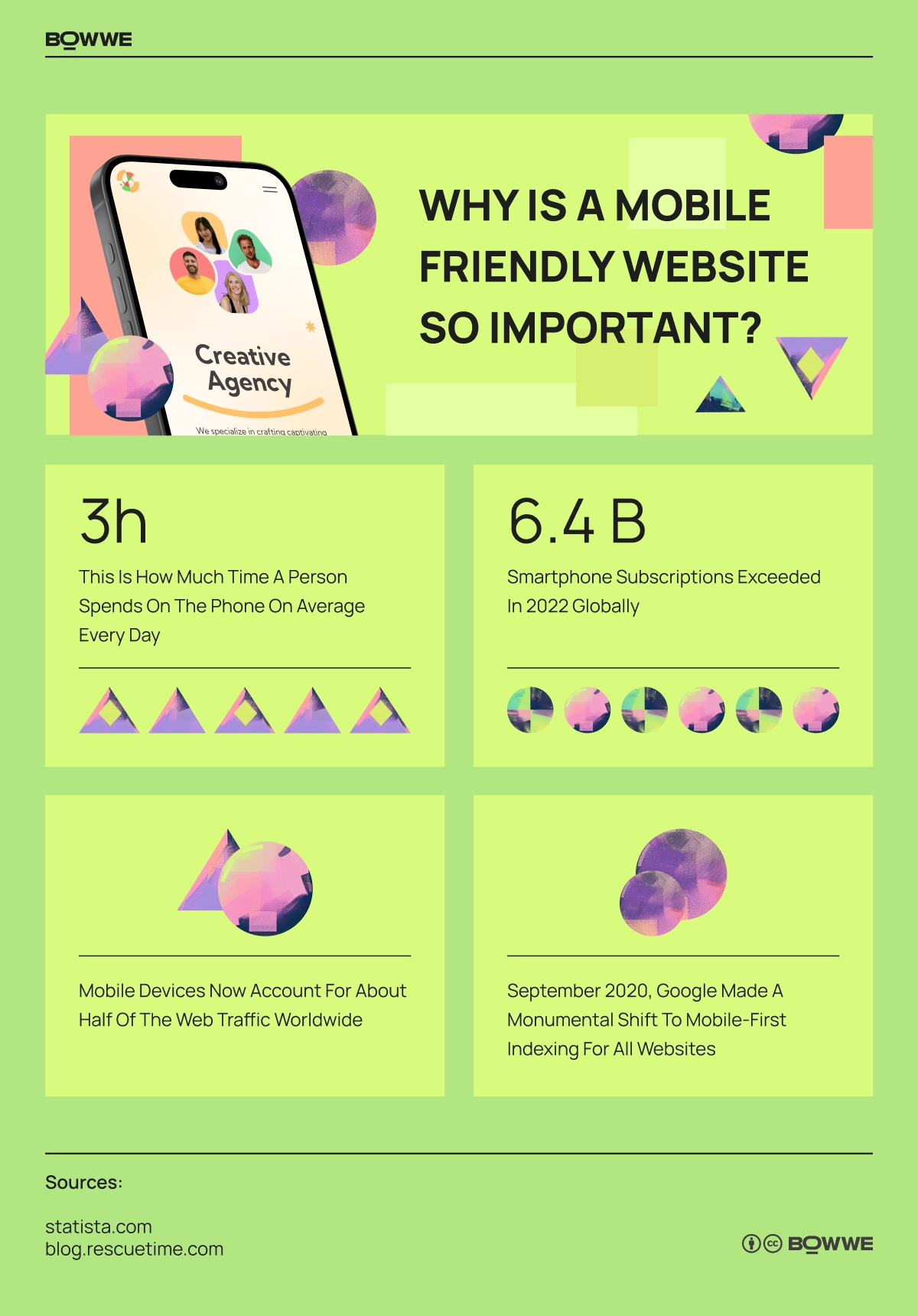
In 2022, the globe hit a staggering almost 6.4 billion smartphone subscriptions. Fast forward to 2025, and we're looking at a world where 7.49 billion people are expected to be tethered to mobile devices! It's not just about carrying a smart device anymore; it's about the entire web world revolving around these handheld gateways.
Mobile devices now account for about half of the web traffic worldwide. Every second person browsing the web is likely swiping on a screen, not clicking with a mouse. In regions with limited infrastructure, the leap was straight from no internet to mobile internet, bypassing the desktop era altogether. India stands out as a shining example, leading the charge with a massive mobile-first online population. Meanwhile, in the United States, despite the plethora of tech available, mobile still dominates a significant chunk of online traffic at around 45.49%.
97% of Americans now own some kind of cellphone, with 15% relying solely on their smartphones for internet access. We're not just owning these devices; we're living on them, spending an average of over 3 hours daily glued to our mobile screens.
Movement toward mobile-first
In September 2020, Google made a monumental shift to mobile-first indexing for all websites. This wasn’t a gentle nudge but a clear signal that mobile-friendly websites are not just preferred; they’re prioritized. Having a site that's optimized for mobile use doesn’t just boost your visibility in search results; it essentially aligns your online presence with the evolving digital landscape.
Moreover, mobile users are a unique breed. They’re often local, on the move, and with intent to take action. Whether it’s searching for the nearest coffee shop, comparing prices while in-store, or booking a last-minute appointment, mobile customers are ready to buy. Optimizing your website for these users means not just capturing their attention but potentially converting their spontaneous searches into sales.
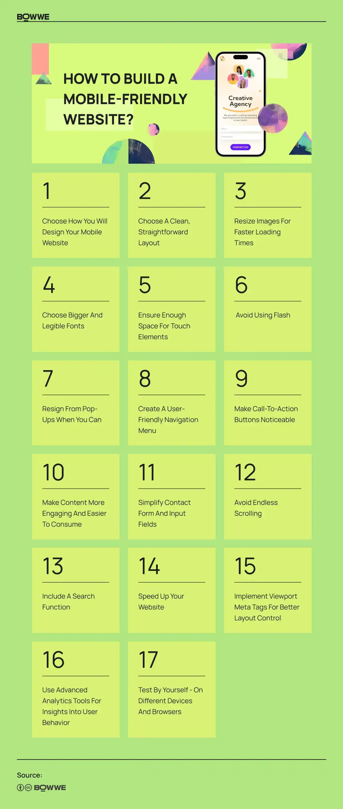
How to build a mobile-friendly website: Essential tips for every skill level

1. Choose how you will design your mobile website
Let’s explore the possible way of building a mobile website.
1.1. Responsive web design
Imagine pouring water into different sized glasses. The water (your website’s content) naturally adjusts to the shape and size of the glass (the device screen). That’s responsive web design in a nutshell. It’s fluid, versatile, and ensures your site looks fantastic whether it’s viewed on a giant desktop monitor, a tablet, or the compact screen of a smartphone.
Responsive design isn’t just a fancy trend; it’s the standard. Google loves it, and so do users. Why? Because it delivers a seamless browsing experience, no matter the device.
1. 2. Adaptive web design
If responsive design is about fluidity, adaptive design is about customization. It’s like having different outfits tailored for specific occasions – one for a sunny day at the beach, another for a formal dinner. Adaptive design means your website detects the device it’s being accessed from and picks the most suitable layout from a set of pre-designed layouts.
1.2.1. Responsive vs Adaptive Design: What’s the difference?
Responsive design is about flexibility; one layout to rule them all, adjusting dynamically to fit any screen size. It’s about creating a consistent experience across devices, minimizing the need for redirects and enhancing site speed and usability.
On the other hand, adaptive design focuses on crafting specific experiences tailored to different screen sizes. This can lead to more personalized interactions but requires a deeper understanding of your audience’s most common devices and potentially more work in creating multiple layouts.
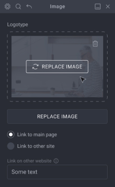
1. 3. Alternative: Responsive website builder
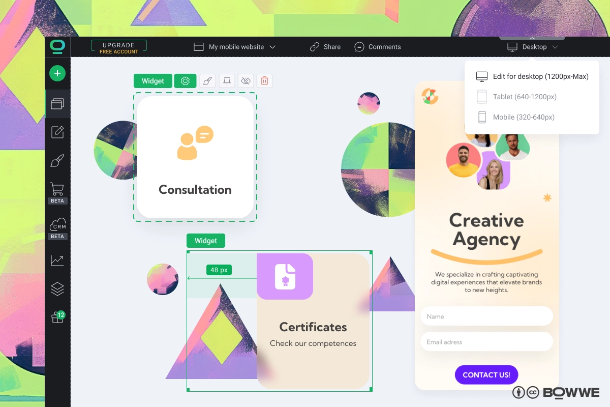
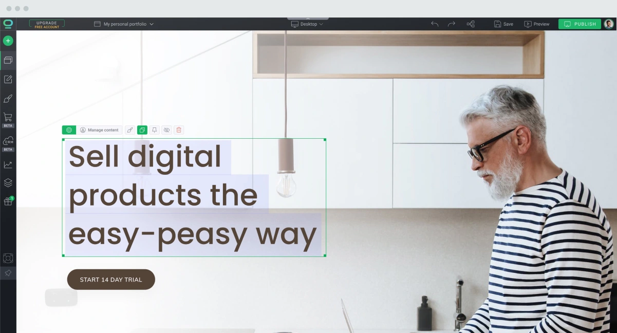
Imagine having a magic wand that effortlessly adjusts your website’s design to look fabulous on any device. That's the essence of using a responsive website builder like BOWWE. This tool isn't just about making adjustments; it's about revolutionizing the way your website interacts with different devices. With BOWWE, every page breathes responsiveness.
The beauty of BOWWE lies in its simplicity and depth. You can tweak each element to your heart’s content, ensuring that whether your audience visits from a desktop, tablet, or smartphone, they get a seamless experience. Dedicated breakpoints allow you to tailor the layout and visual elements to fit perfectly on any screen size, making your website not just mobile-friendly but truly mobile-optimized.
1. 4. Alternative: Responsive website template
Responsive website templates are your shortcut to creating a website that effortlessly adapts to any screen size, ensuring an optimal viewing experience for all visitors, regardless of the device they're using. By choosing a responsive template, you not only save time and effort in website design but also ensure your site is mobile-friendly from the start.
Now, if you're looking for a perfect responsive website template take a look at BOWWE’s collection! Crafted with meticulous attention to detail, each website template is a masterpiece of design intelligence, ready to embody your content with elegance and professionalism.

Check all responsive templates!
These templates save you hundreds of hours in design and development. They are pre-optimized for growth, waiting for you to infuse them with your unique content. With a responsive template from BOWWE, your website isn't just set to launch; it's ready to soar.
1. 5. Alternative: A mobile app
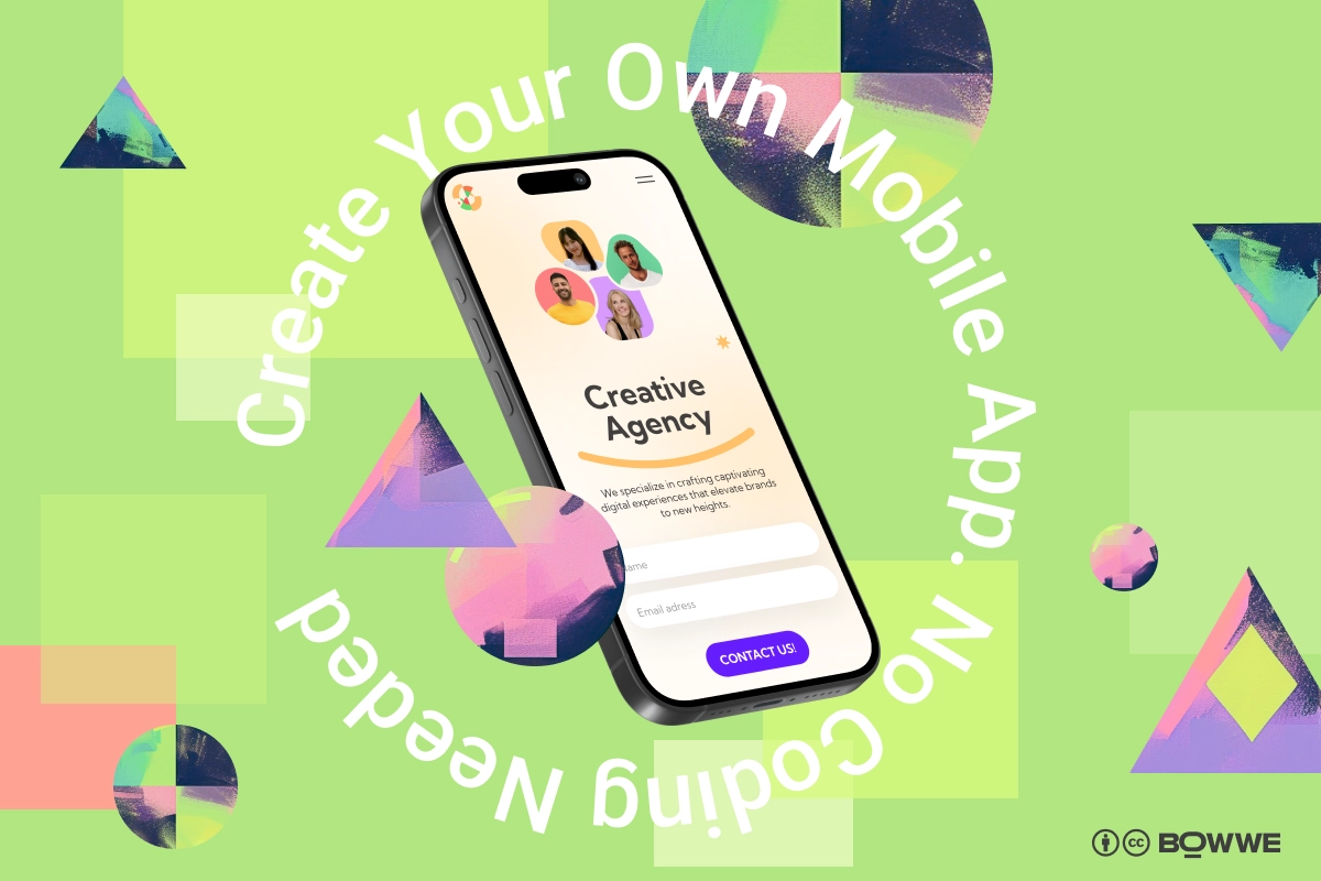
Sometimes, your digital strategy demands something more tailored, more distinct – a solution that's not just mobile-friendly but mobile-first. For those moments, consider the path less traveled: a mobile app or, even more intriguing, a BOWWE Micro Page. Designed for those who envision their website with an app-like feel, a Micro Page offers a compact, focused, and highly engaging user experience. It's like distilling your website into its most potent form, perfect for audiences who prefer the immediacy and convenience of an app.
2. Choose a clean, straightforward layout
Imagine your website like your favorite coffee shop - easy to navigate, with everything you love right where you expect it. That's the goal of a simple layout for your mobile site. It's all about making it easy for anyone who visits to find what they need without any fuss. Think less clutter, more clarity. This is super important for mobile users, who want to find things quickly on smaller screens.
3. Resize images for faster loading times
We all love crisp, beautiful images on a website. But if they're too big, they can slow things down, which might frustrate your visitors. Aim to resize your images so they're fast to load but still look great. A good rule of thumb? Keep your images under 1MB (the less the better) and consider formats like WebP, which keeps the quality up but the file size down. This balance helps your site load quickly on mobile devices, keeping your visitors happy and engaged.
Thankfully, there are many online free tools for image optimization and resizing. These tools compress your images, reducing their file size while maintaining the essence of their beauty. Check out tools like XConvert, FreeCovert, iLoveIMG to make your website content lighter and faster!
4. Choose bigger and legible fonts
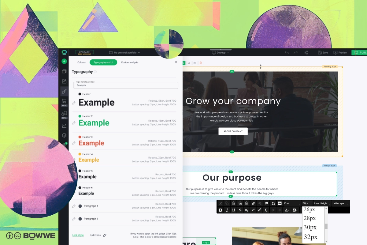
Imagine walking into a beautifully designed room only to find that the fine print on the art pieces is nearly impossible to read. That’s how users feel when they encounter tiny, cramped fonts on a mobile website. Choosing large, legible website fonts is not just a design choice; it’s a declaration of your commitment to user accessibility and comfort.
Large website fonts make it easy to read and interact with your content, no squinting required. It’s about ensuring that whether someone is checking out your site while lounging at home or glancing through it on a bustling subway, your message comes through loud and clear.
5. Ensure enough space for touch elements
Mobile browsing is a tactile experience; it’s about touch and movement. This means buttons, links, and interactive elements do not need to be just visible but also easily tappable, with enough room around them to avoid the frustration of mis-taps. It’s about creating an environment where interactions are smooth, intuitive, and, most importantly, enjoyable.
6. Avoid using Flash
Once the king of interactive web content, Flash is now more like a relic of a bygone era, especially in the mobile domain. The reasons to avoid using Flash on your mobile website are both practical and forward-looking. Most modern mobile devices and browsers no longer support Flash, making any content created with it invisible to a vast audience. Moreover, Flash can significantly slow down page loading times, impacting your site's performance and user satisfaction.
Focus on HTML5 for your interactive and multimedia needs. HTML5 is not only widely supported across all devices and browsers but also offers better security, performance, and battery efficiency on mobile devices. This switch not only future-proofs your website but also aligns with best practices for mobile web design, ensuring your site is accessible and engaging for all users.
7. Resign from pop-ups when you can
We’ve all experienced the mild annoyance of a pop-up interrupting our browsing experience. On mobile, this irritation is magnified due to the limited screen real estate. Resigning from pop-ups whenever possible is a gesture of respect towards your users’ browsing experience. Pop-ups can be especially problematic on mobile, where they often disrupt navigation and can be difficult to close, potentially driving users away from your site.
For those times when a pop-up is necessary (perhaps for legal reasons or critical announcements), ensure they are mobile-friendly. This means making them easy to dismiss, ensuring they don’t take up the entire screen, and considering alternative designs like banners or slide-ins that are less intrusive.
8. Create a user-friendly navigation menu
.webp?718338.9000000358)
Imagine stepping into a new city without a map. That's how users feel when they encounter a complicated navigation menu on a mobile site. The goal is to create a navigation menu that acts as a compass, guiding users effortlessly through your site, allowing them to find what they're looking for with just a few taps.
Opt for a hamburger menu on mobile devices. This three-line icon expands to reveal your menu options without cluttering the screen, keeping your design clean and focused. Also, prioritize your menu items based on what your audience seeks most, ensuring their journey is as logical as it is effortless.
9. Make call-to-action buttons noticeable
Your CTA buttons are your site's signposts, directing users towards taking action, be it subscribing, buying, or contacting, so don’t reduce their importance, especially when building a mobile website.
Making your CTA buttons noticeable isn’t just about size or color (though these are important); it’s about their message and placement. Ensure your CTAs are surrounded by enough space to make them easily tappable, and use action-oriented language that resonates with your audience's desires.
10. Make content more engaging and easier to consume
In the fast-paced mobile world, your content needs to grab attention and deliver value within moments. Think of your mobile site as a highlight reel of your best content—images, videos, and animations play starring roles, with text supporting these visuals without overwhelming your audience.
To create a mobile-friendly website try to:
- Use high-quality images and short, engaging videos to tell your story.
- Break text into bite-sized, digestible pieces and use bullet points or numbered lists to convey information more clearly.
- Introduce more white space, making it easier for eyes to navigate through your message.
11. Simplify contact form and input fields
.webp?1238542.2000000477)
Every field in a form is a hurdle your visitor needs to jump over. The more hurdles, the less likely they are to reach the finish line. Simplifying your contact form and input fields is about removing as many hurdles as possible, making it a breeze for users to reach out, subscribe, or engage.
On the mobile version of your website limit the number of fields to only what’s absolutely necessary. Name, email, and a brief message should often suffice. For mobile users, every extra field can feel like a chore, so ask yourself, “Is this information essential?” If not, it’s probably best left out.
12. Avoid endless scrolling
While scrolling is a natural action on mobile devices, there’s a fine line between scrolling and falling into an abyss of endless content. Avoiding endless scrolling on your mobile site ensures that your users find value in every swipe and don’t get lost in a sea of information.
Structure your content with clear sections and use “Back to Top” buttons or sticky menus to help users navigate your site with ease. This layout strategy respects the user’s time and attention, providing them with a satisfying and efficient browsing experience.
13. Include a search function
Incorporating a search function into your mobile site acts like a digital concierge, guiding your users directly to what they’re seeking with just a few taps.
Make your search bar easily accessible, possibly at the top of each page or within the menu. This simple addition can significantly enhance user experience, making your site more user-friendly and accessible.

14. Speed up your website
A fast-loading website not only pleases your visitors but also improves your rankings in search engine results. Optimizing your website’s loading speed involves a mix of strategies, from compressing images to minifying CSS and JavaScript files.
Inheritance in CSS is a powerful concept that can help streamline your styling process. By setting styles on a parent element, you can have those styles automatically apply to its descendants, reducing the need to duplicate styling across your site. This not only makes your site lighter but also easier to maintain.
Understanding and applying concepts like CSS inheritance within responsive website builders like BOWWE can significantly enhance your site’s efficiency and performance.
Use tools like GTMetrix or PageSpeed Insights from Google to analyze your website's performance on mobile devices. These tools provide invaluable insights into how you can further optimize your site for speed, offering specific recommendations tailored to your site's unique needs.
15. Implement viewport meta tags for better layout control
To ensure your website looks and functions beautifully on all devices, implementing viewport meta tags is essential. These small snippets of code might not seem like much, but they wield the power to significantly improve your site's mobile responsiveness. They tell browsers how to adjust the page's dimensions and scaling to fit the device screen, ensuring your content is always displayed perfectly.
Example of use:
<!DOCTYPE html>
<html>
<head>
<title>Viewport Meta Tag Example</title>
<!-- Viewport Meta Tag -->
<meta name="viewport" content="width=device-width, initial-scale=1.0">
<!--
width=device-width instructs the page to match the screen's width in device-independent pixels.
initial-scale=1.0 sets the initial zoom level when the page is first loaded by the browser.
-->
</head>
<body>
<h1>Welcome to My Website</h1>
<p>This page is using a viewport meta tag to ensure it displays correctly on all devices.</p>
</body>
</html>
Include the viewport meta tag in the <head> section of your HTML to control the layout on mobile browsers effectively.
When using the viewport meta tag remember about these points:
- width=device-width: This setting makes the width of the webpage match the screen's width in device-independent pixels, which is useful for responsive design.
- initial-scale=1.0: This setting controls the initial zoom level when the page is first loaded. A value of 1.0 means no zoom. It ensures that the website is rendered at actual size, neither zoomed in nor out.
- minimum-scale and maximum-scale control how much the user can zoom in or out, respectively.
- user-scalable can be set to yes or no to enable or disable zooming functionality for the user.
16. Use advanced analytics tools for insights into user behavior
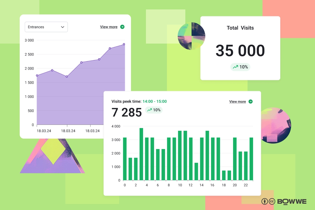
Understanding how users interact with your site is crucial for ongoing optimization. Tools like Google Analytics and HotJar offer a window into your visitors' behaviors, preferences, and pain points. These insights allow you to make data-driven decisions, enhancing your website's usability and engagement.
BOWWE's statistics feature further enriches this analytical journey by providing detailed insights specific to your site’s performance across different devices and browsers. Monitoring metrics like bounce rate and session duration can help identify content that resonates with your audience or areas that need improvement.
17. Test by yourself - on different devices and browsers
While analytics tools provide valuable insights, there's no substitute for personal experience. Testing your website on various devices and browsers gives you firsthand knowledge of its performance and usability from your audience's perspective. This step is crucial in identifying and fixing any issues that could hinder the user experience.
Use tools like BrowserStack or conduct informal testing sessions with friends and colleagues to cover a broad range of devices and browsers. Pay special attention to loading times, ease of navigation, and the overall user experience on different screens.
Building a mobile website - summary
Your journey to creating a mobile-friendly website is just beginning, and the potential is limitless. Remember, every great site started with a single step. With dedication, creativity, and the right tools at your disposal, you can build a website that not only ranks well but also wins the hearts of your mobile audience. Remember - it’s about making your site not just accessible, but effortlessly navigable, engaging, and fast for everyone, everywhere, on every device.

Karol is a serial entrepreneur, e-commerce speaker m.in for the World Bank, and founder of 3 startups, as part of which he has advised several hundred companies. He was also responsible for projects of the largest financial institutions in Europe, with the smallest project being worth over €50 million.
He has two master's degrees, one in Computer Science and the other in Marketing Management, obtained during his studies in Poland and Portugal. He gained experience in Silicon Valley and while running companies in many countries, including Poland, Portugal, the United States, and Great Britain. For over ten years, he has been helping startups, financial institutions, small and medium-sized enterprises to improve their functioning through digitization.