Do you refresh or create a website from scratch? Now the time has come to choose the best font. This is a crucial choice. Why? The layout and appearance of texts significantly affect the website's aesthetics, functionality, and readability. A website with good fonts is much more user-friendly and translates into a higher conversion!
Choosing the best font for a website is not easy. However, all you need to do is follow this guide to ensure you select the best web font!
Start Now
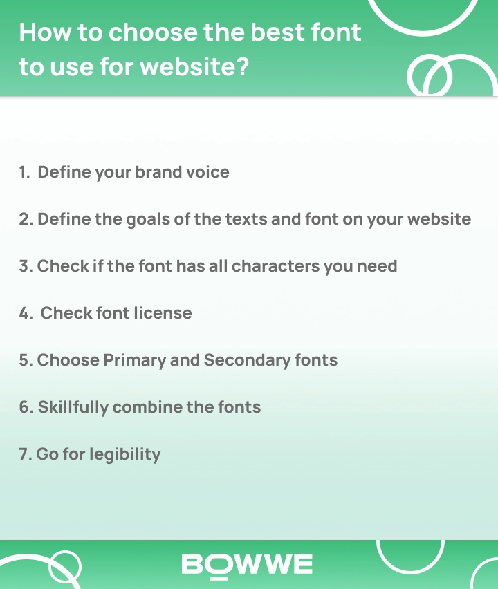
How to choose the best font to use for website?
Here are the 7 key steps you should take!
1. Define your brand voice
2. Define the goals of the texts and font on your website
3. Check if the font has all characters you need
4. Check font license
5. Choose Primary and Secondary fonts
6. Skillfully combine the fonts
7. Go for legibility
Let's take a look at how to make each of them in practice.
Step I: Define your brand voice
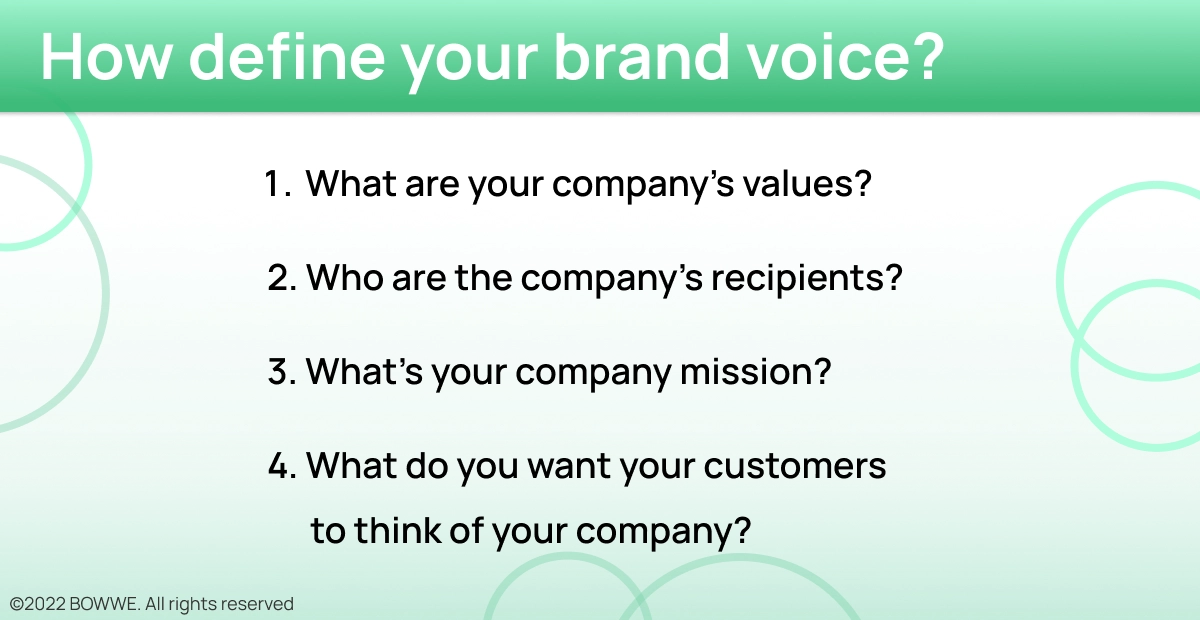
When it comes to fonts, your brand is everything. It's what customers see and identify with when they think of your company. That's why it's so important to make sure you choose the right font for your business. But how do you determine the voice of your brand? And how do you choose a font that reflects that?
To determine the nature of your brand, you need to ask yourself some questions:
1. What are your company's values?
2. Who are the company's recipients?
3. What's your company mission?
4. What do you want your customers to think of your company?
Write down the answers to these questions! They will help you with the next steps in font selection, which we will explain in this article!
Step II: Define the goals of the texts and font on your website
Regarding website design, the text and font you choose are important. They help to set the tone and convey your message to visitors. So, what are the goals of your text and font?
The text on your website should be easy to read. It should be large enough to be seen quickly, and the font should be easy to understand. In addition, it's essential to use a consistent font throughout your website. This will help to create a unified look and feel. You should also know how important the role of the text will be.
Get started
No coding experience required.
The font you choose should also be appropriate for your website's content. For example, if you're running a business website, you may want to use a serif font to make the text appear more professional. Conversely, if you're running a website with a more casual tone, you may want to use a sans-serif font.
1. Categories of fonts
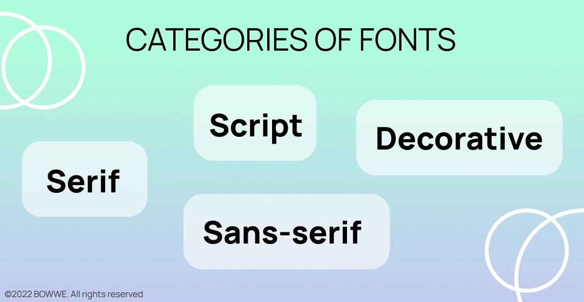
Fonts are mainly divided into:
1. Serif fonts
2. Sans-serif fonts
3. Script fonts
4. Decorative or Display fonts
1.1. Serif fonts
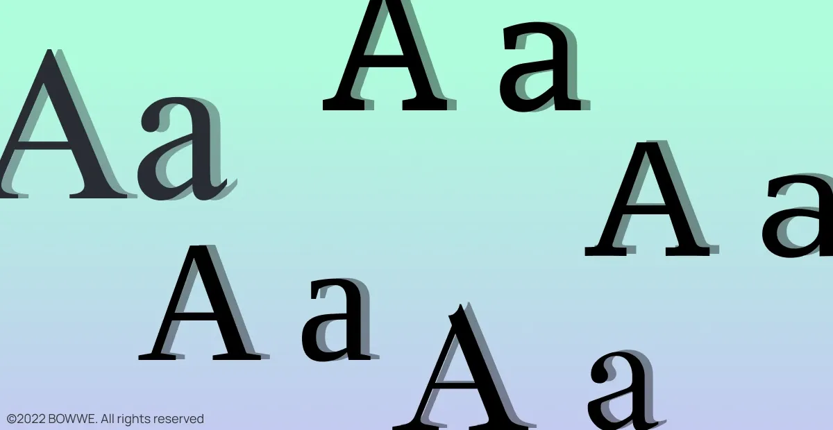
These fonts have transverse or diagonal line endings (so-called serifs) decorating the script.
The use of serifs gives the texts a traditional, more elegant character. These fonts have long been used in long paper publications (mainly in books) as serifs help readers follow the line of text, thus making it easier to read.
Due to their decorative character, serif fonts also look good on websites ... but most of all, when they are used as additional content elements, e.g.
1. headings,
2. quotes,
3. subtitles,
4. logos,
5. slogan
They can be used by companies that want to emphasize their many years of experience, refer to tradition, and signal certainty and stability.
Popular serif fonts: Times New Roman, Georgia, Palatino, Bookman Old Style, Garamond, Courier, Lucida, Century, Arno Pro, MS Serif.
1.2. Sans-serif fonts
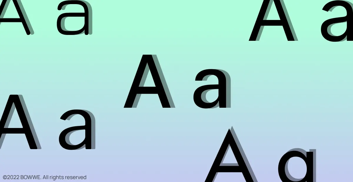
Sans-serif fonts are devoid of serifs. For this reason, they have a more modern and minimalist character.
Their use on the Internet has become commonplace because screens couldn’t correctly display serif fonts in the past. Also, sans-serif fonts displayed on the screen don't tire the eyesight.
They should be used by companies that are innovative or want to be perceived as modern and dynamic. They show accessibility and simplicity, so they will be a good choice for a company that addresses its services to the young generation.
Popular sans serif fonts: Arial, Open Sans, Montserrat, Helvetica, Futura, Verdana, Trebuchet MS, Univers.
1.3. Script fonts
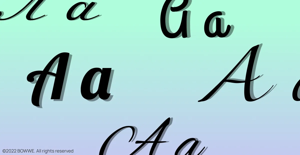
They are fonts that mimic handwriting. They are elegant and formal but also a little bit humorous. Among them, you can find both very ornamental and quite simple fonts.
Their advantage is high expressiveness. They carry an enormous emotional charge that you can use to evoke a specific reaction in the recipients. Besides, script fonts attract attention and allow you to communicate serious or humorous content (depending on the font type).
Elegant script fonts are perfect for wedding invitations and greeting cards. On websites, they will work when you use them to write smaller text elements - e.g., headings or quotes.
When using these fonts, you should pay attention to their legibility. The more decorative and "complicated" the font - the greater the chance that it will be unreadable for the recipient.
Popular script fonts: Great Vibes, Lobster, Grand Hotel, Sofia, Arizonia, Black Jack, Cookie, Germanica, Miama, Pacifico, Tangerine.
1.4. Decorative and display fonts
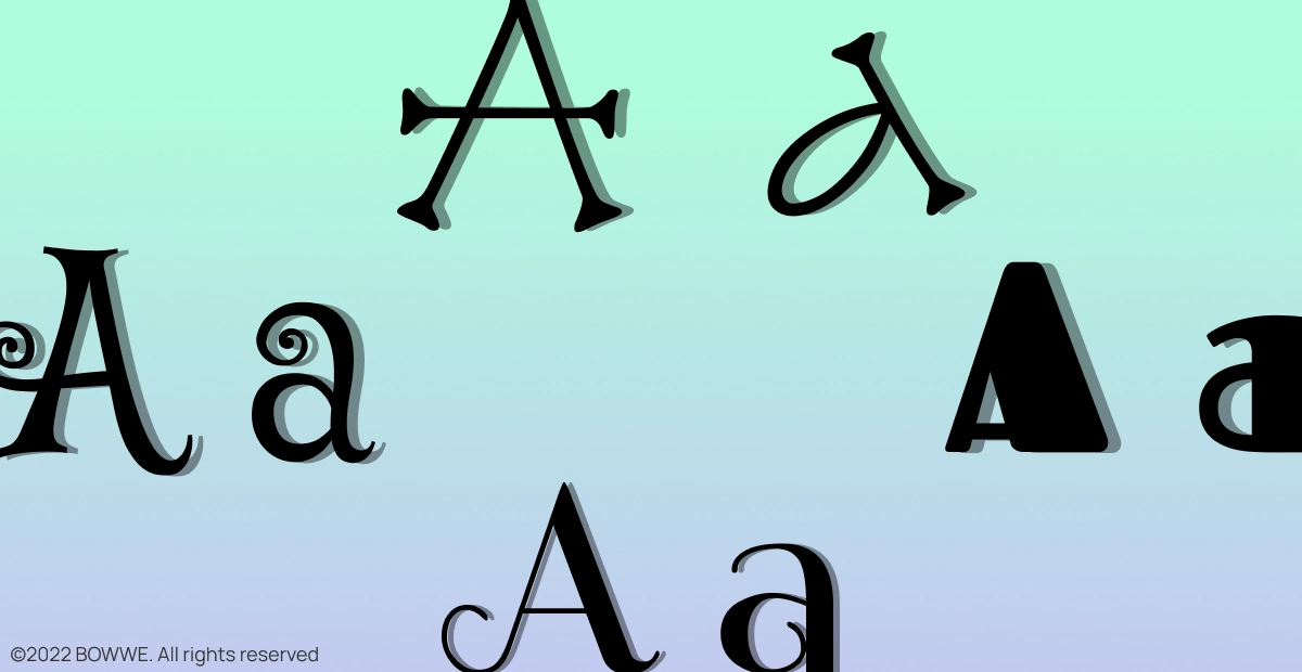
It is a large group of very diverse fonts distinguished by an elaborate shapes and high ornamentation.
Their form may be related to specific emotions (e.g., fear - with gothic decorative fonts that the title of horror movies is sometimes written) or one particular historical time, place, or object. Decorative fonts also often refer to cultural phenomena, e.g., graffiti. Sometimes the form resembles pictures.
They are very expressive and original fonts. Therefore, you have to be careful with their use - they can quickly become unfashionable because they often reflect certain times' design trends.
Step III: Check if the font has all characters you need

Have you started considering your choice of several fonts? Good!
Before you decide, however, make sure that the font you choose has all the necessary characters.
Not having all the signs is a common trap. It's easy to fall into it when you use text generators and check the font's appearance not with our target content but with, for example, Lorem ipsum.
As this text is written entirely in Latin, you may not notice the lack of vital signs, including language diacritics.
The lack of language diacritics is not the only trap you can encounter. It also happens that popular fonts (both paid and free) have problems with certain characters... or don't have them at all.
Step IV: Check font license
What is also crucial when choosing a font is the utility license. You need to check if the license by which you have the font allows you to use it in general on websites.
Be careful, especially with the fonts installed with the Adobe Creative Suite or the operating system. Their license often only allows them to be used in printed materials, not on websites. Therefore, not every typeface can be converted into a digital font and placed on the website.
If you want to be sure you can use a given font on the web, use the Google Fonts library.
Step V: Choose Primary and Secondary font
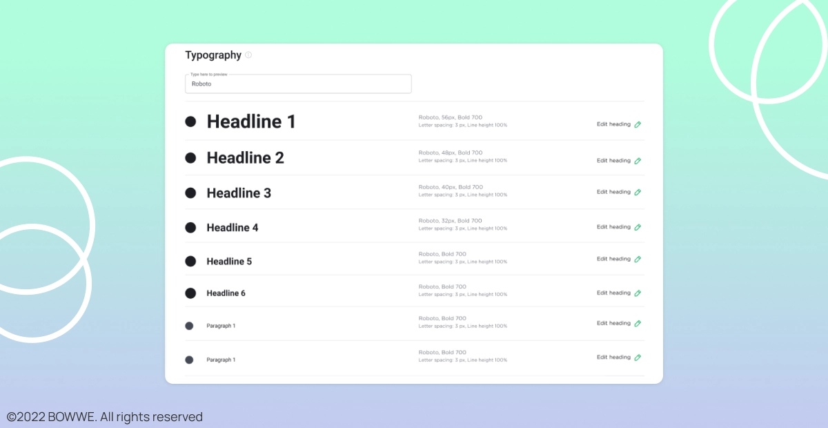
Do you like a few fonts but have difficulty making the final decision? Remember that you can't use too many of them. 2-3 fonts on a website are the optimal number.
Using many fonts introduces chaos on the website and makes it difficult to read the text - then, you will not reach potential customers.
Most professional websites include:
1. Primary Fonts
2. Secondary Fonts
3. Accent Font (optional)
Each of these fonts has a different role and is used for different content. To give your website a professional look and make it easier for you to choose the best fonts - take a look at how each of these groups differs from each other:
1. Primary font
The most visible on your website. Used in slogans, titles, and headings. Although it will not be the most used, customers should identify your brand with it. It's worth it to match the font in your logo (as long as it contains text).
2. Secondary font
Will be the one that will fill the text blocks: paragraphs, product descriptions, or blog entries. This is the most commonly used font on every website or online store.
While the primary font may be original, the primary purpose of a secondary font is readability. It is vital - customers should read your content easily.
3. Accent font (optional)
It's not a required font, but you should consider selecting it.
You can use it, for example, in CTA (Call To Action) buttons to attract attention and generate clicks. Accent font can also emphasize the text's essential parts or highlight quotes.
This font type should be different from the rest to attract your audience's attention effectively.
Do you want to find a font from a website that you were visiting? Would you like to use it on your own website?
Install a plugin - Chrome FontFace Ninja. With its help, you can check the name of each font used on a website. Just click on the icon of the installed plugin and use your mouse cursor to select the font whose name you want to know.
Step VI: Skillfully combine the fonts
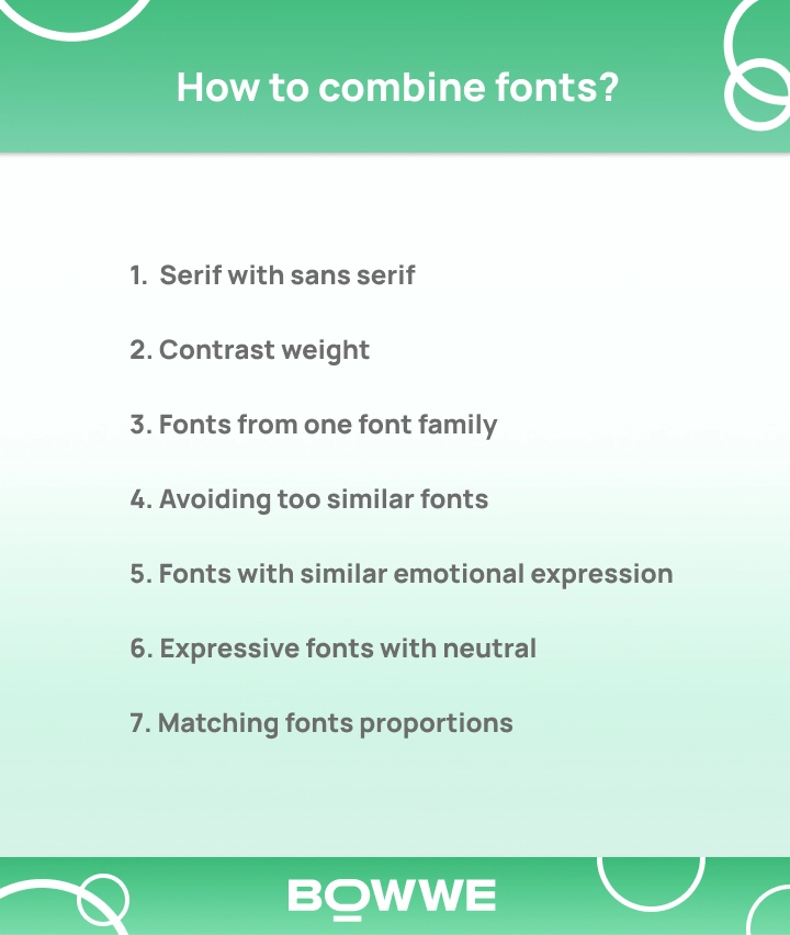
You know the basic types of fonts and how to prioritize them on your website. Now is the time to learn how you can master the art of combining them. The best way to do it is by following these tricks:
1. Serif with sans serif
Serif and sans serif fonts are a safe combination - mainly when you use them in different sizes. Such fonts are so different that, in many cases, they look attractive.
2. Contrasting weight
Use a thicker font for headings and a thinner font for longer texts. This will make the headlines stand out more and make the text easier to read.
3. Fonts from one font family
Using fonts from the same family can quickly achieve the thickness mentioned above (e.g., Open Sans and Open Sans Semibold). Many fonts have many variants - consider combining two of them on your website.
For example, in BOWWE Website Builder, you will find different Roboto font versions: Roboto font, Roboto Condensed, and Roboto Slab.
Get started
No coding experience required.
4. Avoiding fonts that are too similar
This rule also applies to contrast. Suppose the difference between the font is too tiny (fonts are too similar to each other). In that case, the connection will not look good - even if one is Serif fonts and the second - is sans serif.
5. Fonts with similar emotional expression
There are fonts, which are the carriers of emotion. For example, they are meant to be sophisticated, profound, dynamic, or fun. It would be best not to combine fonts from such different groups because we will create communication and visual chaos.
6. Expressive fonts with neutral
If you use a script (similar to handwriting) font in your header, use a neutral font to write your body text. Besides, using two expressive fonts close to each other will distract the reader and make it difficult for him to read.
7. Matching fonts proportions
If two fonts have entirely different proportions (e.g., one will have distorted letters and the other condensed), they may look awful. It is worth checking that the lowercase letters' height is the same - if yes, the fonts are more likely to match.
Below you will find links to helpful tools to help you combine fonts accurately.
1. Font pair
The page presents pairs of fonts that look good together. Prepared pairs of fonts can be downloaded from the website immediately (all fonts are available in Google Fonts).
2. Typ.io
Website shows various fonts with examples. Particular attention should be paid to the font lists used on websites.
Step VII: Go for legibility
What factors affect the readability of the text on the website?
1. Inter-letter lights
Most fonts are well designed in this respect, but as the basic font it is worth choosing its universal variant, not, for example, narrow.
2. Leading
Too small leading will make reading difficult. Ideally, the line spacing should be min. 120% letter case (150% is often considered optimal).
3. Paragraph spacing
For even greater readability, use slightly longer spacing between paragraphs.
3. Text alignment
Too much text and small margins in one line can effectively discourage reading. The Golden Rule describes 50-60 characters in verse as an ideal.
4. Contrast
Font should be such a color that it stands out against the background on which it is presented. Both too low and too high contrast will make reading difficult.
5. Size
The font size indicates the importance of a given element and allows you to divide the text into readable sections. Optimal font sizes for individual elements:
1. Titles: 30 - 70 px,
2. Subheadings: 22 - 30 px,
3. Plain text: 16 - 20 px.
6. Italic, bold, underlined
Best used sparingly. Underlining is rarely used on web pages. Bold emphasizes the importance of the items, increasing their visibility. Italics are great for foreign language expressions and quotes.
Are you ready to choose the best fonts for your website?
First - let’s recall what should be done when choosing a font for a website:
1. Define your brand voice
2. Define the goals of the texts and font on your website
3. Check if the font has all characters you need
4. Check font license
5. Choose Primary and Secondary fonts
6. Skillfully combine the fonts
7. Go for legibility
Once you are familiar with selecting a font for a website, you can move to the next phase - choosing the final fonts to use on your website. To do so, check out our list of the best website fonts to decide which one is perfect for you!
Start Now

Karol is a serial entrepreneur, e-commerce speaker m.in for the World Bank, and founder of 3 startups, as part of which he has advised several hundred companies. He was also responsible for projects of the largest financial institutions in Europe, with the smallest project being worth over €50 million.
He has two master's degrees, one in Computer Science and the other in Marketing Management, obtained during his studies in Poland and Portugal. He gained experience in Silicon Valley and while running companies in many countries, including Poland, Portugal, the United States, and Great Britain. For over ten years, he has been helping startups, financial institutions, small and medium-sized enterprises to improve their functioning through digitization.


