Typography has a massive impact on how your audience processes your content. If you stick to the golden rules of typography, users will be eager to visit your website, read your blog posts, or admire your company logo. Without attention to proper typography, you can't expect anyone to spend even a few seconds deciphering what you're trying to convey to them. In this guide, you'll learn how to avoid this situation and maintain user-friendly typography on your website.
Start Here!
What is typography?
Before we go over the practical application of Internet typography principles to your website, let's briefly explain what typography is. By definition, typography is a set of rules regarding the visual aspects. It is a term used in both traditional and digital printing.
Web typography is essential when it comes to creating internet sites or any other content that goes to the web. It depends on it whether, for example, a given article is easy to assimilate or the logo is clearly visible on the website as a difference on printed documents.
Web design typography: must-know terms
What is typeface in typography?
A typeface is a set of characters with consistent graphic features, e.g., shape, style, and proportions. Many people confuse a typeface with a font.
When someone are talking about changing the font (Times New Roman, Arial, etc.), they refer to the typeface. Typefaces can be divided into categories, taking into account the script’s different characteristics.
The best-known types of the typeface are:
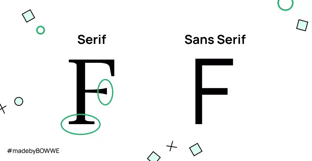
a) Serif typeface (so-called serifs) - letters have flattened endings (e.g., Times New Roman).
b) Sans-serif typeface - simple letters without endings (e.g., Arial).
Leading, tracking, and kerning
Leading, tracking, and kerning are ways of regulating the light (or distance) between letters. These are popular functions found in many graphics programs designed to work with text. What is the main difference between these three methods?
What is leading in typography?
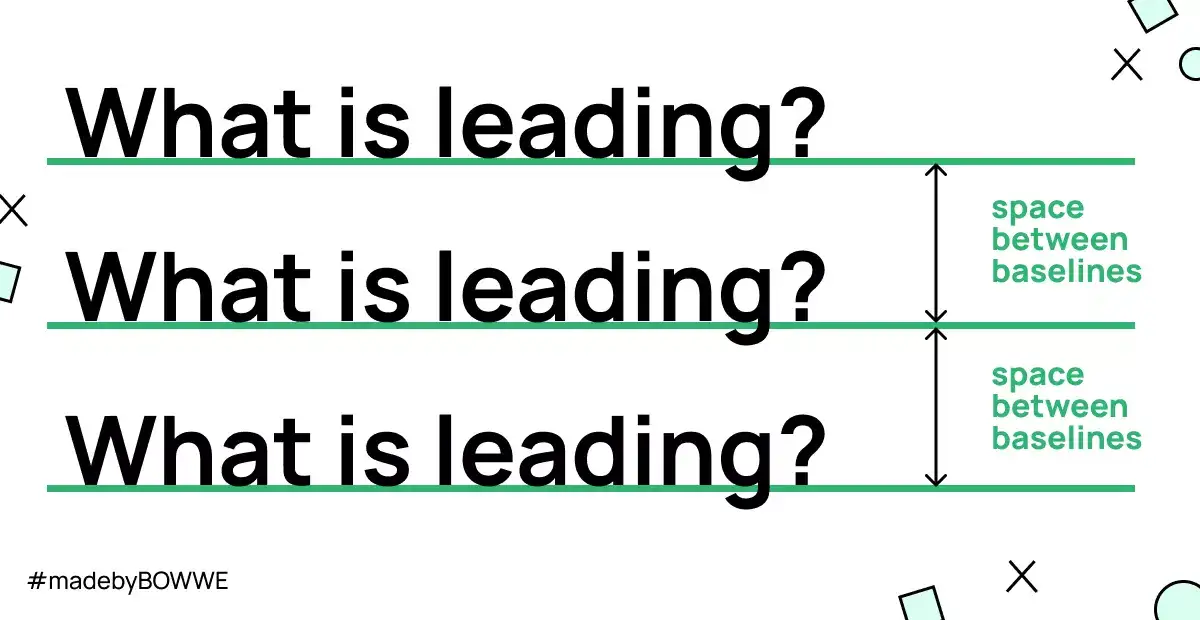
Leading in typography refers to regulating the distance between the writing lines where the letters stand.
What is tracking in typography?
Tracking (also known as changing the composition density) can be applied to a larger text area, e.g., the entire paragraph.
What is kerning in typography?
Kerning is used selectively in the text. For example, it can be used between similar letters V and A to make it easier to read. Moreover, kerning determines the spacing not only between individual letters but also between punctuation marks and numbers.
Widow and orphans
What are orphans in typography?
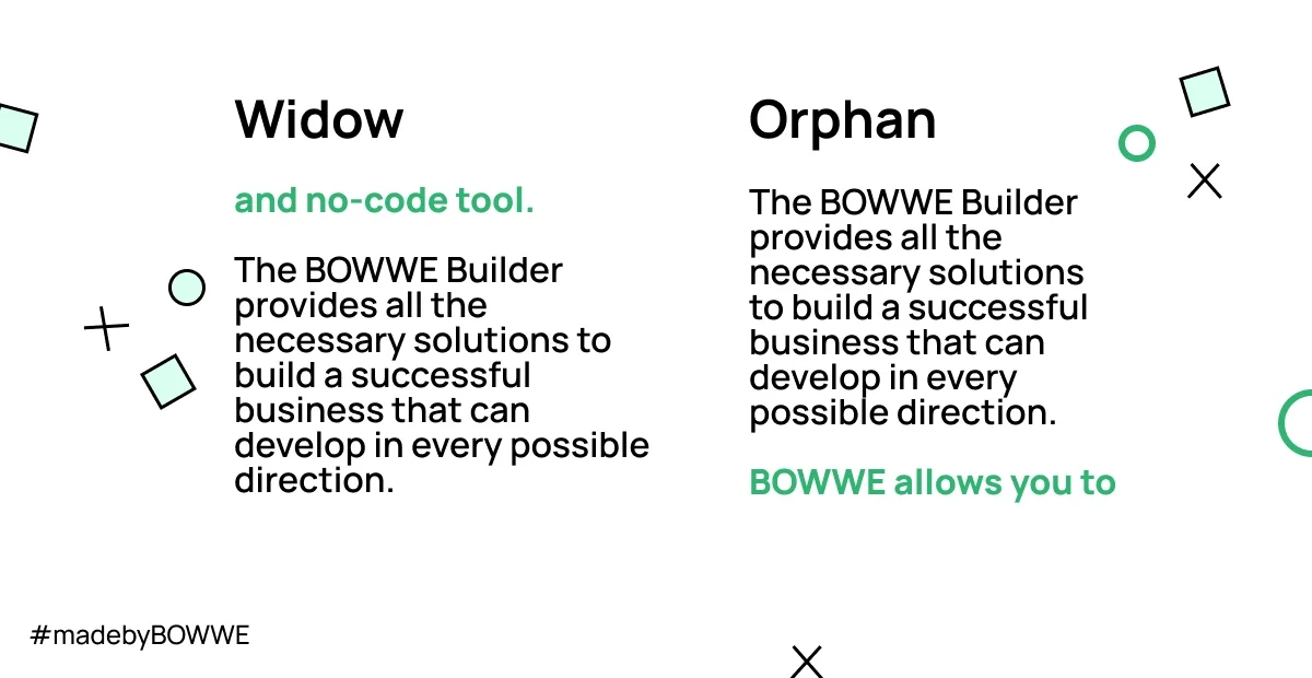
Orphans are words that appear at the end of a paragraph that are left alone on the next line. If you put a single letter word at the end of a line, it is a composition error. Therefore, the conjunctions left at the end of the line should always be moved to the next line.
What are widows in typography?
A widow is a line of text that is left isolated at the end of a paragraph. This is typically considered to be bad typography, as it can disrupt the flow of reading.
Start Building
No coding experience required.
The role of typography in web design
The role of typography is not limited to decorative functions. In the online world, its main task is to make it easier for users to perceive messages from websites. Most Internet users don't read the texts word by word but only scan the content, selecting the most important fragments. Therefore, the entire typography of the page should be designed thoughtfully. After all, your goal is to draw the reader's attention to the most critical information you want to convey.
It cannot be denied that well-chosen fonts can liven up your website and make users stay longer. By following the typography rules, you can be sure that your website's content will be aesthetic, legible, and consistent with its style.
How important is the appearance of the text on the website?
The appearance of text on a website is important for a number of reasons. First, it helps to create a visually appealing site that is easy on the eyes. Second, it can help to convey the overall tone and feel of the website. Third, it can help to make the site more easily navigated and easy to read. Fourth, well-formatted text can help improve search engine optimization (SEO). Finally, good typography can help to create a more professional-looking site.
Typography vs. branding. How do they impact each other?
The text on the website affects how your brand will be perceived on the Internet. Branding consists of name, logo, brand colors, and typography.
Typography can have a big impact on branding. It can communicate the tone and personality of a brand, and influence the way consumers perceive a brand. Good typography will allow brand to look more credible and trustworthy, while bad typography can make a brand look cheap or unprofessional.
Branding can also impact typography. For example, a brand might choose to use a certain font because it is associated with a certain type of customer or because it fits the brand's image. Branding can also dictate the overall look and feel of a piece of typography, such as the colors, spacing, and size of the text.
Common typographical errors to avoid
Typographic negligence effectively discourages users from returning to the site. Some typographic principles shouldn’t be broken, and that even graphic designers sometimes forget in a hurry. Ignoring them may disturb or even completely prevent the content’s message’s legibility. Here are the most blatant typographic oversights that are better avoided as they can ruin the UX of any page design:
Typography is the art and technique of arranging type to make written language legible, readable, and appealing. The goal of good typography is to make the text easy to read by arranging the type in a way that is both legible and appealing. Legibility is the quality of being easy to read, and readability is the ease with which a text can be read.
It is important to balance the competing factors of legibility and readability when designing a typographic layout. The goal is to create website typography that is both legible and appealing, and that is easy to read.
Font too small
Even if you think a small font looks nice and matches the page’s style, remember not to overdo it. Too small a font is always tricky to read. And it is the legibility of the text that you should put first if you want to create a user-friendly website!
Too broad and too long blocks of text
Any negligence regarding the text structure will make your website perceived as chaotic. It is difficult to catch the most crucial information when dealing with a page with too long text strings. Even if you feel you have many forwarding information on your site, remember that users prefer short texts! All you need to do is shorten the texts and follow the optimal number of characters in a line, i.e., between 40 and 80.
No paragraphs
Content without paragraphs will look like an unorganized or illogical train of thought rather than a professional and substantive text. So remember to break the text into paragraphs; you can also separate it with attractive graphics.
No headings in the article
It is another example of a text's lack of organization. Like a detail, it can completely blur the content’s message or testify to a lack of ingenuity.
Wrong choice of typeface
According to the rule, the less is more. Familiarize yourself with the common standards for combining fonts before you make your choice. You can always choose the most popular combinations.
Leaving conjunctions (orphans)
You already know what orphans are and that you shoulddn’t leave lonely conjunctions at the end of a text. It is worth avoiding, even if it is not a glaring error at first glance. Then the text is much easier to read.
Background patterns
You've undoubtedly seen a website more than once where the text is illegible due to patterned backgrounds. Putting text on a photo, or even a distinctive color, is always a risky procedure. Avoid any background with patterns if you don't want to tire the user's eyes.
Start Building
No coding experience required.
Justifying text
Justifying will make your text look unnatural. Therefore, it is worth avoiding this treatment. Instead of giving the impression of organization and elegance, the content becomes unreadable. Justification only looks good in newspaper columns. On the Internet, this results in the formation of white spaces in the text, in other words, gaps. It is better to use the text’s alignment to the left.
Where to find typography knowledge?
Here are a few must-haves resources for every UX designer, web design enthusiast, and anyone who wants to explore the secrets of web typography.
a) First Aid in Typography (Friedrich Forssman, Hans Peter Willberg) - a typographic toolkit that will help many novice designers in need.
b) Shady Characters (Keith Houston) - knowledge about the history of typography and practical descriptions of typographic characters.
c) The Elements of Typographic Style (Robert Bringhurst) - a must-read for typographers and more. You will find some theory and knowledge on building whole typographic arrangements.
d) Google Fonts Glossary - an online database of terms and their definitions related to typography.
Web design typography - summary
You already know what good and user-friendly typography are all about. You realize how much impact it has on your content's readability and clear communication. Now it's time to take care of perfect typography on your own website!
Start Here!

Karol is a serial entrepreneur, e-commerce speaker m.in for the World Bank, and founder of 3 startups, as part of which he has advised several hundred companies. He was also responsible for projects of the largest financial institutions in Europe, with the smallest project being worth over €50 million.
He has two master's degrees, one in Computer Science and the other in Marketing Management, obtained during his studies in Poland and Portugal. He gained experience in Silicon Valley and while running companies in many countries, including Poland, Portugal, the United States, and Great Britain. For over ten years, he has been helping startups, financial institutions, small and medium-sized enterprises to improve their functioning through digitization.

