As a business owner, you know that having a website is important. Not only does it give customers a way to learn about your company and what you have to offer, but it also provides a way for you to connect with potential customers online. However, simply having a website is not enough – you also need to make sure that it is designed in a way that is effective and will help you achieve your business goals.
In this article, I will provide you with some tips on how to design a website for success. If you're thinking about creating a website, or are in the process of doing so, you'll want to read these web design tips.
Start Here!
11 essential web design tips to follow
Below you will find a list of tips that will help you create a website that will meet its goals and users will be happy to use. Stick to them, and the results of your work will not be wasted!
1. Always do research
Before creating a website, always do your research. This includes:
a) Understanding your target audience and what kind of content will appeal to them. Knowing them thoroughly, you will be able to respond to their needs. Thanks to this, you will not have to worry about poor traffic on the website.
b) Know your competition. You will learn what things should be included on your website to make it stand out and be more effective.
c) Make your design reflect your business. Good research will help you not lose touch with what is characteristic and important for your industry.
Once you have a firm grasp on these aspects, you can begin creating your site. Keep in mind that your research should be an ongoing process, as your audience and competition can change over time.
2. Plan visual hierarchy
When planning the visual hierarchy of your design, start by considering the overall message you want to communicate. Then, break down that message into smaller parts and decide how you want to order them. You generally want to lead users from the most important details to the least important ones.
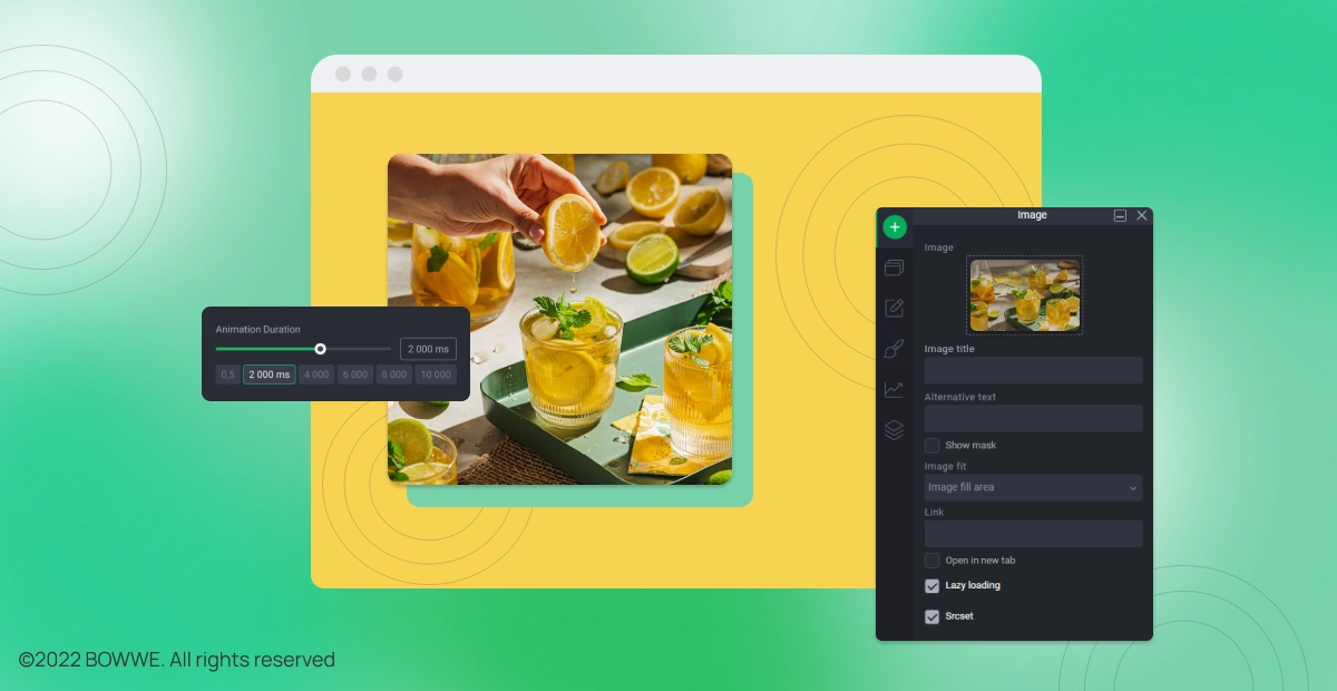
Once you have a general plan, start thinking about the individual elements you'll use to communicate your message. What kind of visuals will best communicate your ideas? Will you use images, charts, or something else?
When you're planning the visual hierarchy of your design, keep in mind that less is more. Too many elements can be overwhelming, so only include the most important details. By focusing on the essentials, you can create a design that is easy to understand and navigate.
One of the most important design principles is the use of white space. White space is the area between elements on a page, and it's crucial for creating visual hierarchy and improving readability.
Good use of white space can make a big difference in the look and feel of your website or app, and it's something that's often overlooked. When designing your website, take a step back and see if there's anything you can do to improve the spacing. Even small changes can have a big impact
3. Make your website easy to navigate
Making your website easy to navigate is important for two reasons. First, it helps your visitors easily find the information they're looking for. Second, it makes your website look more professional and polished.
You can do a few things to make your website more navigable. First, make sure your menus are clear and easy to understand. Second, add links to important pages in your sidebar or footer. Finally, use breadcrumbs to help visitors track where they are on your site.
By following these tips, you can make your website more navigable and user-friendly. This will help you attract more visitors and convert more leads into customers.
4. Use mostly relative positioning
The use of relative positioning allows search engines to quickly understand your content because all elements relate to each other. The opposite is when it comes to absolute positioning. Since the elements aren't related, search engines have trouble understanding the context of the content. They can't see if the headline is related to the image or the text. This is why you should use absolute positioning with caution.
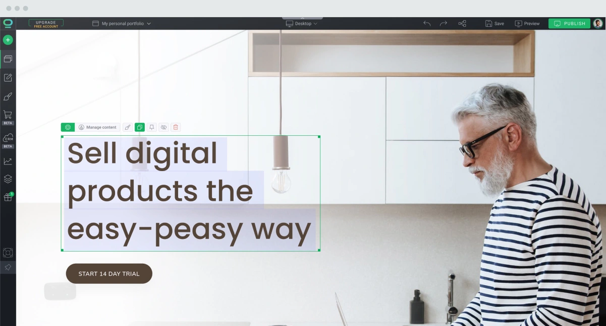
At BOWWE, you have a choice between relative or absolute positioning, when most website builders don't offer that choice. Thanks to this solution, you can be sure that your website in BOWWE will be perfectly positioned.
5. Remember about responsiveness
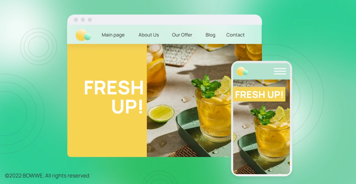
A responsive website is a website that is designed to adapt to the screen size of the device it is being viewed on. This means that whether a user is viewing your site on a phone, tablet, or desktop, they will be able to see it without issue. Creating a responsive website is crucial because it ensures that your site can be accessed by as many people as possible. Today, even more than 50% of website traffic comes from mobile devices!
There are a few things you can do to make your website responsive. First, you will want to use responsive design principles. This means using CSS media queries to change the way your website looks at different screen sizes. You can also use responsive images, which are images that automatically adjust to the size of the screen they are being viewed on. Finally, you can use a responsive grid system to help organize your website content in an effective way.
Ideally, you should create a mobile and desktop version of the site simultaneously - in BOWWE, every website you make is automatically responsive.
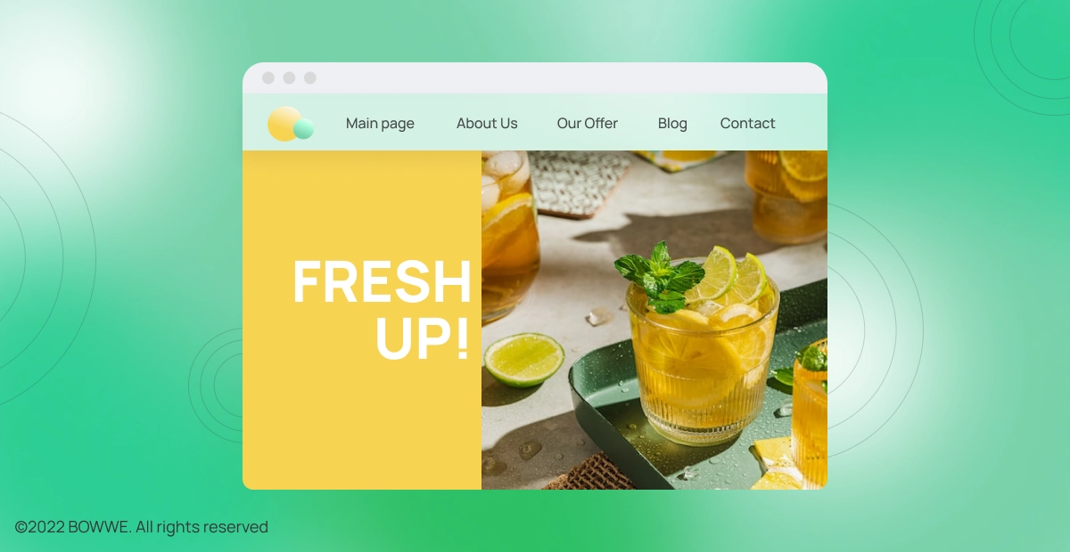
6. Put the most important content in the above-the-fold
It is based on the belief that the most important information should be at the very beginning. After this, the rest of the "less important" content should be placed. This particular section of the page has its name and is called "above the fold". What does above the fold mean? This term describes the part of the website that the user sees first. To put it even more straightforward - it is the visible part of the page without "scrolling".
In the "above the fold" section, the most valuable content for the recipients (and search engines) is placed. There are, for example, title images, the most important keywords, menus, and Call-To-Action buttons.
How important is "above the fold" really? For users, it is the place that usually decides whether to stay on a given page or leave it. This section needs to have content that grabs their attention and convinces them that they will find some valuable information here. In turn, for search engine robots, "above the fold" is a place that informs them about the content and subject matter of the content on the website.
Does this mean that you have to put as much content as possible in "above the fold"? No! It is a place where only the most important content should be placed. However, it should be chosen wisely because if you overdo it, your action may bring about opposite effects than expected. Google imposes penalties in the event of placing too many keywords or ads in the "above the fold". What then is worth putting in "above the fold"?
a) Call-To-Action buttons
b) Graphic
c) H1(header)
d) Internal links
e) Contact form
f) Most important keywords
Get started
No coding experience required.
7. Make it easier to get to know the website content
One of the most important things you can do to make your website more user-friendly is to make it easy to view and read.
How can you make sure that people will get to know the content on your website?
a) Breaking your content up into small, digestible pieces makes it much more likely that people will actually read it. And when they do, they're more likely to understand and remember what they've read.
b) Avoid long paragraphs and longline lengths. Long walls of text are not attractive to users and do not encourage them to read the content on the page.
c) Write meaningful and attractive headings and subheads. Most people skim websites instead of getting to know their content from beginning to end. Attractive and clearly visible headlines will help you catch their attention and encourage them to pay more attention to the content on the page.
8. Use colors to inform and attract attention
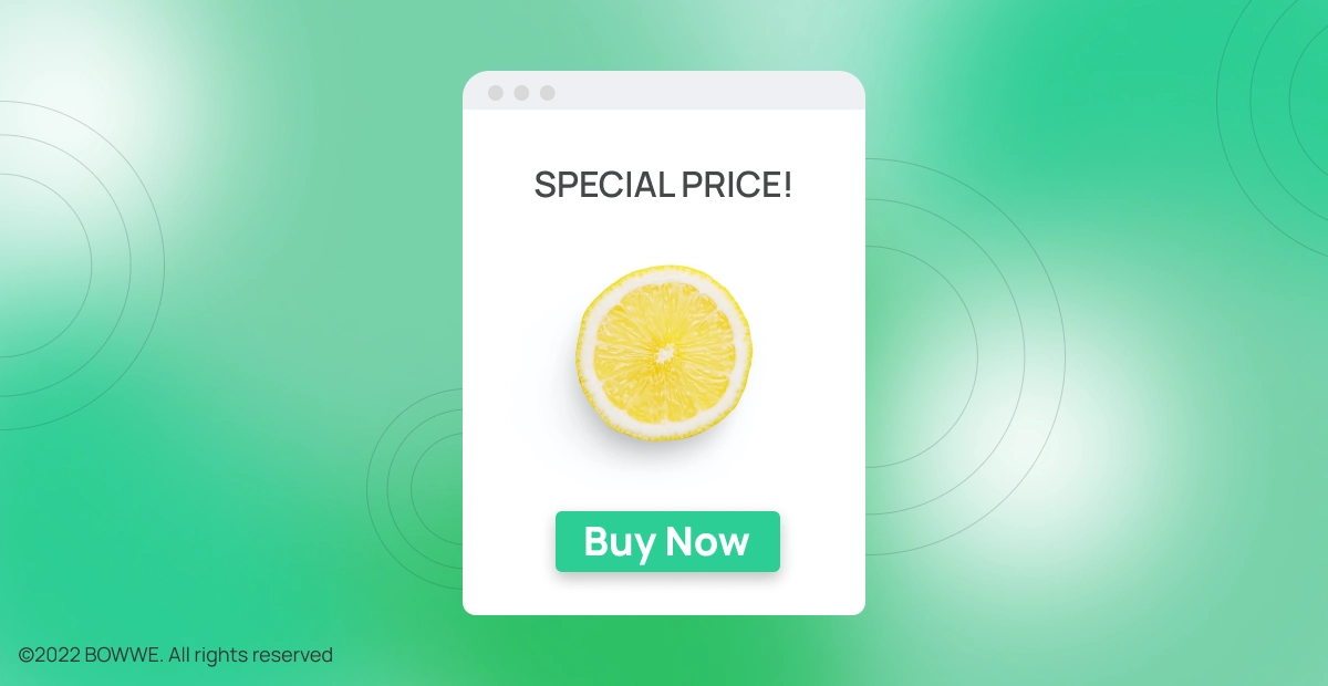
Colors can be a great way to add visual interest to your website. They can also be used to help users navigate their way around.
For example, you could use different colors for different sections of your website, or for different icons. Or you could use colors to highlight important information.
Whatever way you choose to use them, colors can be a helpful tool in making your website more user-friendly.
The use of colors also works very well for CTA buttons. Let's say a user is in the process of finalizing a purchase, but at some point, they want to terminate the process and want to leave the website. Then the message "Are you sure you want to cancel the purchase?" appears along with the two buttons "Yes, quit the purchase" and "No, I want to continue the purchase".
At this point, the second button should be in a distinctive color to attract the user's attention more. However, the first one should be dimmed or marked in red, because this color is associated with a threat or something forbidden. Such a simple trick can keep the users and turn them into a real customer.
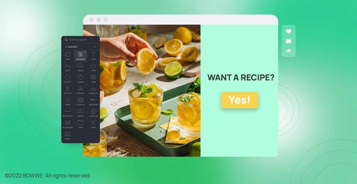
9. Place visual elements on the website

It's no secret that people are visual creatures. In fact, studies have shown that humans process visuals 60,000 times faster than text. That's why it's so important to use visuals on your website - they can help capture attention, convey information more effectively, and even improve your SEO.
But what kind of visuals should you use? And where should you put them? Here are a few tips to help you get started:
a) Use photos and infographics to break up text and add interest.
b) Place visuals near the relevant content to help users understand what they're seeing.
c) Use icons to direct users' attention and help them navigate your site.
By following these tips, you can ensure that your website makes the best use of visuals to engage and inform your visitors
If you choose to include visual material on your site, make sure you include photos of people. They can increase the conversion by up to 40%! However, remember that pictures of real people, e.g., employees, will have a greater chance of increasing conversion than stock photos that inspire less trust and emotions.
10. Provide the recipient with the information they came for
Answering your website visitors' top questions is a great way to give them the information they need and keep them coming back for more. Here are some tips on how to do just that:
a) Identify the most popular questions. Use Google Analytics or other tools to see which pages on your site are getting the most traffic and which questions people are asking most often.
b) Write clear, concise answers. Be sure to address the question directly and provide all the information the person needs in a single paragraph.
c) Use keyword-rich titles. This will help your answers show up in search engine results when people are looking for information on your topic.
d) Promote your answers. Use social media, email marketing, and other channels to let people know that you have answers to their questions.
By following these tips, you can make sure that your website visitors always have the information they need, and that they keep coming back for more.
11. Include social media buttons
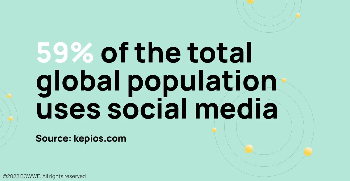
As you probably know, social media is a huge part of the internet these days. Many people use it to connect with friends and family, share news and experiences, or just stay up-to-date on what’s going on in the world.
Because of its popularity, it’s no surprise that more and more businesses are incorporating social media into their websites. This can be a great way to connect with potential and current customers, and it can also help to boost your website’s visibility and search engine ranking.
If you’re thinking about adding social media buttons to your website, there are a few things to keep in mind. First, you’ll need to choose which social networks you want to include. Facebook, Twitter, and Google+ are some of the most popular options, but there are many others to choose from. After you include social media buttons on your website you can then start promoting your pages on the social networks, and encourage your visitors to share your content with their friends.
Adding social media buttons to your website can be a great way to connect with potential and current customers. Just be sure to choose the right networks!
Best practices for web design - summary
Let’s recall the most essential web design tips:
1. Always do research
2. Plan visual
3. Make your website easy to navigate
4. Use mostly relative positioning
5. Remember about responsiveness
6. Put the most important content above the fold7. Make it easier to get to know the website content
8. Use colors to inform and attract attention
9. Place visual elements on the website
10. Provide the recipient with the information they came for
11. Include social media buttons
The above web designing tips are essential to creating a professional website. You must remember them at any time during the project implementation. Thanks to them, you will save a lot of time, avoid basic mistakes, and ensure that your website will meet your goals.
Start Here!

Karol is a serial entrepreneur, e-commerce speaker m.in for the World Bank, and founder of 3 startups, as part of which he has advised several hundred companies. He was also responsible for projects of the largest financial institutions in Europe, with the smallest project being worth over €50 million.
He has two master's degrees, one in Computer Science and the other in Marketing Management, obtained during his studies in Poland and Portugal. He gained experience in Silicon Valley and while running companies in many countries, including Poland, Portugal, the United States, and Great Britain. For over ten years, he has been helping startups, financial institutions, small and medium-sized enterprises to improve their functioning through digitization.