How to make the customers take advantage of your offer? Is a corporate website an excellent tool to convince them? Usually yes. But in some cases, websites hold a lot of information that can distract the audience - while in sales and marketing, a simple, clear message is what counts.
The solution is a well-structured Landing page. According to HubSpot research, having a large number of Landing pages (10-12) can increase the number of leads obtained by as much as 55%! In this article, you'll learn how to create a Landing page that will attract customers.
Start Here!
What is a Landing Page?

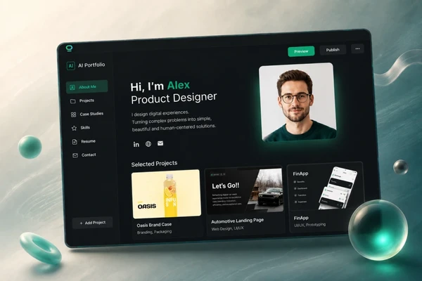
A Landing page is a website dedicated to a specific target group to mobilize the user to perform a particular action (e.g., make a purchase, book a visit, leave contact details). The name comes from the fact that it is the first page that the user "lands" on due to marketing activities - usually after clicking on an advertisement in a search engine, on social media, or mail.
Usually, the Landing page takes the form of a so-called one page or single page (a site that does not have additional tabs) and consists of sections and catchphrases (CTA) that convince the visitor to perform a specific action.
Two types of Landing Pages
Landing pages can achieve different goals, but two basic categories can be distinguished - in terms of their function:
1. Click Through Landing page
2. Lead Generation Landing page
Click Through Landing Page

Such a website aims to go to another page, which is usually much more extensive. The Landing page presents only a part of the offer, and its advantages and links to a page that contains detailed information about the products offered or services, their prices, availability. Often the user can make a purchase on the referred page.
Lead Generation Landing Page

Such a page aims to collect users' data - their name and surname, telephone number, or e-mail address. On such a Landing page, you may be encouraged to leave a contact to view the offer, but user data may be collected more subtly. Companies offer a discount for subscribing to the newsletter or provide free valuable materials (e-books, reports, infographics) to people who will provide their e-mail addresses in return.
Why is the Landing Page important?
Not every Landing page is a sales page (one where you can make a direct purchase). Many websites of this type are part of the sales funnel. The task of such a website is to ensure that as many users as possible reach the next stage of the sales process. When the Landing page collects data of visitors with whom communication is then conducted - it increases their interest in services and the level of trust. And then, the chance that these people will make the purchase increases.
Creating a Landing page brings much better results than a website with many functions and various recipients in advertising campaigns. It is important to focus the message on one thing you want to convince the visitor of such a Landing page.
All information should be easily accessible, clearly visible, logically arranged, and the execution of the action - as simple as possible. It is mainly due to this simplicity of information and focus on one goal, and addressing one group of recipients of Landing pages are usually much more likely to make an important action
What is the main purpose of a Landing Page?

A Landing page is created to increase conversions. Conversion is a significant action taken on a given page by the visitor, like sending an inquiry via the contact form, account registration, booking an appointment, or purchase. If you dream of more conversion from your online activities - a Landing page will be the best solution, because everything it contains is designed to lead the user to one action. It can have a greater impact on increasing the conversion that is important to you, even than, for example, a website with too many things that can distract the recipient.
What is the Landing Page used for?
As stated, the goal of the Landing page is clear - collecting conversions. However, the conversion will vary depending on the type of project. For online stores, it will be purchasing a product, for the hotel industry - making a reservation, and for a corporate blog, a subscription to the newsletter. Hence, different types of Landing pages are derived, which encourage the user to take essential action in many ways. Here are some of them:
Coming soon Landing Page

The Landing page is the announcement of something new, such as a website or the premiere of the expected product. It may only contain an H1 header with a "Coming Soon" message. Such a page (by placing, for example, a contact form) is a great way to reach the first recipients.
Launch Page Landing Page

Usually, it is created when a new product enters the market. The website then contains detailed information about the product, such as its description, price, or place to purchase it.
Subscription Landing Page

It is a Landing page whose primary purpose is to encourage users to subscribe, e.g., to a newsletter. Such a site is usually distinguished by a banner with a catchy headline, a CTA button, and a sign-up form.
Countdown Landing Page

This type of Landing page is used in the event of a planned premiere of a product or event. It often happens that such a page only contains a countdown to a given premiere without more detailed information for building expectations and greater interest in a given product or event.
Landing Page vs. Website
The Landing page will not replace your website. However, it can be a great complement to it and help you promote your offers more effectively, increase the number of newsletter subscribers, visits to your website, or the number of inquiries received - depending on the purpose of your Landing page.
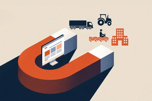
Your website can be targeted at many groups of people. For example, as a gate manufacturer, you can address the content on your website to individual customers (owners of single-family houses), business and industrial plant owners, developers, architects, sales agents, and fitters and service technicians. The Landing page will help such a company address the offer only to a selected group - e.g., individual customers who search for phrases related to garage doors in Google. A Landing page will be a good tool for you, especially if you direct your offer to a broad group of recipients and want to reach with promotion or product only to a specific group of recipients.
What is the difference between a Landing Page and a Website?
It is good to know the difference between a landing page and a website because then it will be easier for you to choose the right tool to achieve a specific conversion goal. So how is a Landing page different from a website?

What should you remember before creating a Landing Page?
Landing pages are essential elements of online marketing campaigns. Usually, users find them after clicking on an advertisement (e.g., Google Ads or Facebook Ads) or from mailing campaigns.
The Landing pages must be consistent with your marketing campaigns. If a user clicks on an ad to download a free e-book and cannot perform this action, the Landing page will not fulfill its role. Similarly, if they clicks on an ad to learn about specific services and other types of services presented on the Landing page, the user will feel disappointed and quickly leave the site.
The Landing page can also be promoted on social media, in the footer of the e-mail, in the newsletter, in every post published on the blog. However, it must be considered whether the people you target the offer are the same target group you correspond with or to whom you direct other marketing activities.
How to build a Landing Page - step by step
Work on the Landing page should proceed through the implementation of individual stages of the project.
How to build a Landing pages that convert - in short:
1. Do research
2. Plan sections
3. Create a mockup
4. Write the texts
5. Make a Landing page
1) Do research
The first thing you should do is define the purpose of your Landing page. Only then should you start researching. How to conduct it? Let's say you run an electronics store and have a product that you want to increase sales for. In that case, you should start by looking at how your competition has carried out similar activities. Did they create a Landing page? Check what it looked like, what it contained, and how effective it was. This will help you take the right direction to create your own Landing page.
2) Plan sections

Consider what your Landing page should contain (it's worth starting with specifying its type - examples were discussed earlier) to increase the chance of achieving the assumed conversion as much as possible. Remember that the Landing page cannot contain much content that will distract the user from its goal. Therefore, focus on the most necessary sections and plan their arrangement to result from each other and be helpful for the user.
3) Create a mockup
4) Write text
This is an essential part of creating your Landing page. Because it cannot contain a lot of content, you need to make sure that it's catchy and persuasive. Pay special attention to the copy on the CTA buttons and headers - vital Landing page elements. Present what value you provide for the recipient and how you intend to fulfill it ("Builder from BOWWE - create a website without coding in 1 day!").
The creation of texts for the Landing page should be preceded by dividing the mock-up into sections, which you should set goals for. Only then should you start creating headlines and the rest of your content.
5) Create a Landing Page

It's time to take the last step - create a Landing page. You can do it in several ways.
- by creating a Landing page from scratch in the Landing page builder
- using ready-made widgets and sections
- selecting a ready Landing page template and modifying it
Start Free!
No credit card required.
Remember that after making a Landing page, you should observe it (e.g., its results, visitors behave) and optimize it from time to time to achieve even better results. If you did your job well, ideas for possible corrections worth testing would certainly appear while working on the first version of the Landing page. Installing tools such as Google Analytics, Hotjar, etc., will surely provide you with even more.
If you use the right tool, the whole thing should take very little time. Making these changes in BOWWE usually takes up to a few minutes.
What makes a good Landing Page - elements
What elements will be on your Landing page will determine by its purpose. However, several elements can increase the effectiveness of Landing pages. Before creating your Landing page, follow the list below and consider which ones to include in your project.
1. Logo
Placing the logo on the Landing page seems obvious. However, have you ever wondered why this is so important? First of all, the recipients who lands on the website will be sure that they are in the right place - on a trusted website, a trusted company. Secondly, the logo is an image element and if you have many Landing pages it will simply build your company's recognition.
2. Catchy header
This element will be the first thing that the Internet user will notice. The campaign's final result depends very much on it; hence, it must very effectively attract attention and evoke a feeling of a solid need to read the entire page. In the header, you should inform about the broadly understood benefits that the customer will obtain thanks to your offer (for example, "A durable natural leather handbag 30% cheaper for you!").
Knowing the needs of your target group well, you should easily come up with a perfect headline that will reach your audience.
3. Top benefits
Now it is time to convince the customer through the most important benefits. Benefits are not the same as functions! The benefits should be something that somehow solves your consumer's problem. Let's take Canva as an example. The home page says, "Canva allows anyone to become a designer." If someone is looking for a tool for a person who is not a professional graphic artist - the benefit of using Canva was presented to them immediately after "landing" on the website.
4. The most important values
The following information element lists the most critical values provided by the product/service in short sentences. These elements are to distinguish the offer from the competition. Internet users don't read but scan the information found on the Internet, so it is crucial to managing the space with the content skillfully.
5. Advantages of the offer

The fact that a customer has landed on a Landing page doesn't mean that they are determined to take advantage of your offer. It is therefore essential to present the product or service to them in such a way as to convince them that this is what they need, and buying from your company is the best option. When highlighting the benefits that the user will achieve, refer to your product or service's desires.
You don't have to have the best offer in terms of quality, price, etc. It certainly increases the effectiveness significantly, but there are also such arguments as the ease of making a purchase solving customer problems, which the purchase of your offer solves. Since the client has already found your offer, make them perceive it as attractive enough and trust it, and then good results will come.
6. Coherent message
The Landing page must be consistent with where the potential customer came to it (for example, if they were directed to it through a banner, it should refer to in its appearance and content).
After switching to the Landing page, the Internet users should see exactly what they expected and what the banner they clicked on suggested. Otherwise, they will quickly leave our Landing page, and you will be left with a huge bounce rate and an ineffective Landing page.
7. Effective CTA
Be sure to add a call to action to encourage users to take the specific action you want. Be sure to place them high in the page layout.
The key to achieving the goal on the Landing page is a call to action (CTA) - a button that encourages the recipient to click and leads him to perform the desired action. First of all, it must be expressive, appropriate, and contain a clear message.
If you manage to convince the customers to take advantage of our offer thanks to the above elements, you must direct them to the appropriate path, which will lead to achieving the Landing page goal. Again, you have to give the customers everything on the tray, so the buttons directing them further must be visible and placed in a place that the users will not miss. The button should stand out in color. Ideally, it should strongly contrast with the surrounding elements, but it must also match the website's design. It should contain a short and legible message informing about what it is for, for example: "Buy now", "Book", "Get a test drive," etc.
8. High-quality photos

Consumers buy with their eyes. If your Landing page contains blurry, low-quality images, or unflattering photos, your customers will not purchase the items you display. Try to create an interesting arrangement. For example, by selling handbags show them in an attractive way, you can present the items sold in the presence of a newspaper, book, or a specific phone model. In this way, the consumer will be able to imagine the actual size of the bag. The customer must also be able to zoom in on the photo and view the item from different perspectives. Show the front, back, side, and inside of the bag .
A customer buying online makes a decision based on visual stimulations. If there is only text or low-quality photos and graphics on the page to which we are targeting the campaign, they will discourage the customers from further action (they will lose trust), and there is a risk that they will resign from making the purchase. Therefore, make sure that the materials placed are not only of high quality but also professionally made. The frame presented in the photo must be well thought out and inspire confidence. Graphics should present all the product's advantages.
9. Description
Remember that the Landing page should encourage the customer to a specific action (conversion), e.g., purchase a service or product. Provide the necessary information to make a purchasing decision - the customers can't have doubts, and you cannot force them to guess. Everything should be clear; then, you will gain their trust and be able to count on high conversions. Don't include phrases that could confuse a potential customer or introduce some ambiguities. Also, have an incentive to ask questions if needed.
Start Free!
No credit card required.
10. Texts
Another important element on the Landing page is text. Many website owners believe that the description is unnecessary, and the users will call or write an e-mail if they want to know something. Unfortunately, at the sellers with this approach, the phone is usually silent, and there is only spam in the e-mail inbox.
If you want to encourage the users to purchase, be sure to describe the product or service offered. However, don't include an extended essay that discourages users from reading. Insert short, thematic paragraphs, bold the most critical information, and use formatting, headings, bullets, and other practices. It is an excellent move to place a photo or video next to a paragraph presenting the described service or a given product feature. In the text, try to answer the most common questions bothering the customer, including information to whom our offer is addressed and what the given group of recipients will gain by making the transaction.
11. Visible contact details

Don't forget to put your contact details in a visible place on your Landing page. The customers must know which number to dial to call your office or what e-mail to enter in the recipient field in the e-mail box and most importantly - the customers must know from whom they are buying (on the Internet, extortion is an everyday reality, so do not be surprised by cautious customers). Also, present what the entire purchasing process looks like and how long the customers will have to wait for the order's delivery.
12. Address data
Despite your efforts to ensure that the Landing page contains comprehensive information about the offer, there will always be customers who don't find all the information vital. The potential customers will most likely contact you and ask additional questions in such a situation. Don't make them leave the Landing page and go to the contact page or look for a phone number or e-mail address all over the page. If a users leaves a Landing page, there is a risk that they will not come back, so all the work and costs involved in creating it will probably be wasted.
For this reason, the phone number and e-mail address must be clearly visible on the subpage selected for targeting the campaign. If you only operate locally, it will be equally essential to provide the address of your business, and when access may be problematic, describe it in detail, including a map. Also, be sure to include your working hours because you don't want the clients to come to your business after it closes.
13. Recommendations and opinions

Today, opinions are essential elements on every website and Landing page of the micro, small or medium company. According to statistics, 9 out of 10 consumers trust opinions and recommendations. It's worth taking advantage of it.
Posting satisfied customers' comments reduces anxiety and help answer the question, "Is it really worth it?". Of course, you can doubt how valid the presented opinions are. However, there is a way to dispel them by using opinions taken from Honaro, i.e., places where only verified customers can leave them and use them. Simply register on Honaro.com, add your company, and then use the system verification opinions. Simply ask customers to leave their opinion by giving them a unique code authorizing them to do so or use other options to verify whether someone is a customer or not. Finally, it's worth adding that their Reviews will automatically appear on your Landing page made in BOWWE Creator.
14. References from clients
In the case of companies directing their offer to business clients, it may also be helpful to present references from existing clients. You can do it in several ways:
1. In the form of a reference list - by naming all or most of the companies that have already benefited from your offer. It is best to sign this section like "Reference List". If possible, it is worth briefly describing what project you have implemented for each of the clients. In the case of permanent cooperation, mark it, e.g., by writing "constant cooperation for 7 years".
2. Posting scans of references received in writing on the site - it is best to put them in a section resembling typical sections with opinions. Choose the quotation from the review that best reflects the cooperation with a given company and add details (photo of the entire reference, company logo, or a picture of the author of the review).
3. In the form of a video with references - it is an excellent form of building trust in your company. Video content is enjoyable to "consume". You can also post the video on, for example, Youtube. From there, new customers can also come to your company after watching such a video.
15. Customer list
Adding your customers' logos to the Landing page will emphasize your credibility - such a section on the Landing page will work very similar to the reference list (described above). It presents less information, but it can be visually designed. Thus it will very effectively attract visitors' attention to your website and will surely be remembered by them.
Including this section will be especially effective if your customers are recognizable and especially if they are known in the industry. If you don't have well-known clients, don't worry - the mechanism will still work.
If you direct your offer mainly to companies, be sure to mention your partners as well, especially if they are large and well-known brands - this is also an important factor for many buyers. If a large company has trusted you, it must have carefully analyzed similar offers from your competitors before.
16. Expert opinion
This is another form of recommendation that you can propose on your landing page. If one of your clients is an industry expert, it's a good idea to ask them for a few words about your business. Adding such a review on your Landing page may simply increase your company's authenticity rating. If a well-known person in the industry has agreed to sign your company with his name, your offer is worth considering.
17. Price lists and the use of the decoy effect

A very good solution is to use price lists on the Landing page - thanks to them, customers can quickly and easily see the entire offer of your company, compare different variants of services or products and gain a sense of security. If you have such an opportunity, use price lists or at least carefully consider the possibility and reasonableness of their use because in the vast majority of cases, they have a very positive effect on the conversion of Landing pages.
An interesting solution is also the use of the so-called decoy effect; you use it to attract buyers to the offer you are most interested in selling (because, for example, you know that this offer is the best for your customers and it is after their purchase that they will be most satisfied). This 'luring' effect on this preferred option can be achieved with a bit of psychology, precisely through the use of decoy effects.
For this purpose, e.g. if you have three different offer plans for your service in the price list that buyers can use with the help of the decoy effect, you can evaluate one of the offers in a very contrasting way, thanks to which the other 2 offers will seem a much more reasonable option for your customers. To better illustrate the operation, let's use the example of a gym. Imagine that you are presenting 3 options in the price list:
→ payment for 3 months - $100
→ payment for 1 month - $30
→ payment for 1 year - $550
The third option presents a value that stands out so much, even shocking compared to the others, that the other 2 options in advance will seem much more justified to customers.
18. Price comparison
Before making a purchase decision, Internet users compare the currently available offers. Displaying a comparison table on the Landing page, e.g., functions in the context of your competition, can simply save them time. It is also a simple way to show your uniqueness and stand out from the competition.
Start Free!
No credit card required.
19. Counter
The driving force behind the purchase is also the numbers that support your offer. This can be a counter showing how many people have made a purchase or how many products are still available. In the event that you offer something on a specific date, a timer that shows the time remaining until the end of the offer will be great. Nobody wants to miss a great deal, and when the clock is ticking and other users buy running out of products or services, many customers will also make a purchase under time pressure so as not to be left empty-handed or doomed to a worse offer.
In the case of time-limited offers, it is worth considering building the entire Landing page layout in such a way that it evokes a feeling of rush in the customer. It may seem like an undesirable impression to you, but it often happens that such Landing pages achieve amazing results. Using the words "Now", "Sign Up Today", "Limited Time Offer", "Last Items", "Buy Now" can help you achieve great results.
20. Team
Adding photos of the leaders behind the company, and sometimes the team, on the Landing page will allow you to show the company more human and confirm that it is not created by robots but by real people—the more natural the photos, the better. You can also add job descriptions or contact information to individual team members.
Bragging about leaders or a team is especially important in the case of service companies because you know what the customer buys is the result of their work. The satisfaction with the purchase depends on them.
21. Video

In justified situations, it may be worth using video materials, often characterized by higher authenticity and the possibility of more accurate presentation of some offer elements than alternative methods, which will often inspire additional trust in your company and result in better conversion. Video is also great at showing the work atmosphere or how the service is performed.
22. Contact form
Usually, one of the last steps before converting is filling out the form. Unfortunately, they are poorly structured on many pages, so they become a place where many users who have so far decided to buy, being the most important moment for you, give up filling it in! How to fix it?
When constructing the contact form, consider the following aspects:
a) The form should be as short as possible and require as little data from the client as possible - do not ask for telephone number, and address,
b) It is also inadvisable to force the user to register and create an account, as this may discourage you and lose the customer,
c) It should be ensured that the form fields are clearly understood and, if necessary, legibly described,
d) Validation - checking the correctness of the given data should work in real-time,
e) If the client's consent to data processing is required, it should be clearly stated, the button for submitting the form should be immediately visible,
f) The entire form should usually stand out from the page and the content of the form should clearly communicate why it is being filled in.
23. Chat
Placing the possibility of direct contact via chat will help dispel the recipient's doubts in a relatively short time and show them that you are always available to them, and help them make a purchase decision. Chat also shows customers that you are counting on their response and opinion. Of course, on the other side of such a chat, there must be a person who, if necessary, will answer the questions of a potential customer. If you cannot ensure this, give up the chat.
24. Layout

Above all, Landing pages must be effective and clearly encourage visitors to take the intended action on your site. Of course, it is worth making the Landing page visually refer to your home page, but remember that your home page may perform a slightly different task than the Landing page. Therefore, it is permissible to change the layout to one that will guarantee the highest number of conversions.
It also happens that the Landing page on purpose has a different graphic design than the website, it may result from many reasons, but the most important thing is that it should be a deliberate and well-thought-out decision. Such a situation often occurs in the case of lead generation campaigns carried out by third parties. When you are not convinced that the current graphic design is of high quality, you can test alternative layouts or when you want to sell the same products but under a different brand.
25. Use of empty spaces
Have you ever bought products in a bustling market while trying to find the best offer for you? I think you will agree that shopping in such conditions is not the easiest one and it is hard to make a purchasing decision. The same situation can happen on Landing pages that are overloaded with information or where the information "blends" together. The problem can be solved by using empty spaces, the so-called white areas. It will help you keep distances between elements and highlight essential information on your Landing page.
Of course, white spaces don't have to be white, so translating empty spaces is much better - it's just areas on the Landing page that don't contain any elements except the background.
Landing page examples
See what a Landing page can look like. Pay attention to its content and the arrangement of the sections. Also, consider how they encourage the audience towards each conversion goal.
Summary - creating a Landing page
A Landing page is a proven and effective way of promotion if you focus on one specific marketing goal. Here's a quick reminder on how to create a Landing page:
1. Do research
2. Plan sections
4. Write the texts
5. Make a Landing page

Don't forget that the goal of the Landing page should be one, and it must be clearly defined. Without it, you won't get satisfactory conversion results, and your work will go to nothing. Therefore, make sure that each point in creating a Landing page is made carefully and with reason. By following the guidelines and tips in this article, your Landing page will certainly enjoy a high conversion rate!
Start Here!
Landing Page basics – FAQ
What is a Landing Page?
How is a Landing Page different from a website?
What are the main types of Landing Pages?
- Click-Through Landing Pages – guide users to another page (like a product or checkout page).
- Lead Generation Landing Pages – collect user info via forms in exchange for offers like e-books or discounts.
Why should I use a Landing Page instead of a regular website?
What elements make a Landing Page effective?
- A compelling headline and CTA
- High-quality visuals
- Clear benefits and trust signals
- Mobile responsiveness
- Minimal distractions
Can I build a Landing Page without coding?

Karol is a serial entrepreneur, e-commerce speaker m.in for the World Bank, and founder of 3 startups, as part of which he has advised several hundred companies. He was also responsible for projects of the largest financial institutions in Europe, with the smallest project being worth over €50 million.
He has two master's degrees, one in Computer Science and the other in Marketing Management, obtained during his studies in Poland and Portugal. He gained experience in Silicon Valley and while running companies in many countries, including Poland, Portugal, the United States, and Great Britain. For over ten years, he has been helping startups, financial institutions, small and medium-sized enterprises to improve their functioning through digitization.