Are you ready to take your website design from concept to reality? A website mockup is a blueprint for your digital masterpiece, and creating one is the key to a successful website. In this article, I will guide you through planning, designing, and developing a website mockup that will wow your audience and set your website apart from the competition.
Start Now!
What is a website mockup?
A website mockup is a visual representation of your website's appearance before it's built. It's like the blueprint of your website; it's the foundation on which you develop your online presence.
A mockup is crucial for any website development project as it helps to ensure that the final product meets the desired design and functionality goals. With a website mockup, you can see how the website will look and function before any coding is done, making it easy to make changes and adjustments before the final product is built.
Why should you create a website mockup?
Creating a mockup should be at the top of your to-do list if you're planning to build a website. Not only does it give you a clear vision of what your website will look like, but it also allows you to identify any potential design flaws and user experience issues before you even start building.
Not creating a mockup is like building a house without a plan; it's a recipe for disaster. Make sure to complete this crucial step, and create a mockup, and you'll be well on your way to building a website that stands out and converts visitors into customers.
Wireframe vs. mockup vs. prototype - explained
When designing a website, there are a few key terms you need to understand - wireframe, mockup, and prototype. These three elements may sound similar, but each plays a different role in the design process.
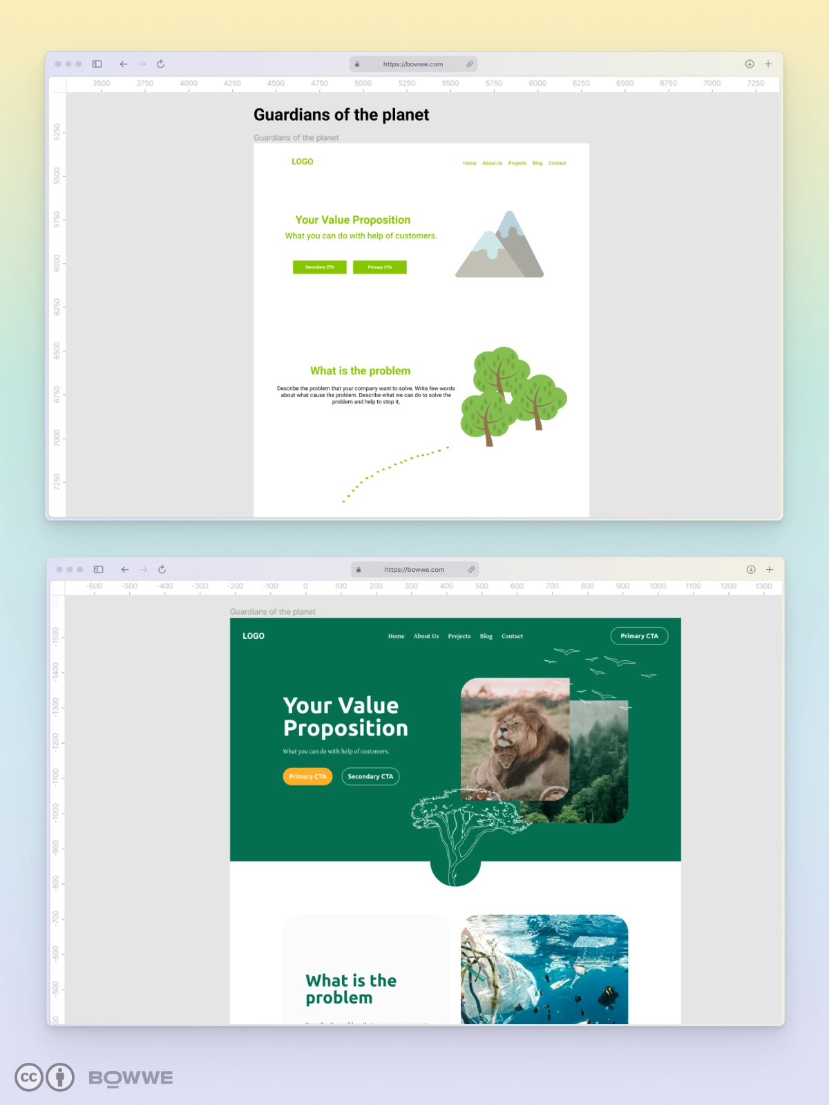
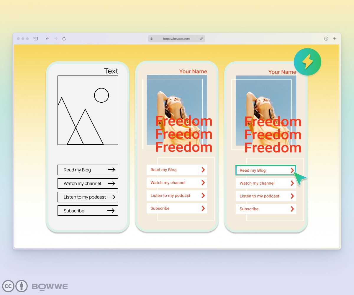
First, let's talk about wireframes. A wireframe is a basic, skeletal representation of your website's layout. Think of it as the base for your website's structure. It's an excellent tool for organizing content and figuring out the overall layout of your site.
Next is a mockup - a more detailed version of your website design. It's a visual representation of your website's appearance, complete with colors, typography, and images. This step is great for getting feedback on your design and ensuring it looks the way you want it to.
At the end comes prototypes. A prototype is a functional version of your website design. It's a working model of your website that allows you to test the functionality and usability of your design. It helps you identify any issues with your website before it goes live.
So there you have it, wireframe, mockup, and prototype - three essential tools for designing a website that looks and functions great. Make sure to use them in the correct order.
3 Crucial Steps For Creating Website Mockup
Stage 1: Planning
a) Setting goals and objectives
Before you even start sketching out rough ideas for your website mockup, setting clear goals and objectives is essential. This will ensure that your mockup is tailored to meet the specific needs of your target audience and align with your overall business objectives.
Think about what you want to achieve with your website. Are you looking to generate leads, increase sales, or provide information?
Top 8 Website Goals [+ Ways to Achieve Them]
Once you've established your goals, you can start mapping out the specific objectives that will help you achieve them. This could include increasing website traffic, improving user engagement, or reducing bounce rates.
b) Identifying the target audience
When creating a website mockup, you must identify your target audience early in the process. Without understanding who you're building the website for, you'll be shooting in the dark and risking your website's success.
To identify your target audience, start by analyzing your existing customer base.
→ Who are they?
→ What are their demographics?
→ What are their pain points?
Once you've gathered this information, you can create buyer personas that represent your ideal customer.
But don't stop there. Take your research further by conducting surveys, focus groups, and user testing. This will give you valuable insights into what your target audience wants and needs from your website. With this information, you'll be able to create a website mockup that resonates with your target audience and meets their needs.
c) Researching design trends and competitors
Researching design trends and competitors are crucial in creating a website mockup that stands out. You want to know what's currently popular in the industry and what your competitors are doing, but you want to avoid copying them. Instead, use this research to inform your own unique design choices.
Think of it like this: if you're a chef and want to create a new dish, you'll look at what other chefs are doing and then spin on it. The same goes for website design; you want to stay current and competitive, but you also want to bring your unique flavor to the table.
By researching design trends and competitors, you'll better understand what works and what doesn't in your industry. This will help you create a website mockup that stands out, engages your target audience, and ultimately converts them into customers.
Stage 2: Design
a) Preparing content
First content, next design. The quality of the content and the value of that content to potential site visitors are most important. This is where many people mess up; they focus too much on the design and not enough on the content.
Before you even start sketching out rough ideas or choosing a layout, you need to have a solid understanding of the content featured on your website. This means understanding your target audience, what kind of information they're looking for, and how to present it in a way that is both visually appealing and easy to navigate.
Take a look at your competitors, see what kind of content they're featuring and how they're presenting it. Research their website, blog, and also social media. You can use tools like Ahrefs or Google Trends to understand better what kind of content will be perfect for your website.
Start Now!
No coding experience required.
b) Taking care of details - layout, typography, color scheme
As for color, choosing a color scheme that aligns with your brand and communicates the right message to your target audience is essential. The colors you choose should be visually pleasing and create a sense of harmony throughout the website. Don’t use many colors; you must follow the general style that you defined initially.
Remember that the colors you choose will also affect the overall mood of the website. Bright colors create a more upbeat and energetic mood, while muted colors create a more relaxed and calming mood.
In the case of a layout, keep it functional and user-friendly. It also needs to be easy to navigate and present users with relevant information well. The text needs to be clear and easy to read, and the photos must be high-quality and relevant to the content. If you want your website to succeed, you must ensure that both the design and content are top-notch.
c) Sketching out rough ideas
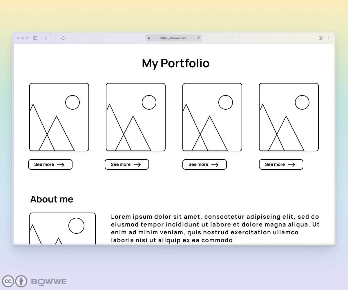
This is where you can let your creativity run wild and develop unique design concepts that will set your website apart from the competition. But don't just focus on aesthetics; think about the user experience too.
→ How will your visitors navigate through your website?
→ What elements will they expect to see?
Sketching out rough ideas is the perfect opportunity to map out the user journey and ensure your design is visually appealing and user-friendly.
Feel free to get messy, use a pen and paper to jot down your ideas, and don't worry about perfection at this stage. The most important thing is to get your ideas out of your head and onto paper. Once you have a rough sketch of your website, you can start refining and perfecting it.
It is worth remembering that the mockup is only planning the elements we will put in it. If you have yet to gain experience in graphics, leave decorative elements.
However, when you hand over the mockup for further corrections - never leave anything to the designer to guess! You want a slider in a given place - write it down, you added a button - describe how it should work, etc.
Stage 3: Development
a) Choosing a mockup tool
It's all about finding the right balance of features and ease of use for your needs. Another critical factor to consider is budget. Some mockup tools are expensive, while others are free or have free trial options. Keep in mind that investing in a high-quality mockup tool can save you time and money in the long run, but it's only sometimes necessary. You can always find free alternatives that provide the basic features you need.
We have prepared for you a short list of website mockup tools that are worth checking. Let's dive into it:
1. For beginners:
→ Balsamiq: A wireframing tool that offers a simple and user-friendly interface.
→ Moqups: A web-based design tool that allows users to create wireframes, mockups, and prototypes.
2. Advanced:
→ Axure: A prototyping tool that offers advanced features such as conditional logic, dynamic content, and team collaboration.
→ Adobe XD: A vector-based design tool that allows users to create wireframes, mockups, and interactive prototypes.
3. Paid:
→ Sketch: A popular vector-based design tool widely used for creating mockups, wireframes, and prototypes.
→ InVision Studio: A professional-grade design tool that offers advanced features such as collaboration and animation.
4. Free:
→ Figma: A web-based design tool that allows users to create wireframes, mockups, and prototypes for free, with some limitations.
→ Adobe XD (Starter Plan): A free version of Adobe XD that offers limited functionalities.
b) Creating a mockup using the chosen tool
The key to success here is to keep things simple and focus on the essentials. Stay calm with unnecessary elements or fancy features. Remember, this is just a mockup, not the final product.
When creating your website mockup, consider every step you did before, from setting a website goal to choosing its color schemes.
Remember also about the usability and functionality of your mockup. As you build it, think about how users interact with your website. Will it be easy for them to find what they're looking for? Can they easily navigate through the pages? These are the questions you should ask yourself as you create your mockup.
Finally, feel free to make changes and iterate. Remember, a website mockup is a work in progress, and there's always room for improvement. So, keep testing and tweaking until you're satisfied with the final product.
c) Testing the mockup for usability and functionality
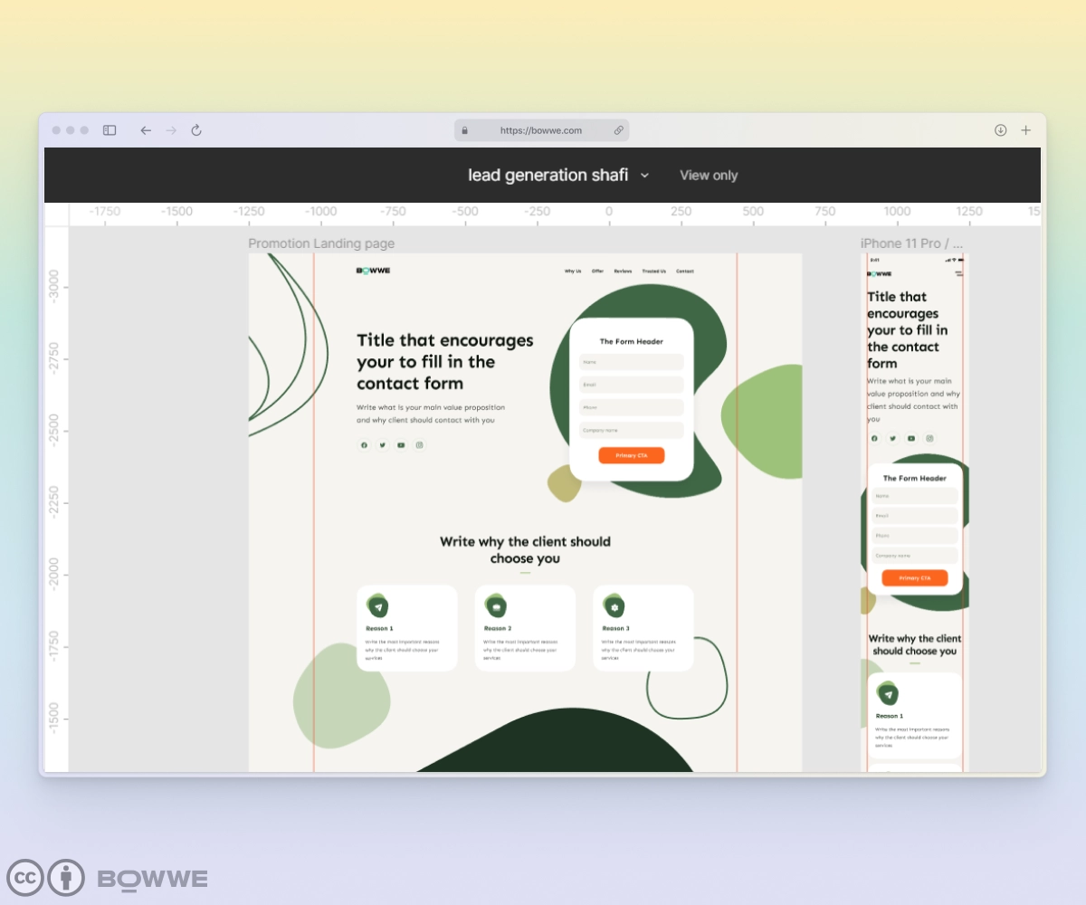
Testing your website mockup for usability and functionality is crucial. You can have the most visually stunning website, but it needs to be more user-friendly and effective. The best way to ensure your website mockup is usable and functional is to get feedback from real users. Show your mockup to a sample of your target audience and ask them to complete specific tasks on the site. Take note of any areas where they struggle or get confused, and make adjustments accordingly.
Predict and think over the most convenient way for the users the site so they can easily find what they need (feedback number, call that action, feedback button, and so on).
Another critical aspect of testing is making sure your website mockup is responsive. With more and more users accessing websites on mobile devices, your website must look and function just as well on a small screen as it does on a larger one. Use a responsive design tool to check your mockup on different devices and make any necessary adjustments.
Creating a website mockup - summary
View website template!
Creating a website mockup is the first step in bringing your website idea to life. By following the steps outlined in this article, you'll be able to design a mockup that looks great and functions seamlessly. Let’s recall how you can make a website mockup:
1.Setting goals and objectives
2. Identifying the target audience
3. Researching design trends and competitors
4. Preparing content
5. Taking care of details - layout, typography, color scheme
6. Sketching out rough ideas
7. Choosing a mockup tool
8. Creating a mockup using the chosen tool
9. Testing the mockup for usability and functionality
Creating a website mockup doesn't have to be an overwhelming task. You can take an idea and turn it into reality with dedication and the right steps. From coming up with an idea to launching the website, these steps can help you create a website mockup that's ready to go.
Start Now!

Karol is a serial entrepreneur, e-commerce speaker m.in for the World Bank, and founder of 3 startups, as part of which he has advised several hundred companies. He was also responsible for projects of the largest financial institutions in Europe, with the smallest project being worth over €50 million.
He has two master's degrees, one in Computer Science and the other in Marketing Management, obtained during his studies in Poland and Portugal. He gained experience in Silicon Valley and while running companies in many countries, including Poland, Portugal, the United States, and Great Britain. For over ten years, he has been helping startups, financial institutions, small and medium-sized enterprises to improve their functioning through digitization.

