When as many as 75% of users form an opinion of your website based solely on its appearance (source: Kinesisinc) you can't afford not to keep up with web design trends. Having an outdated website with poor performance can literally kill your business. Of course, you don’t want that to happen, right? Absolutely check out, then, the compilation of the hottest web design trends for 2025 and make sure you stay ahead of your competition!
Start for Free!
Before we start…
Trends come and go and even return with doubled force. However, there are some that stay with us for a long time and to which anyone who wants to have a successful website should adapt.
A well-kept and up-to-date website
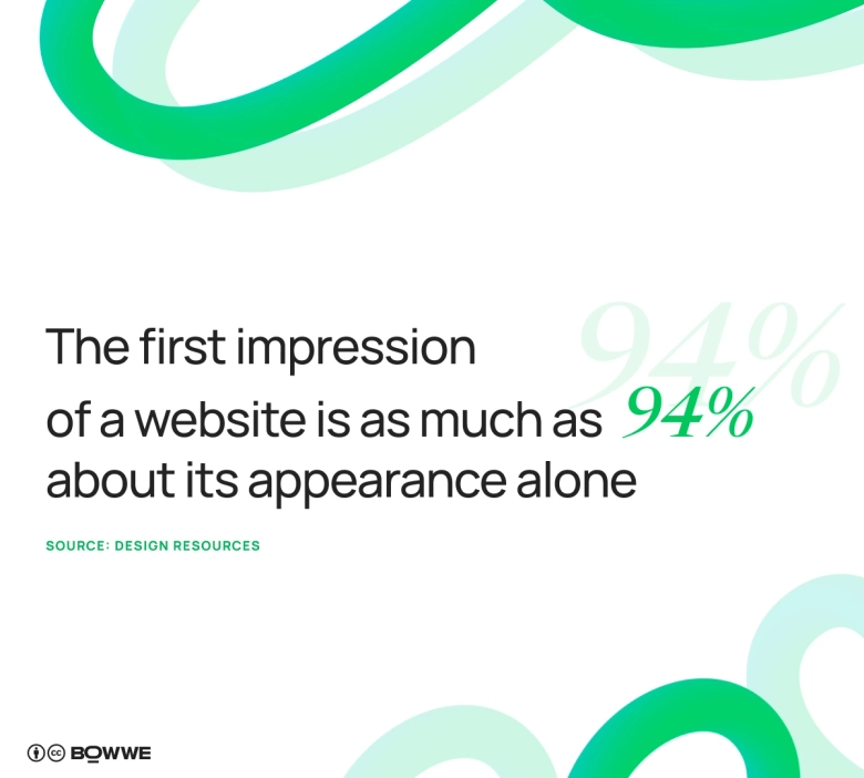
Did you know that the first impression of a website is as much as 94% about its appearance alone (source: Design Resources)? This doesn't mean, of course, that you should feverishly follow every new compilation of web design trends for each upcoming year and modify your site according to them every time. It's more about making sure that you don't underestimate the role of website design, as you will lose a huge amount of customers!
If you make sure that your website looks professional and well taken care of, that's a lot! Believe that users momentarily notice when they enter a website that hasn't undergone any updates for 10 years, and when they enter one that lives up to current trends in website design.
A website enjoyable to use on any device
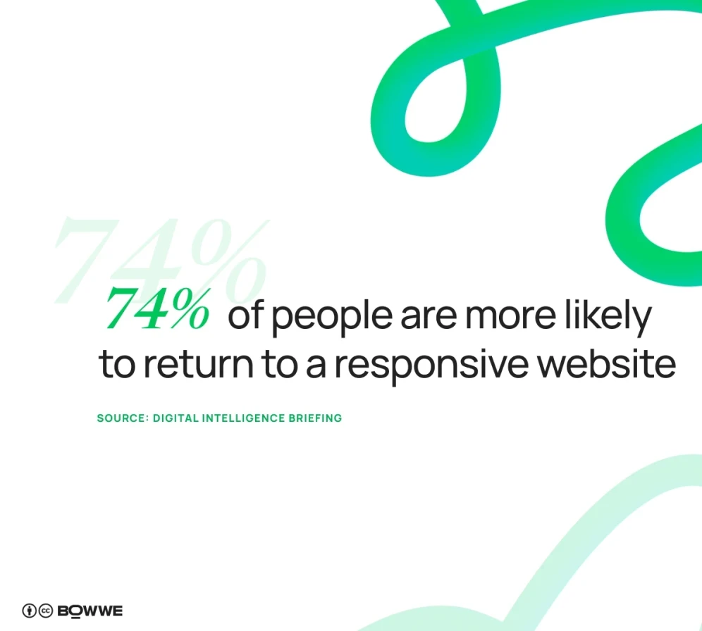
If you want to drive users away from your website effectively, make it... unsuitable for mobile devices. However, if you don't want to do that make sure that your website is convenient to use on any device. As many as 74% of people are more likely to return to a responsive website (source: Digital Intelligence Briefing)!
Lightning-fast website
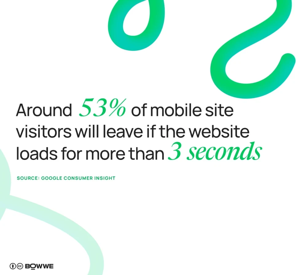
A slow loading website is one of the first reasons why users reject further interaction with it. According to Google Consumer Insight, approximately 53% of mobile site visitors will leave if the website loads for more than 3 seconds. Furthermore, it turns out that this problem leads to lost revenue of up to $2.6 billion a year [source: Design Resources].
Despite appearances, nowadays it is not that difficult to make a fully responsive website quickly and without overwhelming costs. For example, any website created in BOWWE it automatically responsive no matter what plan you use.
Get started
No coding experience required.
What are the current trends in web design?
You already know the basic web design trends that should be implemented on your website. If you’re interested in learning how to create a website that aligns with these trends, check out this detailed guide. Now, let’s dive deeper into the specifics and explore other web development trends that are set to be popular in 2025 and worth your attention.
1. Capture attention with full-page headers
Source: glossier.com
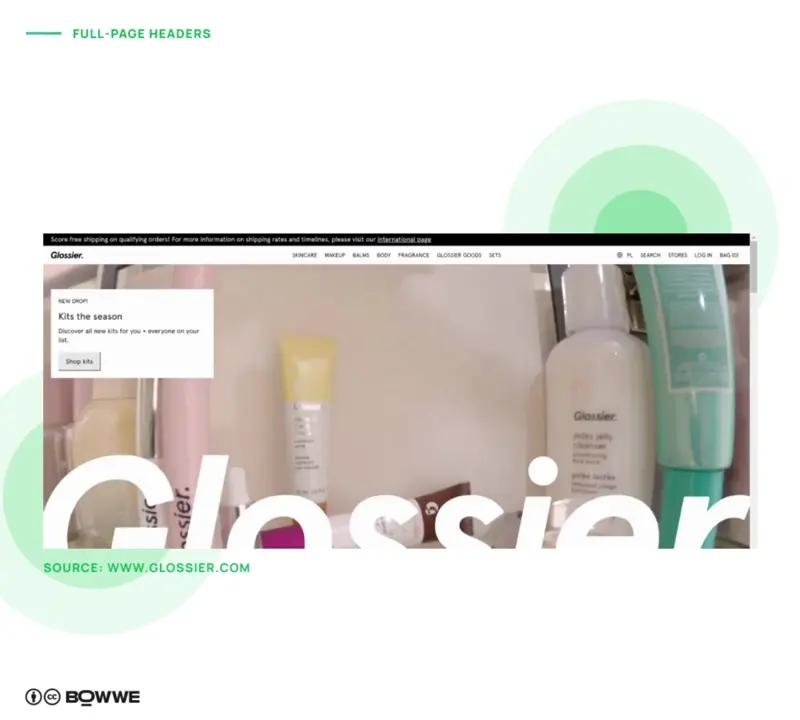
Full-page headers, or hero sections, create an unforgettable first impression by taking over the entire screen with a bold image, minimal text, and a clear call-to-action (CTA). These headers are designed to capture attention immediately, setting the tone for your website from the very first moment.
A great example is Glossier’s use of a lively video in their full-page header, paired with their brand name prominently displayed at the bottom—it grabs attention while conveying brand personality. You can adapt this strategy based on your business type. For instance, if you offer a SaaS tool, showcase it front and center to give users an instant idea of its benefits. If your brand is all about visuals, such as DIY furniture or fresh products, let stunning imagery take the spotlight to make a strong impact.
- Pick a striking image that reflects your brand and vibe.
- Keep the text short and sweet to let the visuals shine.
- Use a bold, easy-to-spot CTA to encourage action right away.
- Make sure your header looks great on all devices, big or small.
- Play with overlays and contrast to make text pop against the background.
2. Prioritize your audience with mobile-first design
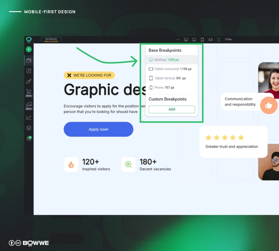
When designing for mobile first, think about what your users will need and expect when they’re on their phones. Mobile-first design also aligns with Google's shift to mobile-first indexing, meaning that search engines prioritize the mobile version of your site for ranking.
BOWWE allows you to create a project from any device version. You can separately adapt your site for mobile devices, tablets or desktops. You can change creation modes with just 1 click!
3. Design for a greener future with sustainable web design
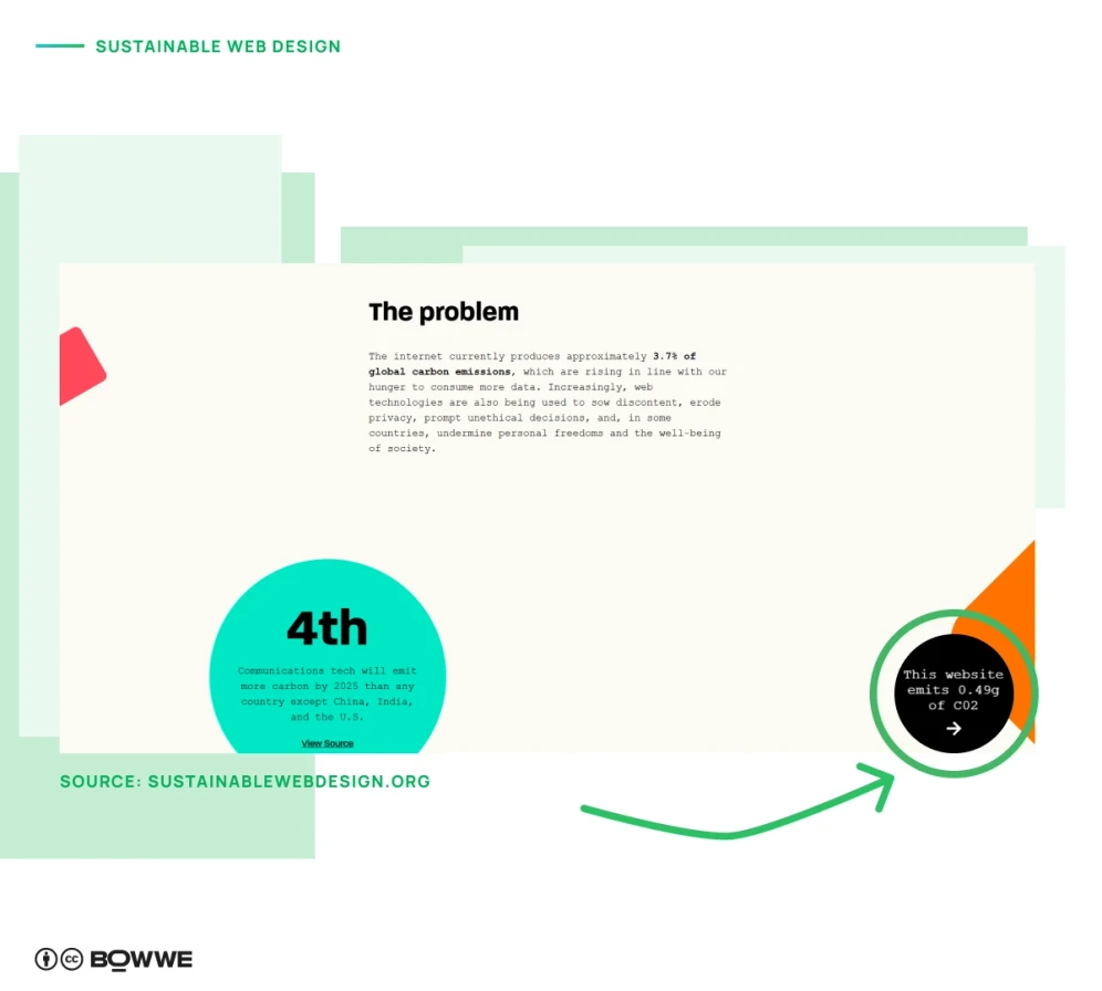
Source: sustainablewebdesign.org
Sustainable web design is all about creating websites that are kinder to the planet. With the internet responsible for about 3.7% of global carbon emissions, each website leaves a footprint. In fact, the average web page generates around 0.8 grams of CO₂ per view, which can add up quickly with high traffic. By optimizing your website, you can cut down on the data stored and transferred, reducing your website impact on the environment.
- Use smaller, optimized images to reduce data load.
- Compress images and other large files wherever possible.
- Limit the number of web fonts to save on data usage.
- Reduce unnecessary plugins and scripts to keep your site light.
- Regularly audit your site’s performance to keep it energy-efficient.
4. Reach everyone with accessibility and inclusive design
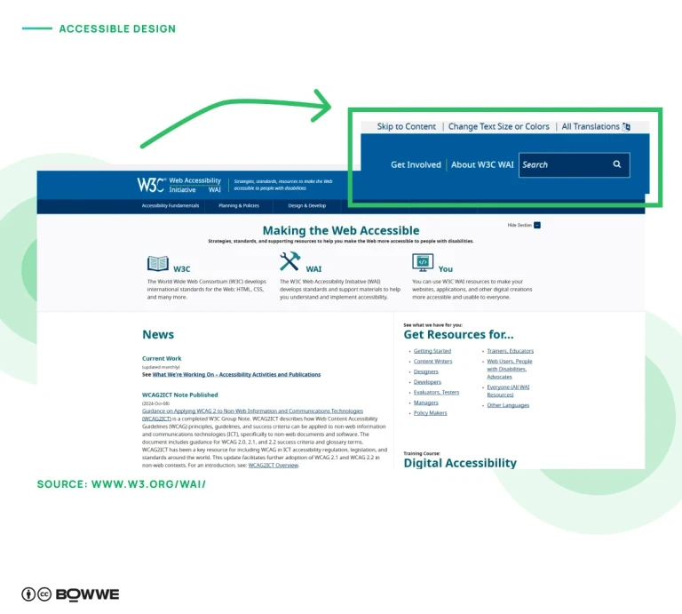
Source: w3.org/WAI/
Accessibility in web design means creating sites that everyone can use, including people with disabilities, mobile users, and those with slow connections. By focusing on accessibility, you’re not only following best practices but also meeting legal requirements in some countries. Accessible sites are designed with features like sufficient color contrast and avoiding color alone to convey information, making sure content is clear and readable for all.
- Ensure high contrast between text and background colors.
- Avoid using color as the only way to communicate key information.
- Add descriptive alt text to images for screen readers.
- Use clear, concise headings and labels for easy navigation.
- Test your site with accessibility tools to spot improvement areas.
5. Explore the possibilities with AI on your website
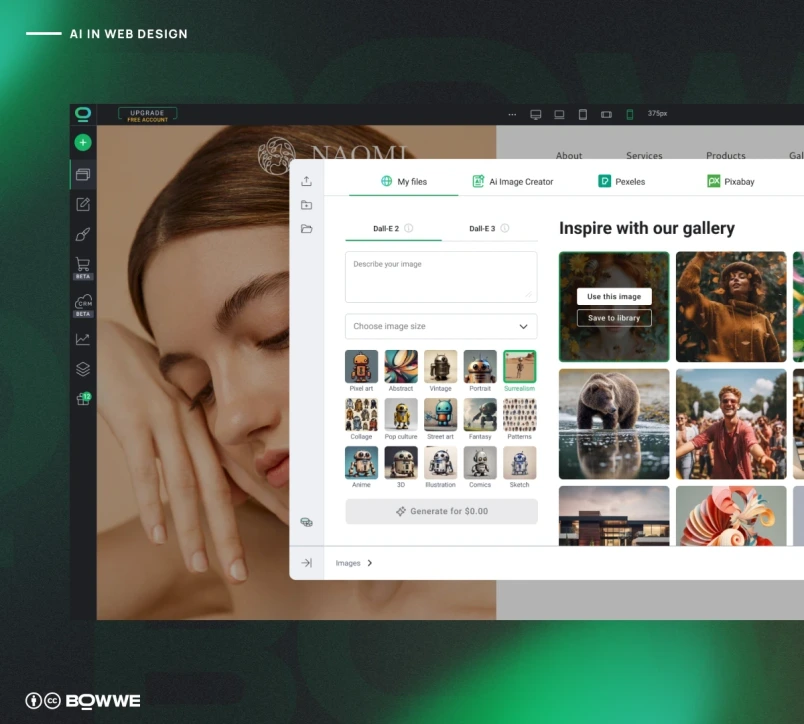
We are already seeing a boom in AI in web design. From brainstorming new ideas and creating mockups to generating engaging content, AI can help bring your vision to life faster than ever. You can even use AI website builders to create a fully functional site with minimal effort. Plus, incorporating AI-driven chatbots means visitors get instant support, improving their experience from the get-go.
More and more websites are using AI-created graphics and videos. At BOWWE, we also help keep up with this web design trend. You can generate AI graphics directly in BOWWE Builder, or create text content for your website quickly and efficiently with our AI Text Generator.
6. Embrace collaboration in website creation
.webp?1412703.2999999523)
Collaboration is becoming the heartbeat of effective website creation, with tools evolving to support teamwork like never before. Figma has launched dev mode for seamless design handoffs, while Canva makes sharing projects and gathering feedback a breeze. At BOWWE, we’re excited to introduce Roles, a feature that allows you to invite team members to your project while controlling their access. For instance, you can give a copywriter the ability to edit content without risking changes to crucial site elements. This way, you can foster creativity and collaboration while keeping your site secure.
Get started
No coding experience required.
7. Organize with grids and two-column layouts
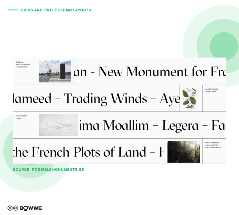
Source: possiblemonuments.se
Distinct grids and two-column layouts are a great way to keep website content organized, giving your site a clean, structured look. Using a simple grid allows you to arrange elements like images or products in an easy-to-navigate format, perfect for visually rich sites. You can also explore two-column grids to add balance and guide users’ eyes through the content naturally. For a more dynamic look, try playing with asymmetry within the grid—this technique keeps the layout fresh and adds a touch of creativity while maintaining a tidy structure.
- Use grids to showcase product images or featured content for a polished, organized appearance.
- Experiment with two-column layouts for balanced storytelling sections.
- Asymmetrical grids can add visual interest while still keeping content structured.
- Ensure consistency in spacing and alignment to maintain a cohesive look.
8. Embrace minimalism for a clean, modern look
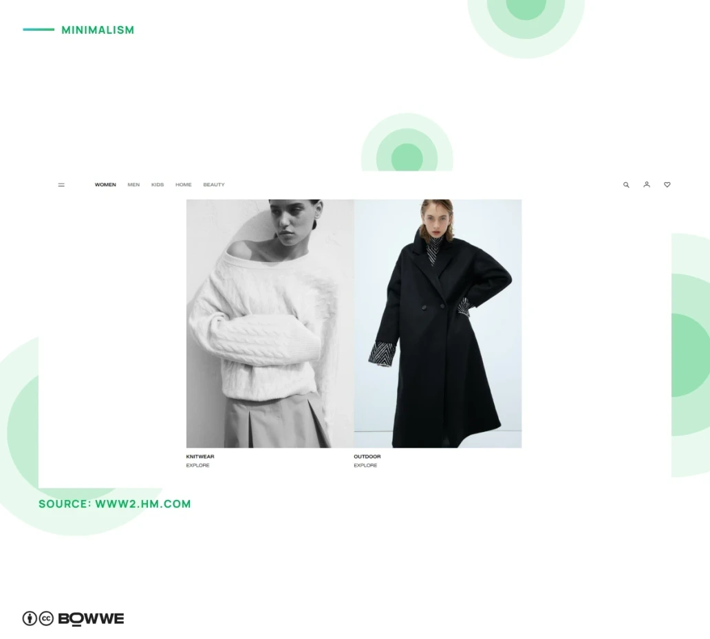
Source: www2.hm.com
Minimalism is a powerful web design trend, especially when paired with grids to keep content structured and visually appealing. By focusing on clean, simple design, you allow your message to shine without unnecessary clutter. Typography becomes especially important here—if you’re avoiding decorative elements, creative typography can bring personality and style without overcrowding the page. This approach ensures that your website feels open and sophisticated while still engaging users.
- Use grids to organize content and create a balanced minimalist layout.
- Opt for bold or unique fonts to add interest if the design feels too sparse.
- Limit colors and decorative elements to maintain a clean look.
- Prioritize essential information, keeping only what truly adds value to the user experience.
9. Show off your playful side through an animated cursor
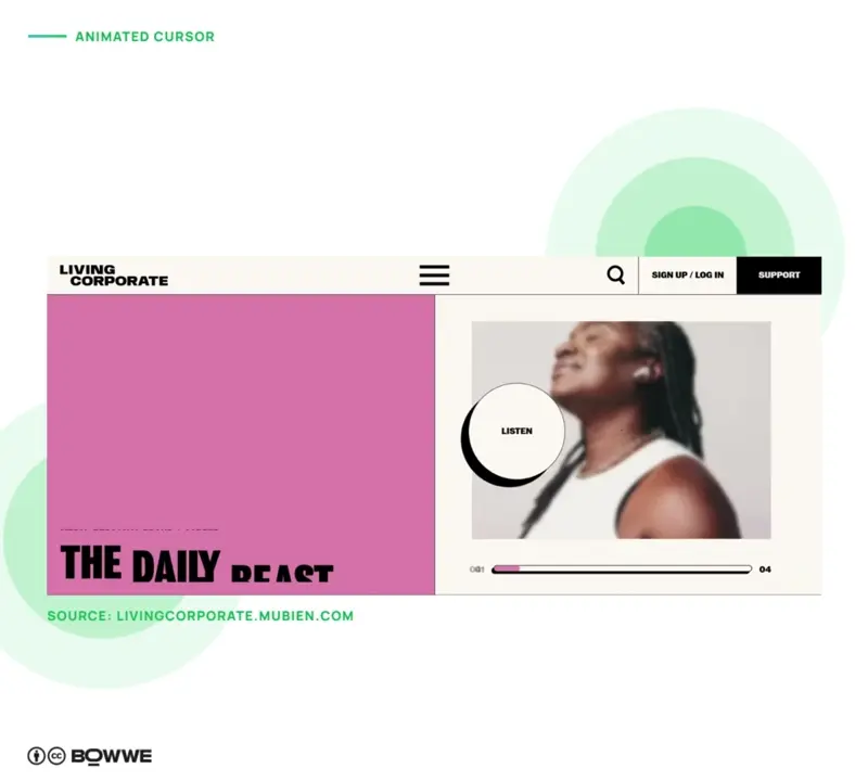
Source: livingcorporate.mubien.com
Using an animated cursor on a website is a trend that has been around for a while now but is still going strong. It is a great way to add personality to a website and catch the user's attention.
There are many different types of animated cursors to choose from, and it can be a lot of fun to experiment with different ones to see what works best for your website. Just be careful not to go too crazy with the animations, or it can end up being more distracting than helpful.
10. Make it engaging with animation
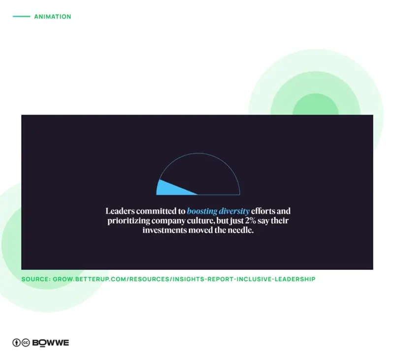
Source: grow.betterup.com
In the past, animations were often used solely for decorative purposes. Now we can see more fun and functional animations. For example, an animation might indicate that a user has successfully completed a task or provide feedback on their input.
Animations can also be tailored to the user’s needs. This means that designers will consider the user’s preferences, age, and other factors to create more user-friendly animations.
The increasing popularity of virtual and augmented reality also contributes to the increased use of animations. We can expect to see more animations used to create a more immersive experience. These animations will create a sense of depth and realism and help to make the user feel like they are a part of the website or app they are using.
In BOWWE, you can quickly liven up your site with pre-made animations. You have a variety of solutions to choose from, as well as ways to present the animation whether it's at the start or perhaps only when you hover your mouse over the element. You can add animations in BOWWE without having to dig around in the page code!
11. Communicate through image and illustrations
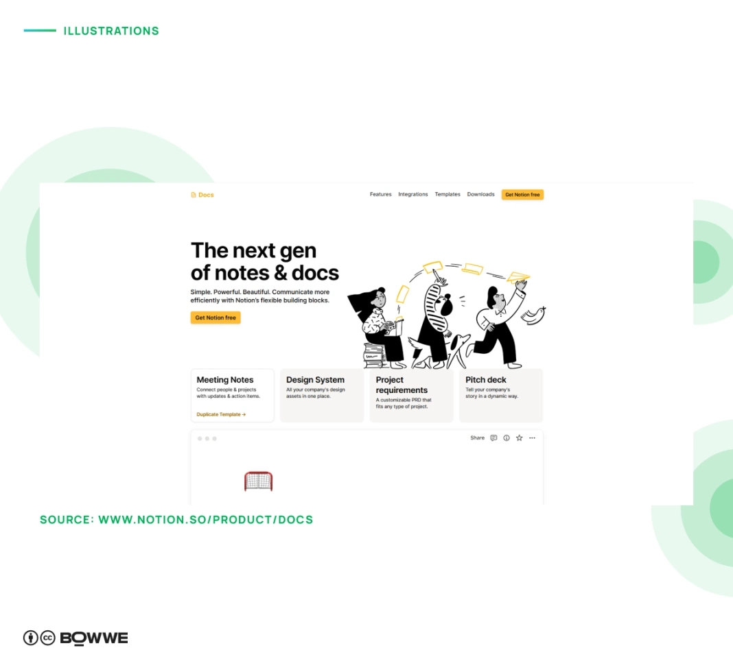
Source: notion.so
One of the reasons why illustrations and data visualization are so widely used is that they can help to explain complex concepts or data in a way that is easy to understand. This is especially important for websites trying to communicate complex ideas or data to their users. If you provide many different statistics on your website, try using visual content; it is a much more convenient way to show essential data than text.
If possible, add custom illustrations. They are a powerful way to give your website personality and make your brand memorable. Unlike stock images, custom illustrations can be tailored to your unique style, helping you tell your story visually and connect with users on a deeper level. They’re perfect for adding a touch of creativity and fun, making complex information feel more accessible and engaging.
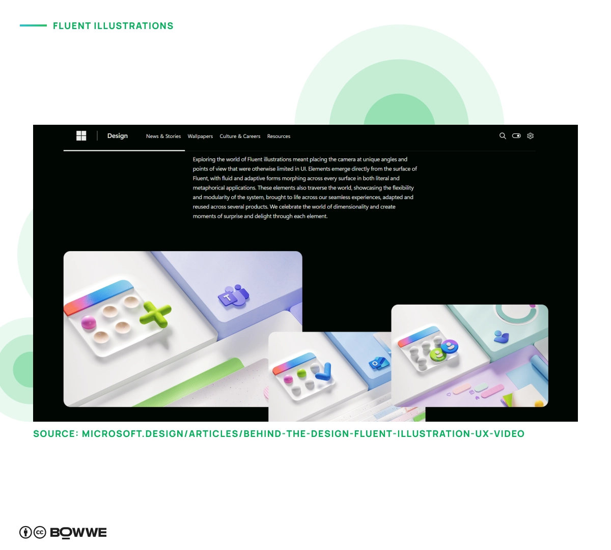
Source: microsoft.design/articles/behind-the-design-fluent-illustration-ux-video/
Fluent illustrations and playful doodles are gaining popularity in web design as a fresh, approachable way to engage users. These elements bring a sense of creativity and warmth to a site, making it feel more welcoming and personalized. Fluent illustrations often have smooth, flowing lines, which help create a seamless, modern look, while doodles add a spontaneous, hand-drawn touch that resonates with users on an emotional level.
- Make sure the visuals are clear and easy to understand.
- Avoid using too many visuals at once - too much information can be overwhelming.
- Use visuals that complement the overall design of the site.
- Consider the context in which the visuals will be seen - will they make sense in the context of the rest of the site?
12. Convey emotions and vibe through gradient
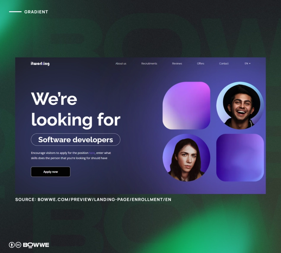
Gradients can be used to create a sense of depth and movement on a website and can be applied in various ways. For example, you can use gradients to create a background, text, or button gradient.
One of the benefits of using gradients is that they can help to create a cohesive look across a website. In addition, they can also be used to add a touch of personality to a website.
Gradient backgrounds are a great option if you’re looking to add a touch of elegance to your website. However, using them sparingly is important, as too many gradients can quickly overwhelm a website.
When it comes to using color gradients in web design, there are no set rules. So, experiment with combinations to see what works best for your website.
If you don't know how to get started with gradient...
- Use light and dark colors to make it more visible.
- Try use multiple colors to make it more interesting.
- Use a gradient that goes from left to right to create a sense of movement.
13. Show transparency through glass textures
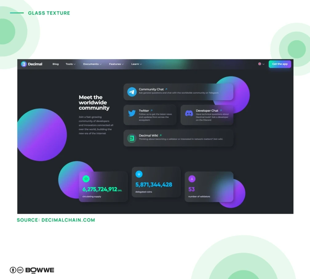
Source: decimalchain.com
Another trend that is likely to continue is the use of glass textures. Glass textures can give websites a modern and sleek look and can also be used to create a sense of transparency and openness.
Glass textures are a great way to give your website a modern and sophisticated look. They’re perfect for businesses that want to make a good impression on their customers. If you’re looking for a way to add some texture to your website, glass textures are an excellent option.
Glass textures can be used in various ways, but some of the most popular applications are backgrounds and borders. You can also use them as overlays on images or text. However, be careful to use them sparingly, or your website will start to look like a mess.
There are a few things to keep in mind when using glass textures in your web design:
- Use light colors to create a sense of airiness and brightness.
- Avoid using too many textures or patterns.
- Use glass textures sparingly, as they can be striking and eye-catching.
- Make sure that the text and other elements on the page are easy to read and that they contrast well with the glass textures.
14. Make a lasting impression with parallax & horizontal scrolling
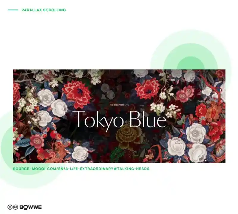
Source: moooi.com
Parallax scrolling is a technique that creates an illusion of depth in a 2D website by scrolling the background at a different speed than the foreground. This creates a visual effect that makes the website look more 3D.
Parallax scrolling can create some stunning effects on a website. It can add visual attraction and create a more immersive experience for the user. If used correctly, parallax scrolling can be a great way to make your website stand out from the crowd.
There are two things to keep in mind when using parallax scrolling on your website:
- Make sure that the scrolling is smooth and doesn’t cause the website to scroll too quickly or too slowly.
- Ensure that the scrolling is consistent throughout the website.
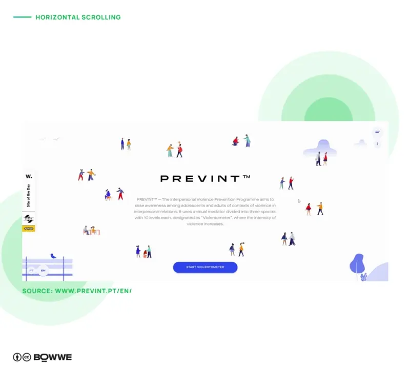
Source: prevint.pt
There are several reasons why horizontal scrolling is a popular trend in website development. For one, it can be a more user-friendly design choice. It can make it easier for users to navigate through content when used correctly. It can also be a more visually appealing way to display information.
Horizontal scrolling is a type of web design that involves scrolls that move from left to right, as opposed to up and down. This scrolling type is often used to display long lists of items, such as menus or product galleries. It can also create a more immersive experience, such as storytelling or instructional content.
If you decide to use horizontal scrolling on your website…
- Experiment a little to find the right layout and scrolling speed.
- Provide instructions for users not familiar with this type of scrolling.
15. Show your personality with creative typography
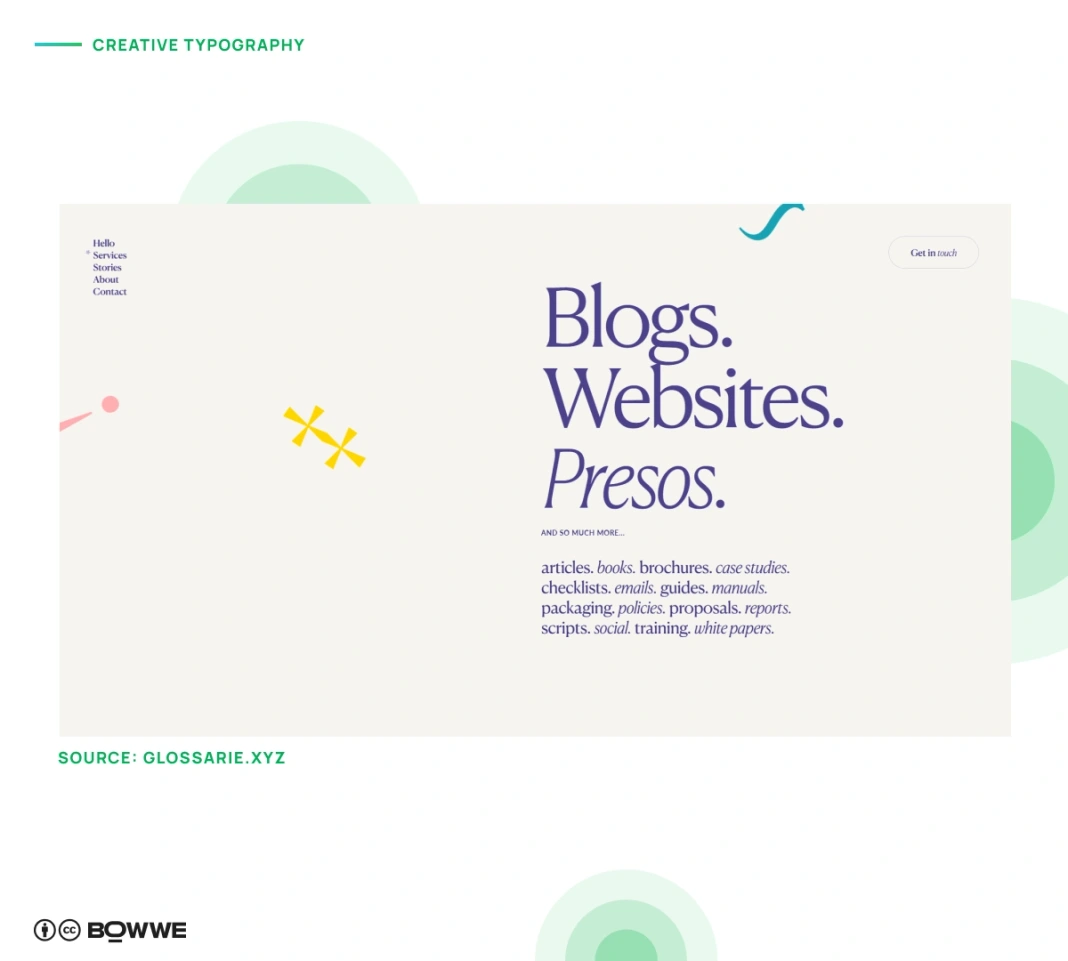
Source: glossarie.xyz
Bold typography and creative text layouts are set to dominate as a major web design trend. Creative typography is all about experimenting with type in unconventional ways, whether it’s through unique fonts, innovative spacing, or even transforming text into visual art. This trend allows web designers to break free from traditional layouts, adding personality and a memorable touch to websites.
We're already seeing exciting examples of this trend in action—some sites use dynamic fonts and bold layouts to immediately capture attention, while others incorporate immersive typography that draws users deeper into the experience. Bold typography and creative text layouts help brands make a statement, creating a strong visual impact that resonates with visitors.
There are endless possibilities when it comes to creative typography, and this makes it a very popular trend among web designers. In fact, creative typography is often used to add personality and visual interest to a website.
Whatever the approach, creative and experimental typography is a great way to stand out from the crowd. It can help you to create a unique and memorable website that will engage and impress your visitors.
If you’re looking to create a website that uses creative and experimental typography, here are a few tips to help you get started:
- Try using different fonts and sizes, and see how they look when placed next to each other.
- Use animations and effects together with typography.
16. Inspire users to take action with micro-interactions
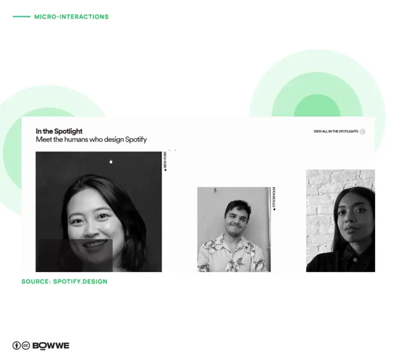
Source: spotify.design
Micro-interactions are tiny moments of delight that make using a website a more enjoyable experience. The little things we do on a website make it feel more personal and engaging.
Micro-interactions can be used to help users accomplish tasks more efficiently. For example, if you are signing up for a new account, micro-interactions can be used to confirm or deny your input. This helps to keep the user informed of their progress and makes the process more streamlined.
Another excellent use for micro-interactions is providing users with feedback about their progress. For example, if you are filling out a form, micro-interactions can indicate when the user has reached the end of the form. This can keep the user informed and prevent them from scrolling through the entire form to find the end.
Overall, micro-interactions can be a great way to improve the user experience on a website. They can help to make tasks easier to complete, provide feedback to users, and add a bit of personality to the design.
There are a few things you can do to create micro-interactions:
- Animation can be a great way to add a bit of fun and personality to micro-interactions.
- Keep micro-interactions simple so that they are easy to use and understand.
- Use feedback to let users know what is happening when they interact with your website or app.
- Make micro-interactions personal by using users’ names or favorite colors.
Web design trends 2025 - Summary
The web design and development trends set to dominate in 2025 are all about delivering a user-centric experience that prioritizes ease of use, responsiveness, and aesthetics. As user expectations rise, they’re less forgiving of non-responsive websites with outdated designs. Visitors now expect every website to be optimized for any device, ensuring comfort, functionality, and visual appeal.
Ignoring these fundamental user needs is no longer an option; a professional, modern website is an essential investment that offers a fast return, such as increased user retention and engagement.
Evaluate which 2025 trends in website design your site already embodies, which you still need to adopt, and which may not be relevant. By focusing on user experience and convenience, you’ll ensure your website meets the latest standards in web design and development trends, setting it up for success in the coming year.
Start for Free!

Karol is a serial entrepreneur, e-commerce speaker m.in for the World Bank, and founder of 3 startups, as part of which he has advised several hundred companies. He was also responsible for projects of the largest financial institutions in Europe, with the smallest project being worth over €50 million.
He has two master's degrees, one in Computer Science and the other in Marketing Management, obtained during his studies in Poland and Portugal. He gained experience in Silicon Valley and while running companies in many countries, including Poland, Portugal, the United States, and Great Britain. For over ten years, he has been helping startups, financial institutions, small and medium-sized enterprises to improve their functioning through digitization.

