Did you know that it only takes 17 milliseconds for a user to evaluate your website subconsciously? So, this moment must be noticed. Stunning website background is one of the visual elements that immediately catches the eye of visitors and encourages them to stay longer on the site. At the same time, many people need to pay more attention to its potential, forget about it or make it boring. Do you want your website's background to catch users' attention? Be sure to learn these 14 tips for creating the best website background!
Start Here
What is a website background?
As you can easily guess, the background is the entire visual space on which the page content is displayed. The background is the basis of any website design. It is something that accompanies visitors throughout their stay on your website. Therefore, a well-chosen background gives the website character, affects its positive reception, and is an essential design element.
What are the types of backgrounds on the website?
Before you move on to choosing a background for your website, it's worth getting acquainted with the basics first. Here are 3 types of backgrounds you can use in your website creation!
Body background - the main background of the site
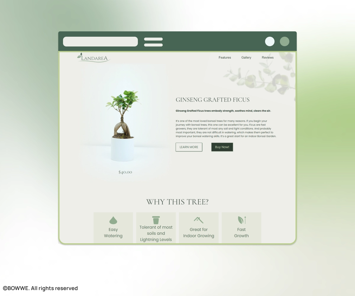
BOWWE template with a standard background for the entire site.
The body background site is a repetitive area found on both the home page and many site subpages. It usually covers most of the displayed page. It can consist of illustrations, various textures, an entire photograph, or color gradients. The most common solution on websites is filling in white or another light color.
Content background - background for the content
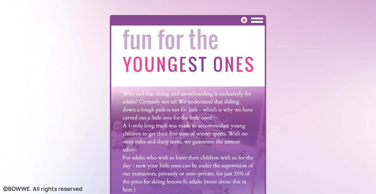
BOWWE template with the content background.
The content background doesn't cover the whole screen but usually surrounds the area around text or graphics on the page. Its task is to emphasize the text or image, improve its visibility, and structure the page by separating separate sections from each other.
Header background - background in the header

BOWWE template with a background in the website's header with a business character.
A different background for the header at the top of the page is a proven way to catch visitors' eyes and focus them on a specific element. An attractive background in the form of an interesting illustration, unique graphics, or colors of your brand in such a visible place will allow you to focus attention on the element displayed there, e.g., the product offer and the call to action.
What can you use as a website background?
There are many options for developing background on the site. It can take many forms, depending on the effect you want to achieve. Here are the basic techniques for creating a background:
→ solid color
→ gradient
→ picture or photograph
→ graphics
→ animation
→ background with parallax effect
Why is it worth taking care of the website background?
The background is one of the essential visual factors that can determine the reception and, thus, the success of the entire website. The appearance of a website is just as important as its content or functionality. When running an online business, you should constantly ask yourself how you can positively influence the perception of the entire website and the results it achieves. So check out what a well-designed background on your website can do:
Creates a good first impression
The background is one of the first elements that catch users' eyes as soon as they enter the site. According to Google, it takes 17 milliseconds for a user to subconsciously form an opinion about a website. A background gives the website the right tone and increases its aesthetic level, which translates into a positive first impression. The background, color, and font are the most important visual aspects of the website that immediately catch the eye. These elements can effectively encourage visitors to stay on the site if they form a coherent composition.
Captures the attention
Just over 2 seconds is enough for the user's gaze to stop at the most interesting element. The eye-tracking method allows tracking the movement of the users' eyeballs on the website. As a result of such research, visual heatmaps show what on the website aroused the user's interest and how long they focused their eyes on it. Website usability studies show that visitors' eyes are first directed toward photos and graphics. The page's main image or filler catches users' attention and holds their eyes for up to 5.94 seconds before they read the site's content or go to individual sections.
Start Building
No coding experience required.
Significantly increases the usability of the website
UX (User Experience) is the sum of good user experiences during their stay on the website. A properly selected background affects the UX of the website, i.e., whether it is user-friendly. A background that harmonizes with the entire design will immediately highlight the site's most essential elements, such as the header or the Call-To-Action button. Thanks to this, visitors will stay aware while browsing your website and quickly find what they are looking for. What's more, they'll remember your site as valuable and navigable.
Builds trust in the brand
High-quality design with an aesthetic background proves professionalism and encourages visitors to stay on your website. This will quickly translate into building trust in your brand. In turn, a failed website design will scare visitors away from getting acquainted with your offer, undoubtedly resulting in a loss of sales. To develop your business online, it is worth taking care of all website elements, including the background. Remember that a consistent website design will always positively affect your offer's interest and increase the conversion level achieved.
14 ideas for stunning website backgrounds
If you're not very experienced in website development, you may have difficulty deciding what background will work best for your project. To help you, below, I collected 14 tips to keep in mind when choosing or creating a website background.
1. Pay attention to the contrast
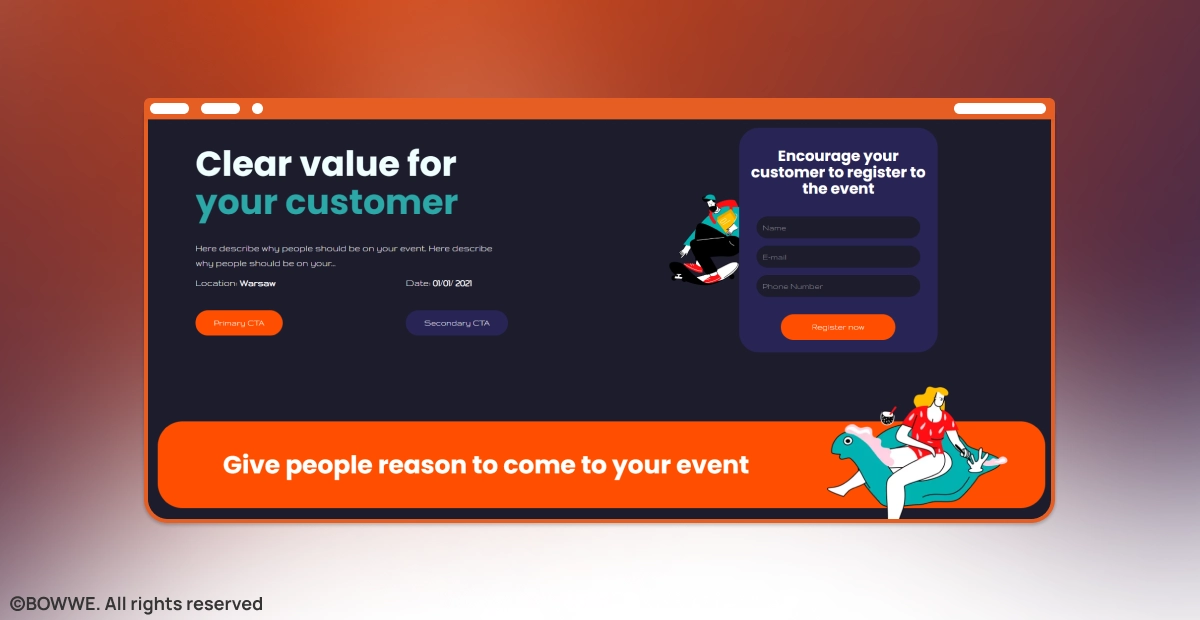
BOWWE template with a dark background and high-contrast details.
A professional website background should emphasize what is most important on your website. For this to happen, you should ensure that the background contrasts with the entire graphic composition of the page.
Improper background contrast with other elements is the most common design error. Too little contrast reduces the readability of the content, thus effectively discouraging reading it. High contrast requires the proper selection of colors and shades - otherwise, viewing the page will tire the eyes. Be sure to make sure that the background of your website differs in color from the text and graphics. A properly contrasted background will emphasize the content's essence and direct recipients' attention where you want it.
2. Include a beautiful background photo
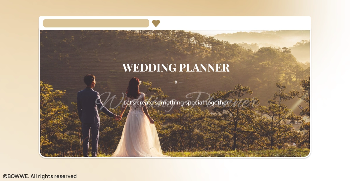
BOWWE template with a background photo that clearly shows the page's theme.
A website with a background image is a classic choice that will allow you to speak to your audience's emotions perfectly. Remember, however, that only some photos are suitable for use as a background. If too many elements are in the picture, it will distract the recipient and reduce the readability of the text. So avoid images with too many details. This is especially important when you're adding text to a cover photo. For example, landscapes can be an excellent backdrop for a website because they are pleasing to the eye and don't contain too many distracting details. Another essential thing is compliance with your business. No matter how beautiful the photo is, choose it only if it reflects the character of your brand.
3. Bet on a uniform background in a distinctive color
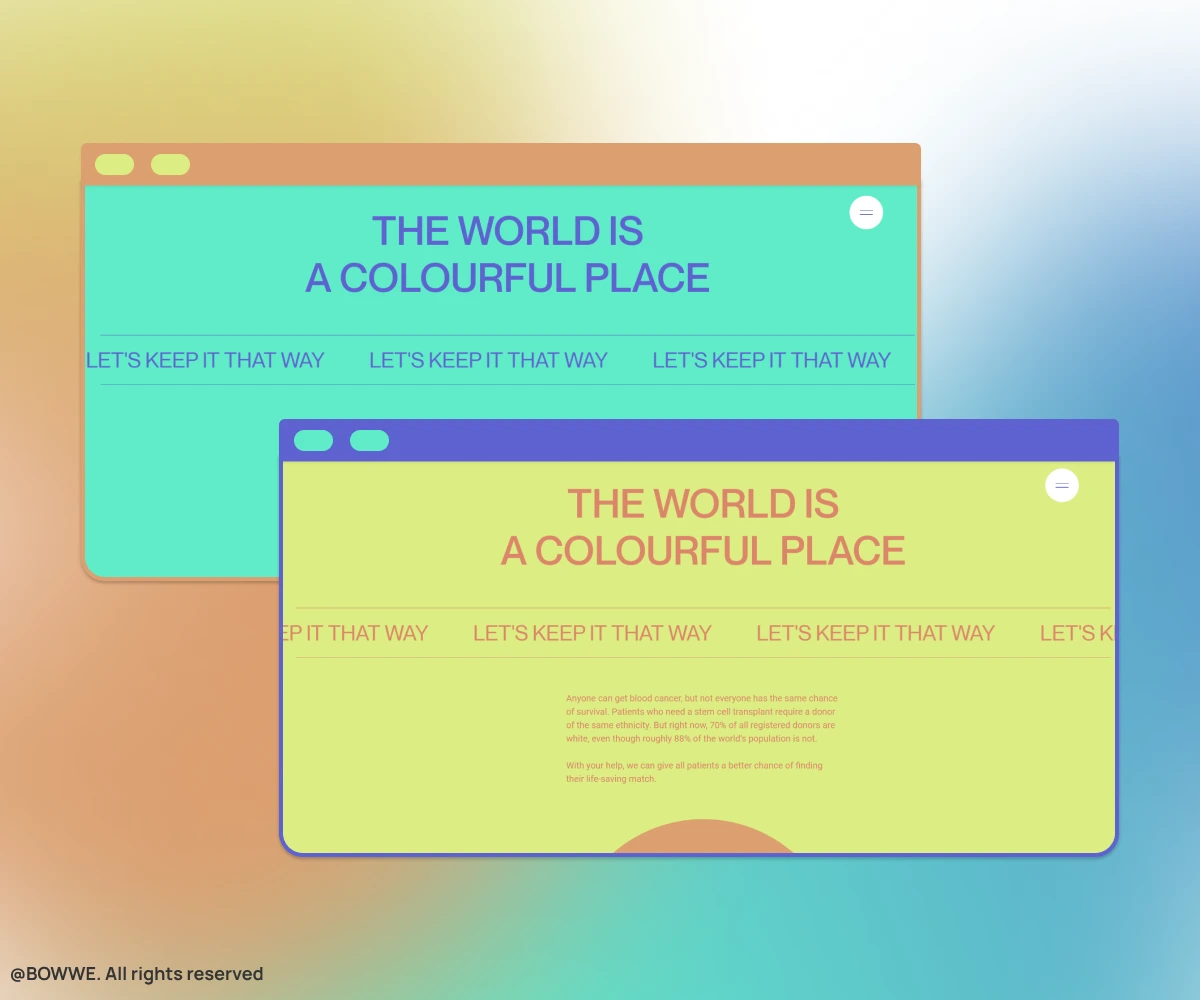
The background in a distinctive color gives the website a strong accent and character. Source: swabtheworld.com
Don't like the idea of using photography or background graphics? If you prefer minimalist solutions, try a solid color. The background in an intense color will certainly not disturb the page's readability and even make the whole project look more attractive. If you want to give your website expressiveness and character, put on a solid color accent in the background. Also, ensure a good contrast with the rest of the website elements.
4. Create a calm vibe with muted color background
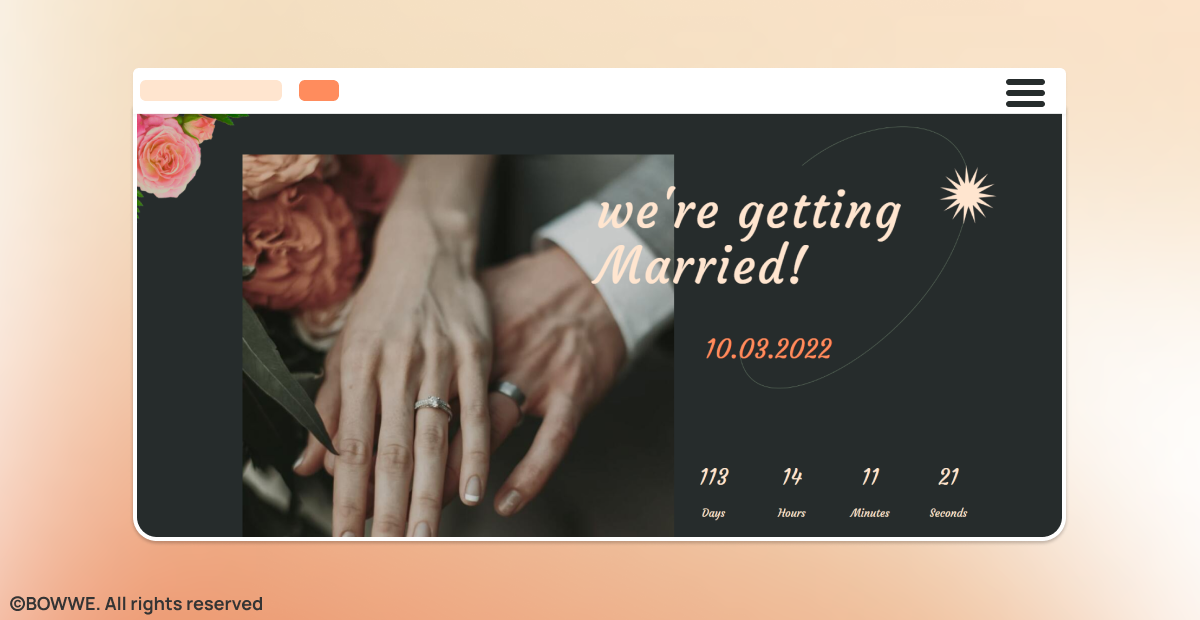
BOWWE template with the muted background.
Love the idea of a solid color background but looking for a more definitive solution? Choose a subdued background color to make the site look elegant and aesthetic. Subdued uniform color in shades of brown or gray will help you achieve a soothing effect and give the website a subtle expression.
5. Improve the readability with light background
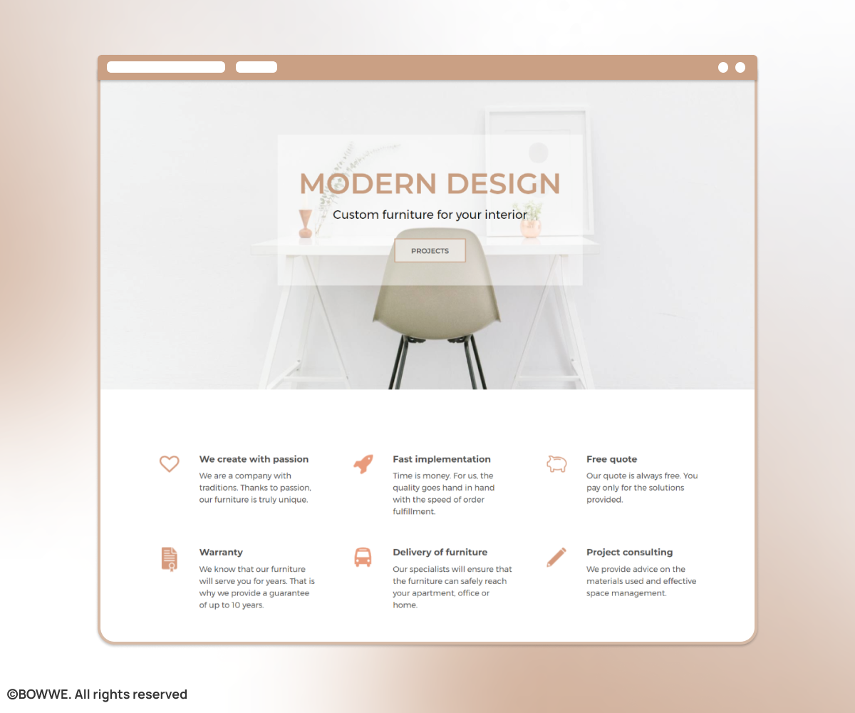
BOWWE template with a modern website background.
A light-colored background will add an aesthetic and modern look to your website. A white background will improve the site's readability and highlight the most crucial information. A background in white or light shades is a classic solution that is always up to date.
Start Building
No coding experience required.
6. Bet on an elegant dark background
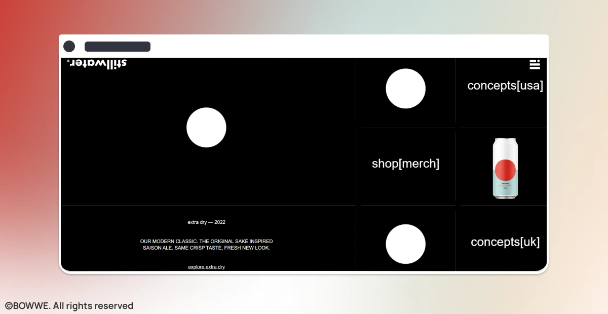
Black website background with minimalist graphic elements. Source: stillwater-artisanal.com
The black background color is not a universal solution for every website. However, a dark background with properly contrasted elements is a less conventional solution that will add elegance and originality to your website. Despite the popularity of the white background, sometimes it is worth choosing dark colors for the page's background. Dark schemes work best on elegant or designer websites' characters. It's a good background for a website where you want to display your products.
7. Use the psychology of colors

BOWWE template for the fitness industry with an energetic orange background.
By creating a background for the website, you can use a color that will be associated with your business. Appropriately used colors will appeal to the emotions of the recipients. So use colors to make an excellent first impression and create associations with your brand.
For example, energetic orange and red will suit the fitness industry, green will bring to mind associations with ecology or healthy eating, and navy blue will emphasize the severe nature of the financial activity.
8. Apply dynamic gradient
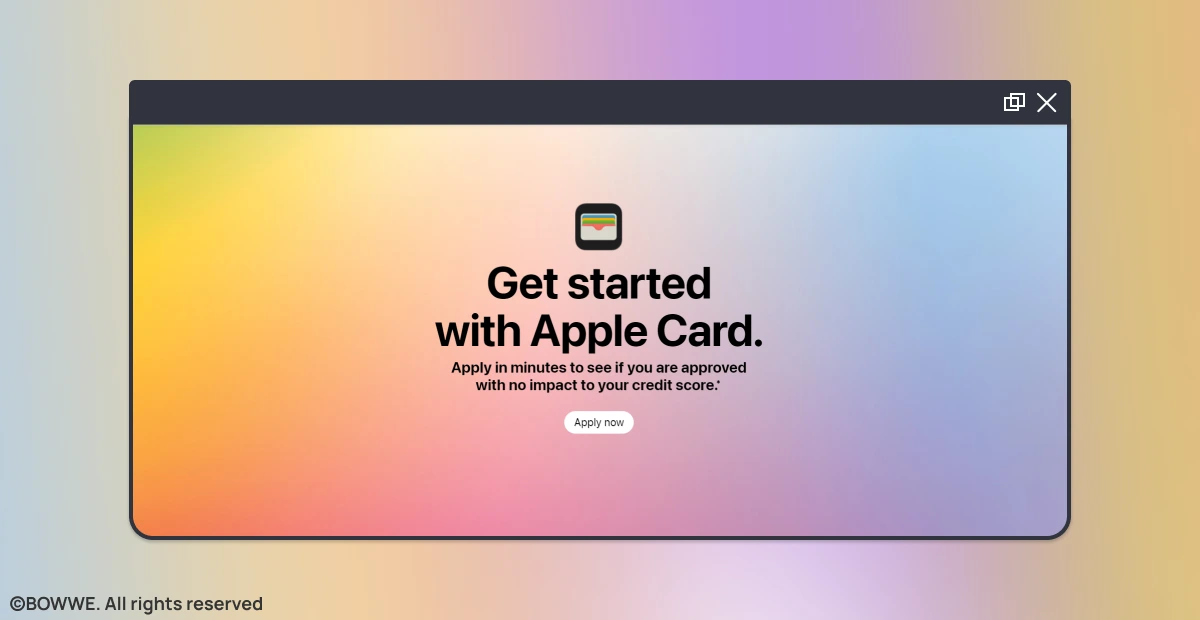
Colorful gradient website background. Source: apple.com/apple-card/
Take advantage of the recurring design trend of gradients. It is a combination of colors with a gradual transition between them. Gradients can be used as a standalone background or overlaid on a photo, giving your website originality.
9. Bring your background to life with animation
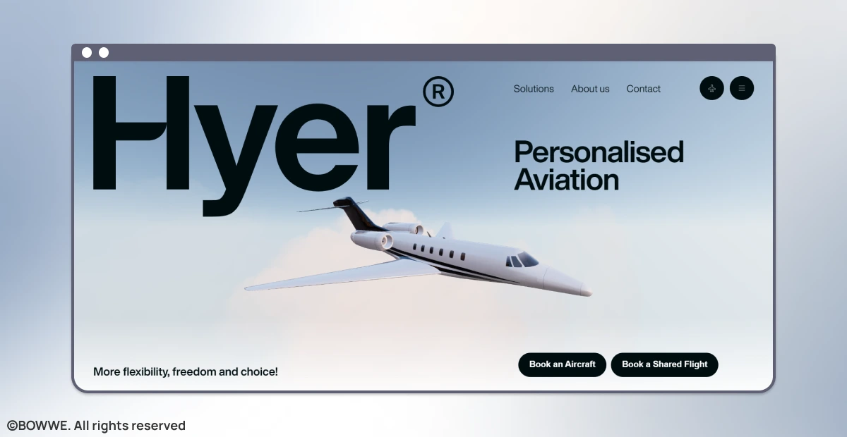
Animated website background with animation. Source: www.flyhyer.com
Do you really want to stand out from the crowd? Try animations! Using background motion will attract attention and quickly tell visitors about the nature of your company.
An animated website background is an excellent way to bring it to life. Remember to keep the animation subtle so it doesn't distract from the main image or message.
10. Make a lasting impression with the brand hero
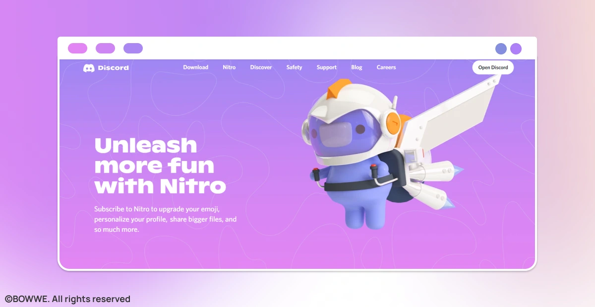
Website background with the brand hero. Source: discord.com/nitro
An interesting idea is to create the so-called brand hero, i.e., a hero who will be associated with your brand. The “hero” can appear in various places on your page, including your site background. As mentioned above, it is also worth reviving the illustrated character in the background with the animation.
11. Create a personalized background with your product
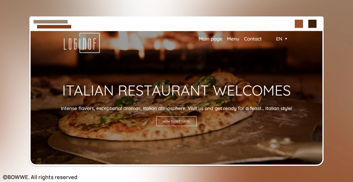
BOWWE template with personalized background.
If you want to stand out, design a personalized background you won't see on your competition websites. How do you create such a special project? Use your own product to design a unique background.
You can integrate the product's image into the background and use its features, i.e. color or shape, in other graphic elements on the page. Integrating the physical features of your product into the visual composition will diversify the project and create strong associations with your brand.
12. Adapt the background to mobile screens
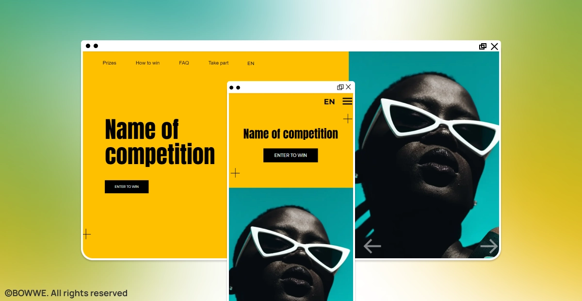
BOWWE template with responsive website background.
Nowadays, responsive websites are essential so make sure your background scales appropriately for smaller screens. For example, an extensive image may look bad on mobile devices.
13. Tell a story through background
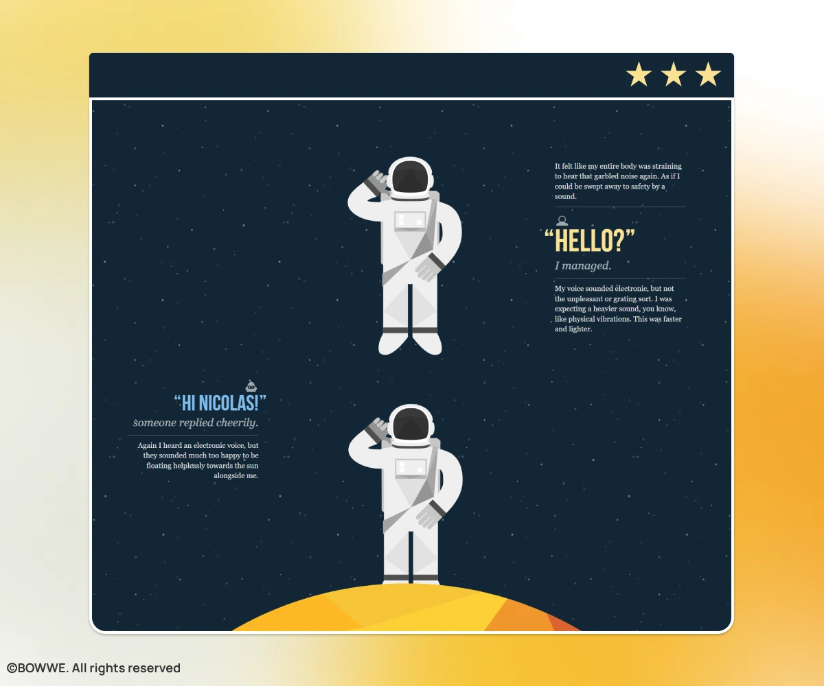
Website background that changes according to the narration. Source: nasaprospect.com
If you want to build real audience engagement, design a background in which you will convey the story of your brand. The storytelling technique will allow you to create an engaging story using background graphics. You can use horizontal navigation, animation, and parallax for this purpose.
14. Break the pattern
Remember that there are usually no rules that you absolutely cannot break in the case of web design. The best designs often break the standards. What matters most is the user experience.
For inspiration, follow web design trends and stay up to date with the latest news. Thanks to this, you can try interesting effects that will diversify the background and add attractiveness to your website.
Create a website background that will delight the audience!
The website background has a real impact on how your website is perceived. Poorly designed, it can prevent Internet users from quickly leaving the website and going to the competition. So let's get inspired by modern web design trends and create the perfect background for your website! Remember to follow the guidelines given in the article when creating it, so that the background actually conquers the attractiveness of your website and delights its visitors!
Start Here

Karol is a serial entrepreneur, e-commerce speaker m.in for the World Bank, and founder of 3 startups, as part of which he has advised several hundred companies. He was also responsible for projects of the largest financial institutions in Europe, with the smallest project being worth over €50 million.
He has two master's degrees, one in Computer Science and the other in Marketing Management, obtained during his studies in Poland and Portugal. He gained experience in Silicon Valley and while running companies in many countries, including Poland, Portugal, the United States, and Great Britain. For over ten years, he has been helping startups, financial institutions, small and medium-sized enterprises to improve their functioning through digitization.

