How to create a Progress Bar on your website?
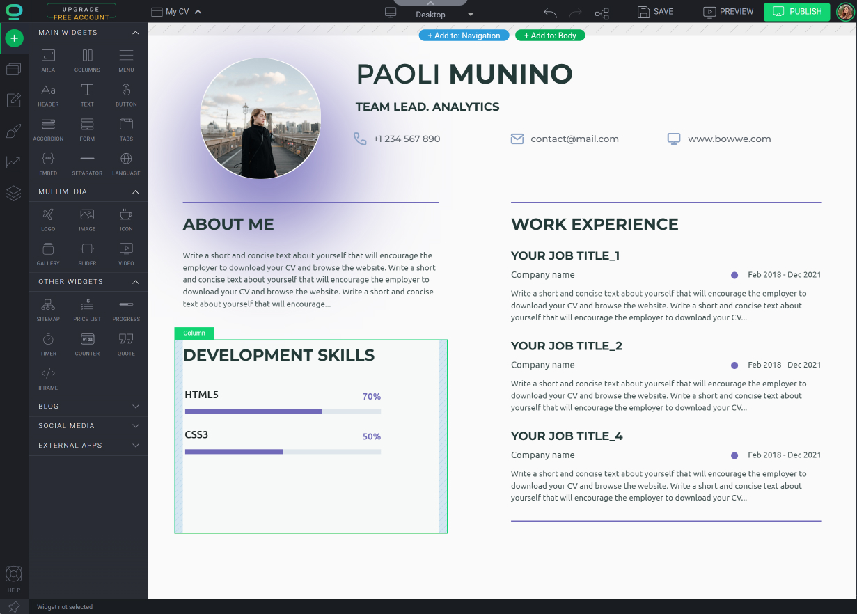
How Progress Bar can look like on your website?
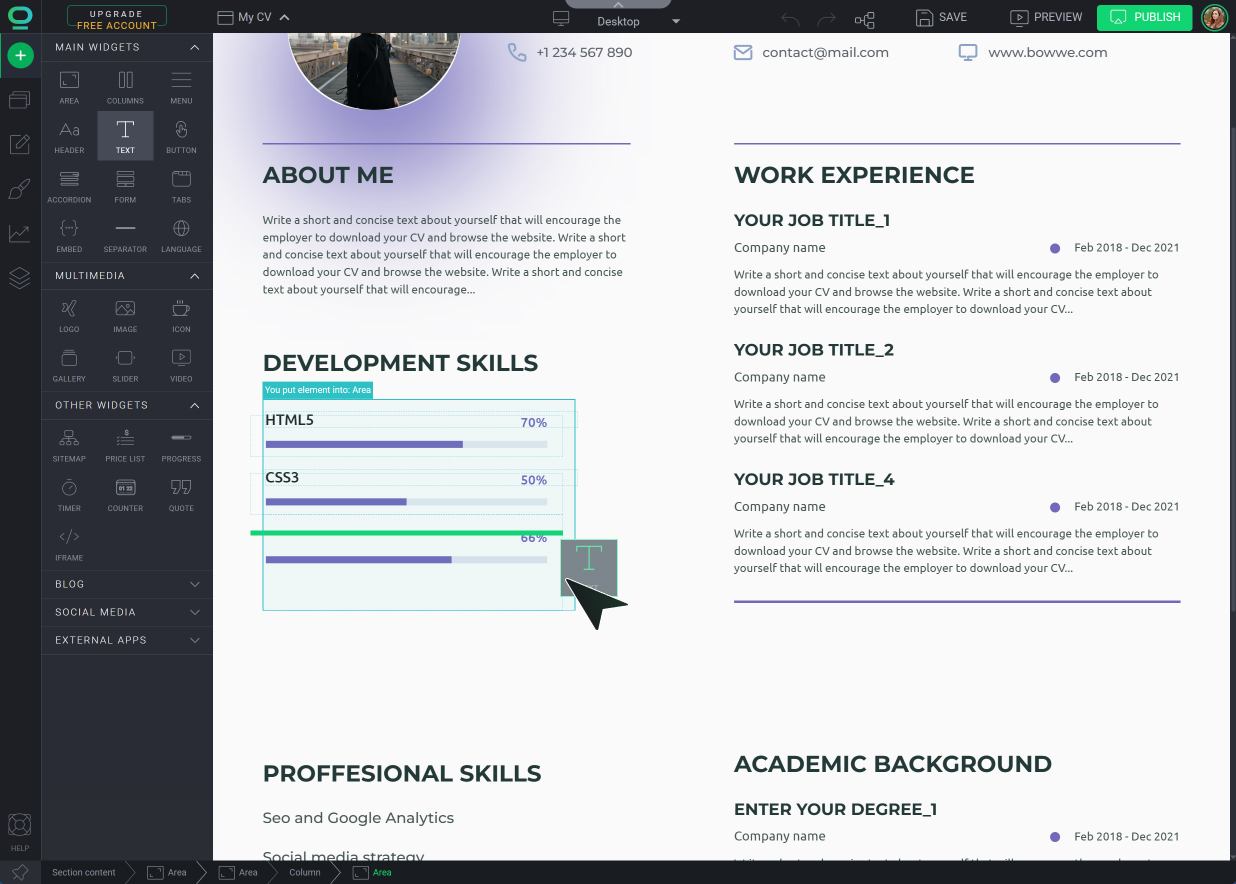
How to add and customize Progress Widget in BOWWE?
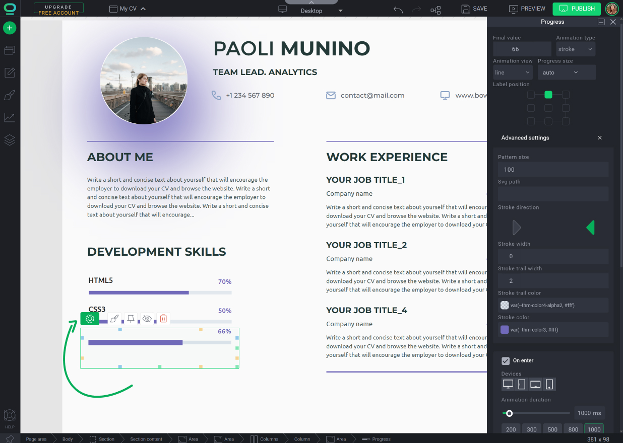
Progress bar - Widget Settings
Looking to visually track progress or completion on your website? A progress bar widget can be just the solution you need! In this tutorial, we'll guide you through the process of adding and customizing a progress bar widget on your website using BOWWE.
How Progress Bar can look like on your website?
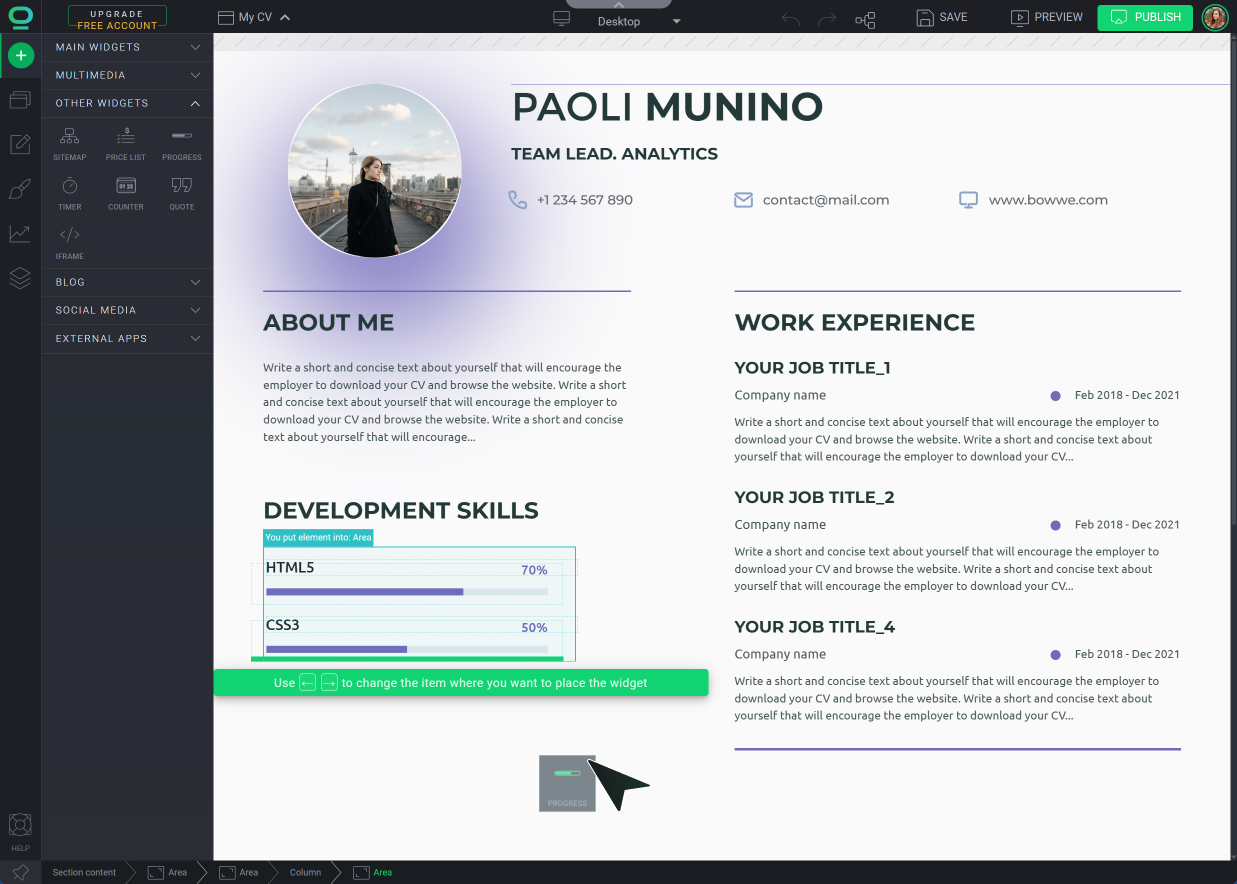
How to add and customize Progress Widget in BOWWE?
Open BOWWE Builder


Go to the Widget Settings and edit the element
Adjust the final value, animation and the appearance of the progress bar

In Widget Styles change the size, position, font and background of the widget
Learn more
Make sure the progress bar is responsive and compatible with different devices and screen sizes. It should adapt well to various resolutions and orientations, ensuring a consistent user experience.
Responsive styling - CSS inheritance

Progress bar - Widget Settings
Final value
Set the desired value at which the progress bar should reach its completion
Animation type
Choose the type of animation to apply to the progress bar, such as linear, ease-in, or ease-out, determining the visual transition between values
Animation view
Select the view or style of animation, like a smooth fill or a gradual increase, that best suits your design and desired effect
Progress size
Adjust the size or dimensions of the progress bar, specifying its width, height, or overall size to fit your layout requirements
Label position
Determine the placement of the label associated with the progress bar, such as above, below, inside, or alongside the bar
Pattern size
Define the size or scale of any patterns or textures applied to the progress bar, allowing for further customization and visual appeal
SVG path
Specify a custom SVG path or shape for the progress bar, enabling unique and intricate designs beyond the traditional linear or circular bars
Stroke direction
Choose the direction of the stroke, such as left to right, right to left, or circular, to control the progression of the progress bar's visual representation
Stroke width
Adjust the width or thickness of the progress bar's stroke, influencing its visual prominence and impact
Stroke trail width
Determine the placement of the label associated with the progress bar, such as above, below, inside, or alongside the bar
Stroke trail color
Define the color of the stroke trail, allowing you to differentiate it from the filled portion of the progress bar
Stroke color
Select the color of the progress bar's filled portion, matching your website or application's branding or aesthetic preferences
Trigger
Determine the event or action that triggers the progress bar's animation, such as page load, button click, or data retrieval


