Responsive Image Optimization
Image optimization is a very important topic to consider when updating your website’s content. In this world, where even a second can make a difference in user experience, a faster loading site is not a luxury, but a must-have and the number one reason for slower loading speeds tend to be the images. But we can fix this problem, by following the rules regarding Responsive Web Design.
What is Responsive Web Design
Responsive Web Design (RWD) is a set of rules that are essential to achieve best project quality. We do provide you with those options, but some of those require additional effort to take full advantage of. Those rules include:
- Framework - which is a platform for hosting and building your website, instead of a more archaic approach of writing the whole code by hand. One such framework is our BOWWE Creator, and its design will automatically help you with accomplishing this step toward the best website you could hope for.
- Fluid Grid System - helps you organize your content in a coherent and neat way that is easy to understand and follow. Widgets utilizing such solutions are sections, columns, and areas.
- Media Queries/Breakpoints - these dictate how the page should look once a certain screen size is met. Sometimes what looks good on a desktop can be too big on a phone screen, so this will help you style your page to look perfect on any device.
- Fluid Image - the main focus of this tutorial. In short, it describes all the guidelines for a perfect balance between image quality and its loading time, which is often harder to achieve than it looks like. This is the point that requires the most user involvement and we’ll explain in detail what to look out for and what to keep in mind while uploading those pictures to your project.
How to optimize your images
Image format
There are a great number of image formats, and most of them serve different purposes.
- JPEG is used for classic photos,
- PNG is used for images utilizing transparency
- SVG is used for icons based on vector graphics
- WebP is used as an optimized substitute for JPEG and PNG, supporting transparent files and even animated ones.
WebP is a relatively new image format but you can be sure that all modern browsers support it. In our projects, we use only WebP for images and SVG for vector icons, and we recommend the same for you.
Compress and resize images
Uncompressed images can take up to several Megabytes of data that needs to be uploaded before the page can be fully experienced by a user which can take even multiple seconds of time. That’s why it’s crucial to optimize your image and according to Google, the optimal size for the image shouldn’t exceed 100kB of space. To help achieve it sometimes an image might require a resize to a size it’s mostly going to be seen. It’s almost impossible to fit a 4k image under 100kB without a substantial loss in quality, but an image in the size of HD+ (1600x900px) is much easier. The closer an image is to its displayed size, the better. You can easily find multiple online sites with free-to-use compression applications that can help you with this.
Responsive widget image
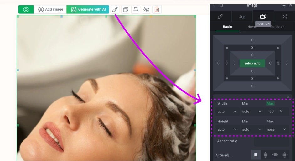
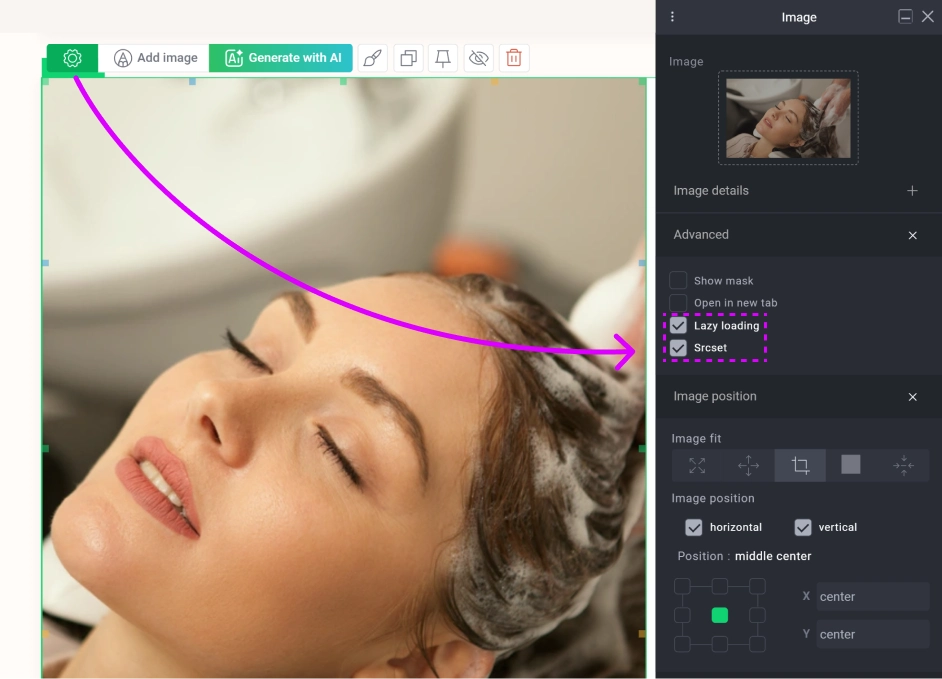
Lazy loading and src-set
Inside the widget image settings there are properties that can improve your widget loading on smaller devices.
- Src-set - will automatically generate a thumbnail for certain device sizes that will load quicker
- Lazy Loading - will prevent loading the image until the user scrolls to that element on the page
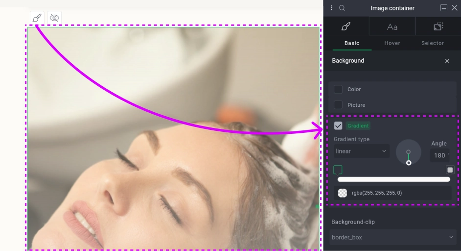
CSS style editing
Media Breakpoint testing
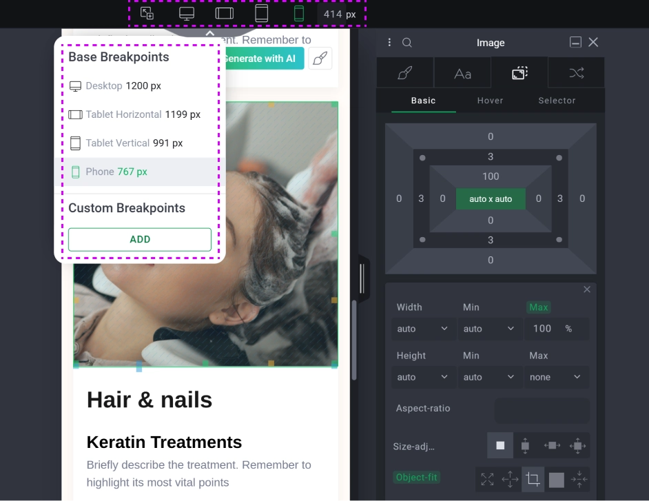
Cascading styles for responsive devices

