Pseudo-Elements and When Use Them?
BOWWE tutorials
Welcome to our collection of online lessons. We’ve created these to help you learn the best practices and get the most out of BOWWE. Come back here whenever you want!

Advanced tutorial: Pseudo-elements ::before and ::after

What are pseudo-elements

Pseudo-elements are abstract CSS styles that can affect your elements in a very specific way. They can help you style certain states or parts of your elements that aren’t traditionally available for any user. This is a more advanced form of styling your widgets. There are a number of pseudo-elements and while we want to focus on ::before and ::after, we’ll briefly list other elements as well.

Pseudo-element

Example

Description


::after

p::after
div::after

Placed after the content of specified element

::backdrop

dialog::backdrop

Applies styles to the background behind a dialog box or popover

::before

p::before
div::before

Placed before the content of specified element

::file-selector-button

::file-selector-button

Selects any button for file uploads (<input type="file">)

::first-letter

p::first-letter

Targets the first letter in each <p> element

::first-line

p::first-line

Targets the first line in each <p> element

::grammar-error

p::grammar-error

Styles text marked as grammatically incorrect by the browser

::highlight()

::highlight(custom-name)

Selects a custom text highlight applied to an element

::marker

li::marker

Styles the markers (bullets or numbers) of list items

::placeholder

input::placeholder
textarea::placeholder

Styles placeholder text in <input> or <textarea> fields

::selection

div::selection

Applies styles to text selected by the user

::spelling-error

p::spelling-error

Styles text marked as misspelled by the browser

::view-transition

::view-transition

Represents the root element for the view transitions overlay, containing all view transitions on the page

::view-transition-group

::view-transition-group

Represents a single snapshot group for a view transition

::view-transition-image-pair

::view-transition-image-pair

Acts as a container for the "old" and "new" view states during a view transition.

::view-transition-new

::view-transition-new

Represents the "new" view state after a view transition completes.

::view-transition-old

::view-transition-old

Represents the "old" view state before a view transition starts.

Aside from the state edition of our widgets we can also add new content to anchor to other elements. And that’s what ::before and ::after are for.

How to use ::before and ::after

::before and ::after are not-realized parts of every widget that by default don’t have any styles and are completely invisible. They can’t also act as containers to drop elements inside of them, but they can house additional content to improve your widgets.

Note:

::before and ::after behave in the same way and most of the time it doesn’t matter which one you choose to style. The key difference between them is that the ::before comes at the start of widget’s content and ::after at the end, which can have implications when the order of those elements is important, or if you want them to be more floaty then by default ::before will be hidden behind the main content and ::after will be displayed in front.
Let’s use our theory in practice. We’ll go through some possible ideas, but there are a plethora of ways you can use those pseudo-elements.

Adding custom list decoration

Showing of your branding can be included even in automated listings for your texts. We can replace standard dots with your company logo.
1
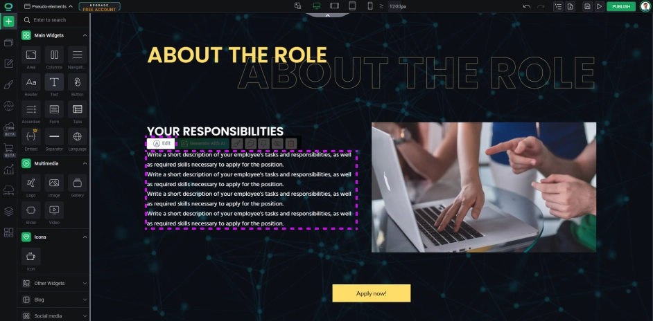
Create your list: drop a text widget to your project and write some content inside.
2

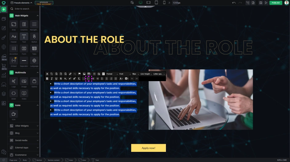
Select the text you want to list, and switch it to a pointed list.
3
Select the text widget and go to the widget styles.
4
Go to the selectors.
5
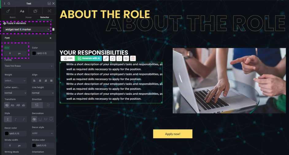
We need to first disable the default pointer. Write inside the selector window `.widget-text li::marker`. This will give us access to all default pointers inside lists.
6
Set the marker font-size to 0px.
7
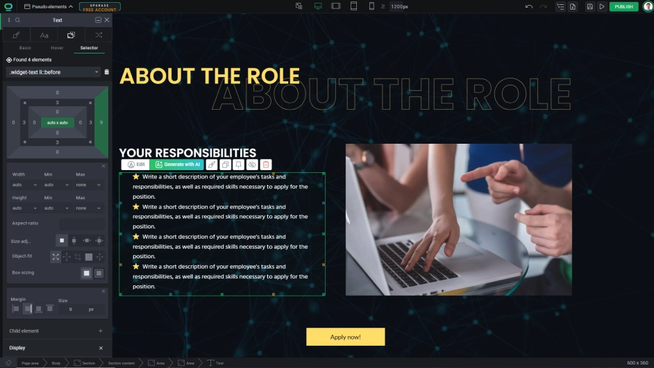
Now we can add our custom pointer. Inside the selector window write down `.widget-text li::before`.
8
Inside the position tab we need to change the pseudo before element into a realized pointer. Let’s start by changing the display to inline-block.

Note:

Pseudo content is not exactly an actual image and it can’t be changed with size, so be sure that your new pointer is the proper size when uploading it.
9
Upload the pointer image you want to use and copy the address either from inside your project or from an outside source.
10

Get back to the before selector and in the Pseudoelement content write down the proper line:

url:("/upload/domain/12345/images/icon-name.svg").
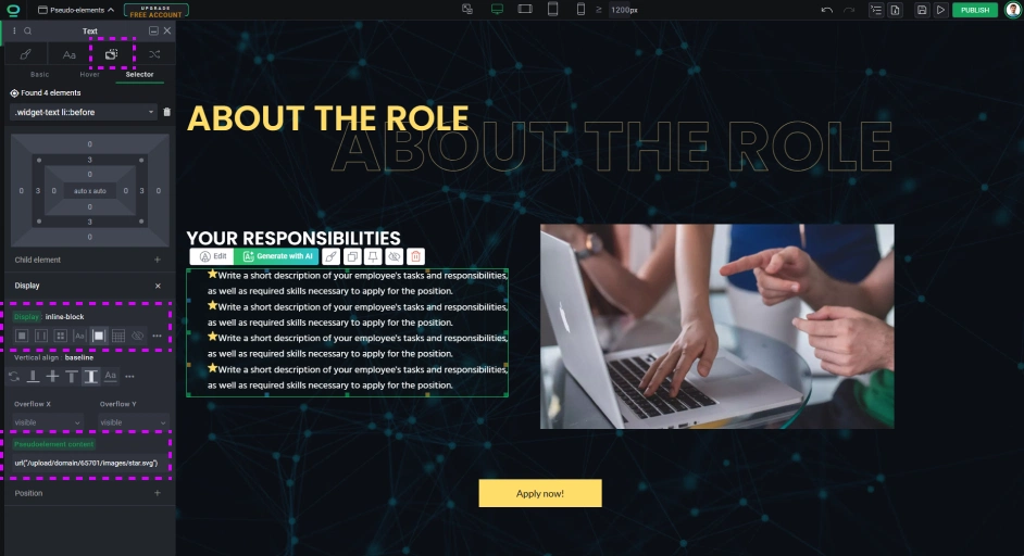
11
Add some margins to right to make some space between the pointer and the text.

Make animated underline to a navigation link

Another interesting usage is to create an animated underline for a link in your menu navigation. Normal text underline is very simplistic and aside from changing a color it doesn’t provide any more styling flexibility. But we can work around it.

1
In your project create some subpages for the menu and drop a navigation widget to the Navbar container.
2

Click on the navigation link and go to widget styles.
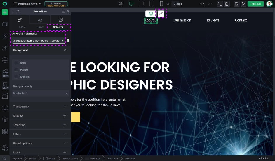
3
Go to the Selector and from the list choose the selector belonging exclusively to the navigation link, which is “.nav-top-item” and add suffix ::before (for a stronger selector you can include its parent in the selector, which would look like this: “.navigation-items .nav-top-item::before”).
4
Now that we are inside the pseudo-element, let's create an object. Go to position tab.
5
Scroll to Pseudoelement content and we need to create an empty object, so write a space inside parenthesis: “ “. Content is not our main focus but it is required for the ::before to be created.
6
Now for the underline. We want it to stretch from the middle to the sides when the user hovers over the link, so we need to create a base that will be affected on hover.

In the size editor set the width to 0% and the height for 2px.

7
We will set the display to block.
8
In the position editor we will select an absolute position and set it to bottom center. Since this underline has a height, it might overlay with the text in the link so we will move it a little using Y positioning and setting it to -2px.
9
We also need a color. Go to the color tab and give it a background color matching your brand color, or maybe a gradient.
10
To make it look pleasant we need to add some smooth animations. Scroll to Transition editor and in transition timing function select ease_in_out and for transition duration write down 500ms (this can be adjusted depending on your preferences).
11

Now that we have our base set-up, let’s adjust the hover state. Inside the selector, using the same selector we just styled, but we need to add a hover state to the link (not to the pseudo-element), so it would look like this:

“.nav-top-item:hover::before” (or “.navigation-items .nav-top-item:hover::before”).

12
We need to change only one style for hover. Go back to the position tab and change the width to 100%.
Now we have our animation ready.
Congratulations!
Now you know how to use ::before and ::after!

Hours

Minutes

Seconds

3 years for less than 1 year

save up to

$723

Closing Symbol