Spacing - How to properly create spacing between elements on your site?
How to add spacing on the website?
The difference between Padding and Margin
How to properly create spacing between elements?
The most common mistakes in creating spacing between elements
How to add spacing on the website?
To create spacing when building a website, padding and margin are two of the most commonly used properties that affect the layout of the elements on a page.You can specify the padding and margin value for each side of the element by providing one, two, three, or four values in the Position Tab.
For example, if you want to add padding to the top and bottom of an element, but not to the left and right, you can select it on the graph.
The difference between Padding and Margin
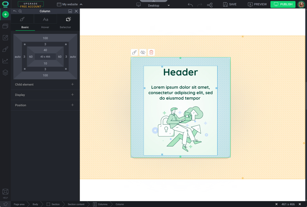
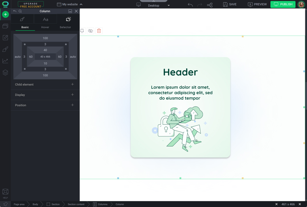
Padding
Margin
How to properly create spacing between elements?
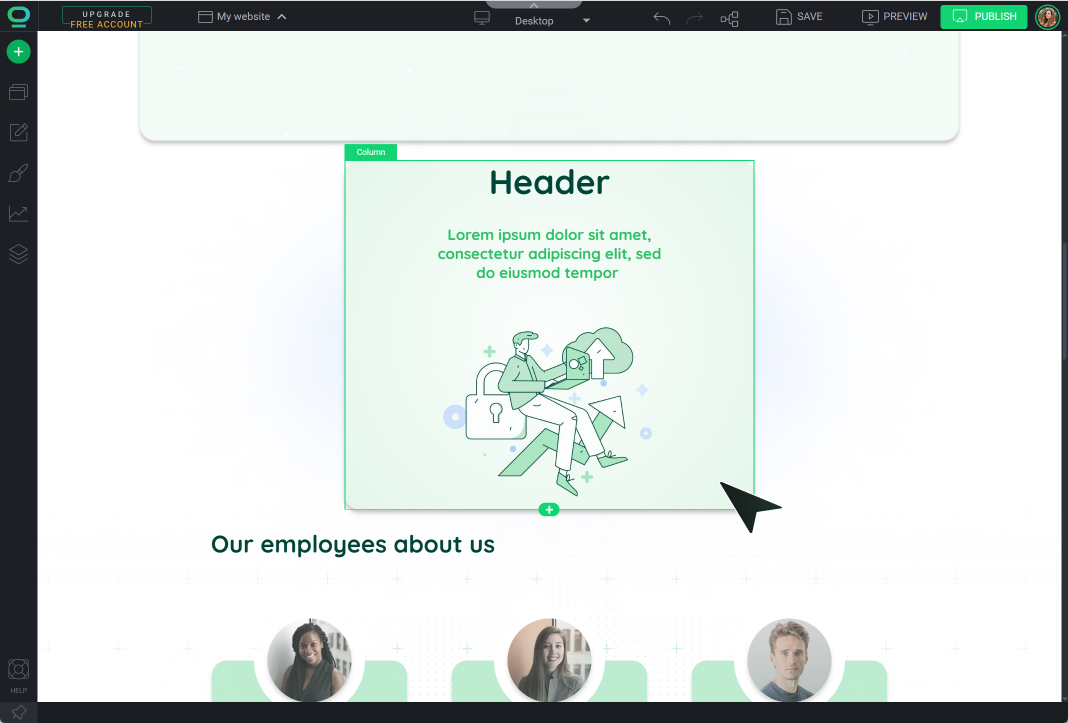
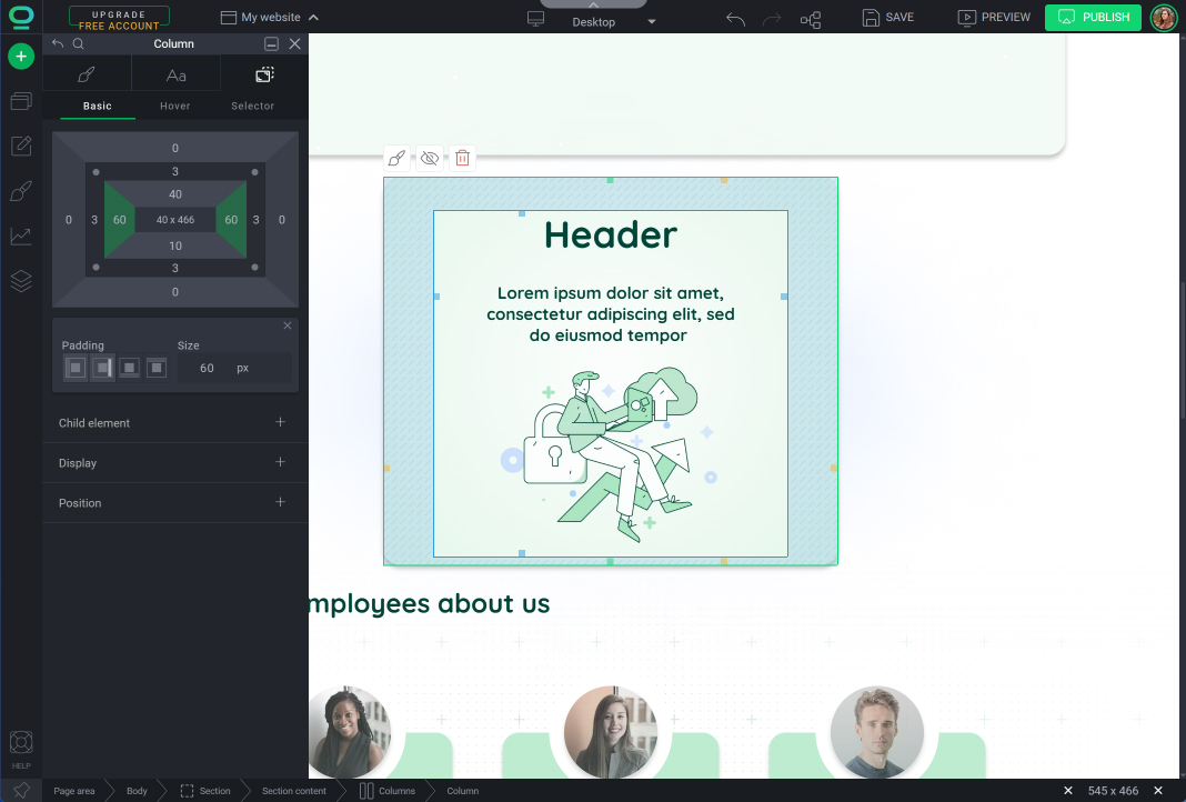
When you place the widget in another one, you can use padding to separate the contents of the internal widget from the external one.
For example, you put the Text widget in the Column widget and use padding to separate the text contents from the border of the column.
Select the element you want to edit
Go to Widget Styles
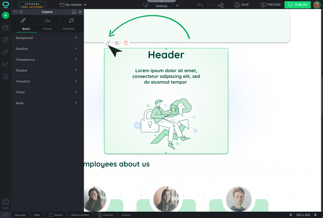
Open Position Tab
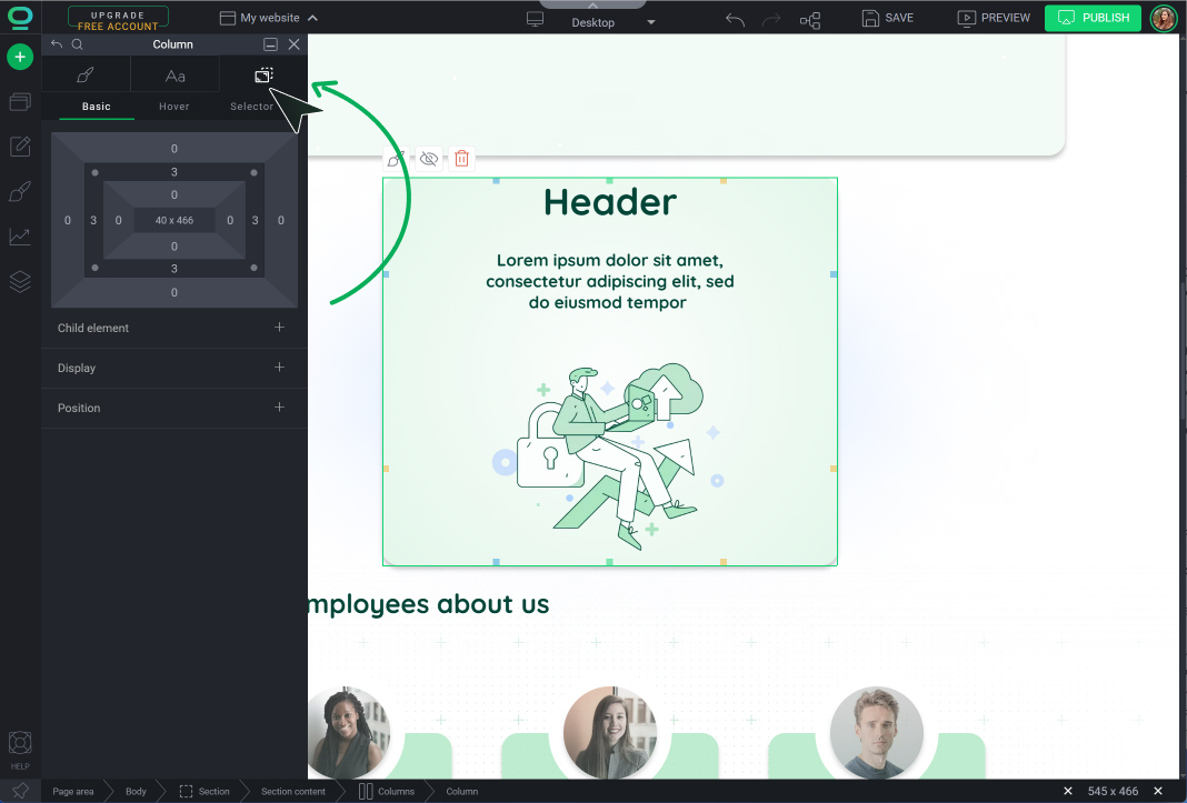
Select on the graph Padding and choose on which sides of the element you want to set it,
Remember about
Widget borders are not used to create spaces between items!
Specify its value to create a space inside the element
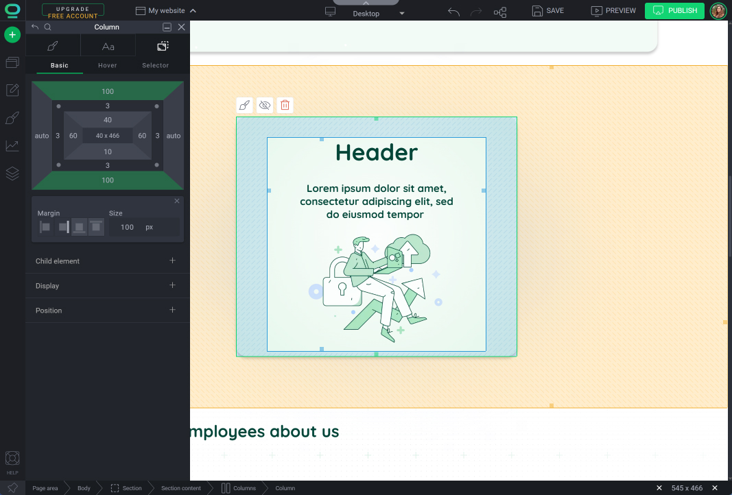
Choose Margin on the graph and edit the value to separate widgets from each other.
The most common mistakes in creating spacing between elements
- Multiple enters
Your visitors will not see it. But for SEO robots, creating a large space between a paragraph of text and another element by pressing the Enter key multiple times is treated as an error. This practice lowers the ranking of your website in the search engine. - Empty Area widget
Spacing between elements with a blank area is also a mistake. For indexing robots, an Area is a collection that should contain other elements. If it is empty, indexing robots will classify it as an unreadable error, which lowers your site's ranking. - Empty Columns widget
Like the blank Area widget, empty columns are also treated as an error. - Moving green border lines
By using the green border outline of the widget, you can give each element constant, unchanging dimensions: width and height. This means that regardless of the circumstances (e.g., changing the screen resolution to a smaller one on a mobile device), the dimensions of such an element will remain the same. This is associated with risk, e.g., website elements displayed on a mobile device will not adapt to the smaller screen size!


