CSS Tricks for Develop a Dynamic Website | BOWWE Tutorials
BOWWE tutorials
Welcome to our collection of online lessons. We’ve created these to help you learn the best practices and get the most out of BOWWE. Come back here whenever you want!

Transform property: CSS Tricks for a Dynamic Website

The transform property is a type of CSS style designed to move, rotate and distort elements inside your project. It will modify visual coordinates without impacting the actual position of elements relatively to other elements.

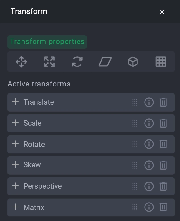
Transform attributes

To access all the available transform attributes you need to select the widget you want to transform, open widget styles and inside the first tab unravel transform style at the bottom of the list.
The available attributes are:

Transform Attribute

Description


translate

allows for moving the element within 2D and 3D spaces

scale

changes the size of the element with a choice of maintaining or not the aspect ratio

rotate

let’s you turn your element around

skew

tilts and deforms your element

perspective

an attribute exclusively used for 3D transforms. It defines the size of the abstract z-axis allowing you to operate in the third dimension

matrix

is a pre-made combination of previous attributes and is used alternatively as one attribute to cover all other attributes

Note:

When using perspective be sure to have it as the first style in transform, since otherwise the CSS won’t apply changes in 3D space. This is how CSS language is interpreted. You can simply drag the perspective attribute to the top of the list and it will dynamically change the order.
The biggest potential in transform is the animation of your elements.

Transform examples

1. Moving Tile on hover

1
Create a simple tile element.
2

Go to widget styles.

3
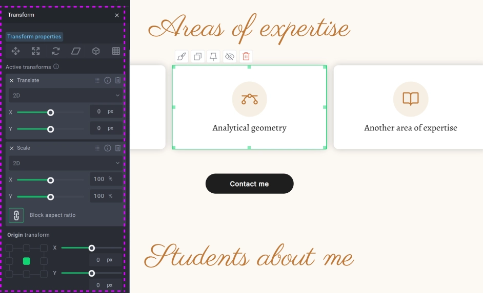
Open transform list.
4
We’ll need to start by setting attributes that we’re going to use and their starting values. Choose translate and scale attributes and leave their default values for now.
5
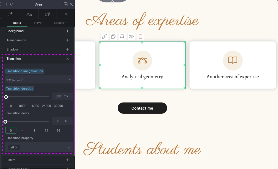
We need to animate the motion on mouse hover and to do this we need to add a transition property. Go to transition and for transition type choose ease_in_out and for the duration 500ms.
The biggest potential in transform is the animation of your elements.
6

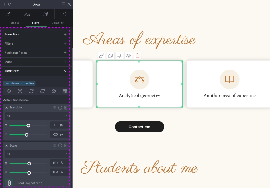
Now select the hover state. From now we’ll be editing the behavior of the element as the user activates it by hovering their mouse cursor over it.

7

Go back to transform and apply subtle changes to translate and scale. We’ll give translate -20px on Y axis and 104% for scale.
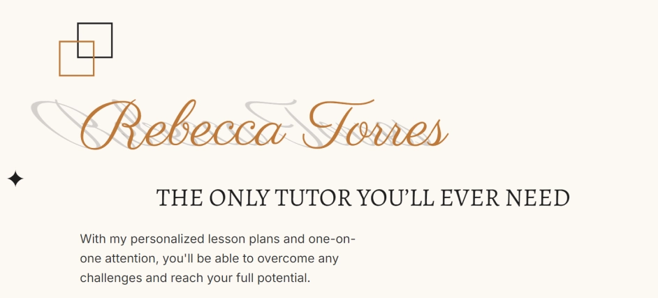
2. Popping text
1
Let’s start by creating a container for our text and its pseudo-shadow. We will drop an area for this.
2

We’ll add a text inside and style it in the way we want. For this example we are using the “Parisienne” font.
3
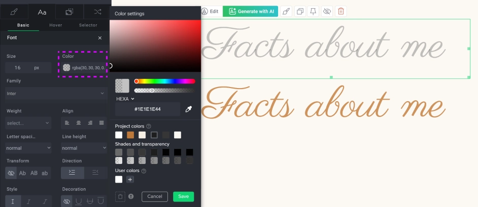
After the styling is complete we need to copy the text and paste it in the same container. This whole container should be reserved just for those two elements.

Note:

If you’re styling headings this way we advise you not to copy the heading, but instead create a new text element and style it the same way as the heading. The reason behind it is that Google is monitoring heading usage on the page and having heading duplicates can bring your page score lower. It’s safer to use the text widget instead.
4
The top text will be our shadow. Go to its styles and change the color to semi-transparent dark color.
5
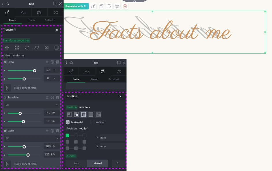
Go to position.
6
Change the position to absolute and z-index to 0.
7
Go to transform.
8
Change skew on the x axis to match your vision.
9
Change translate and scale to match the shadow with the front text (this looks better if there are no letters with tails, like: j, y or special characters).
Congratulations!
Now you know how to use transform in your projects.

Hours

Minutes

Seconds

3 years for less than 1 year

save up to

$723

Closing Symbol