Columns. How to use them when creating a website?
Best practices - when to use Columns on your website?
Columns - Widget Settings
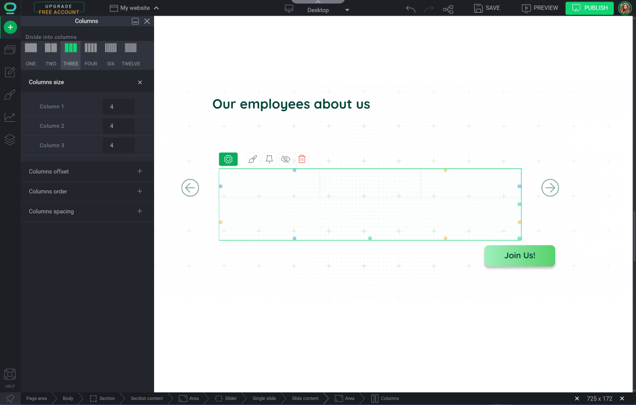
How to add and manage the Columns widget?
BOWWE gives you the Columns widget to connect and manage any elements on the page conveniently. By using different colors, textures, or images in each column, you can create a dynamic and visually appealing layout. They are a powerful tool that will help you keep your website nice and clean.
In this tutorial, you'll learn how to add and edit Columns widget in your project and then use it efficiently.
.jpg?98030.5)
.jpg?164902.70000004768)
Best practices - when to use Columns on your website?
- Organize contentColumns can help you organize content into different sections, making it easier for visitors to find what they're looking for. This is especially useful for websites with a lot of information or content-heavy pages, such as blogs or news sites.
- Create whitespaceBreaking up long blocks of text into columns can make it easier to read and digest. This is because columns provide natural breaks in the content, which can help users focus on specific sections or points.
- Build a responsive layoutColumns can be used to optimize content for different devices, such as mobile or tablet screens. By adjusting the number and size of columns, you can ensure that your website looks great on all devices.
Columns - Widget Settings
Number of columns
The number of columns used on a website depends on the type and amount of content that needs to be displayed. Generally, websites use a two-column or three-column layout.
Having too many columns can make your website look cluttered and confusing.
Columns size
Columns offset
Columns order
Columns spacing
This option allows you to remove gutters between columns. By default, there is a small amount of gutter space between columns to provide visual separation and improve readability.
However, there may be situations where you don't want any gutter space between columns. For example, you might want to create a layout where images or other elements span across multiple columns without any gaps in between.
Remember about:
The 12-column grid system is a commonly used layout design in web development that divides a web page into 12 equal parts, or columns. This grid system allows developers to create flexible and responsive layouts by assigning a portion of the screen width to each column.
For example,if you set the width of a column to 6 parts out of 12 it will occupy 50% of the total grid.
Instruction: Adding and managing the Columns widget
Drag and drop the Columns on your website in a relative way

How to add new elements to your website
Adjust widget settings, and specify:
- Number of columns
- Columns size
- Columns offset
- Columns order


- Consistency is essential in web design. This helps users to read and navigate your website effortlessly.
BOWWE makes it easy and changes made in the Widget Styles to the single column will apply to all the columns in the widget.


