How to acquire AI credits
BOWWE tutorials
Welcome to our collection of online lessons. We’ve created these to help you learn the best practices and get the most out of BOWWE. Come back here whenever you want!

How to acquire AI credits?​​​​​​​

AI generation in BOWWE Builder for Texts and for Images is our newest feature. This feature is locked behind the $10 paywall and is attributed to a single domain. Once you make the purchase, those credits will stay on your domain, no need for monthly subscriptions. The balance is checked only from the amount you have purchased, we will not charge anything in case your balance gets depleted.

How to purchase credits?

1
Open Generate with AI option
2

Click on the Account Balance

3
Click Update Balance
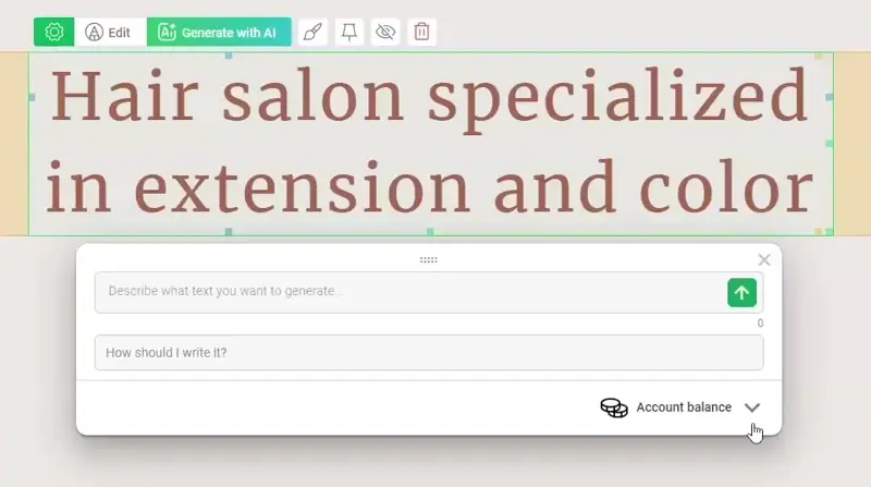
4
Provide your credit card or debit card information
5
(optional) Provide details for the invoice
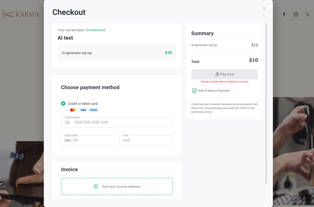
6
Accept payment

Cost of generating an article:

Compact 100-150

$0.01

Moderate 200-300

$0.02

Contextual 300-500

$0.03 - $0.07

Full subject development 500-1000

$0.08 - $0.13

Comprehensive article 1000+

>$0.13

Once you select the breakpoint, the device will be emulated inside the BOWWE Builder and you may change the styles of your elements like the size of your fonts, or margins between elements to accommodate smaller canvas. The changes you make on a chosen device size will only carry over to the smaller devices and not go upwards (hence the cascading styles 😉).


Example: You set your text font size to 20px on a desktop. This without any changes will have the same size of 20px on desktops, tablets, and phones. Now if you were to select tablet horizontal and changed the size of the text font to 16px, then it would be applied to tablet horizontal and phones as well. However, this would not carry over to the desktop, since the desktop is higher in the cascading hierarchy.

Breakpoints

A site created according to RWD (Responsive Web Design) principles adapts to the resolution of the screen on which it is displayed. When styling your site in BOWWE, each device has dedicated breakpoints, where both the layout of the page and the appearance of graphic elements can change (they can disappear or adjust width and height). Breakpoints are related to screen resolution and allow you to adjust the style appropriately for the devices that Internet users use.


Breakpoints in BOWWE

  • Monitor  >1200px
  • Tablet horizontal 1199px - 992px
  • Tablet vertical 991px - 768px
  • Phone >768px
⚡ BOWWE Expert Tip:
We recommend starting with designing your page from the desktop level and going down with elements that you find necessary to update (not all elements need to be adjusted and not for every device size. Which styles and which devices require extra polish depends entirely on you and how the elements look on smaller screens). The exceptions are Micro Pages where the implemented “Mobile First” design flips the cascading hierarchy on its head and goes from Phone to Desktop.
❗ Important:

The cascading behavior only applies to CSS Styles and column settings, not to structure of the page. Dropping for example a picture on a phone will still include it on the desktop, since it is not a change in styles but adding an element.

⚠️Exception:

The only style that doesn’t behave cascading is the hide widget button. It only hides the widget on the resolution you have currently selected and will not hide this element nighter on lower resolutions, nor on higher. Those resolutions have to be handled individually on each resolution, but we also recommend hiding elements on a few resolutions and not on all, since invisible widgets that don’t appear on any resolution can be viewed negatively by Google algorithm.

Benefits of responsive styling

Congratulations!

Now You know how to acquire AI credits!

Hours

Minutes

Seconds

3 years for less than 1 year

save up to

$723