How to add an image as a background
Method 1: Set background image for a container
Method 2: Use mask in widget image settings
Method 3: Set image widget to an absolute position
Images are an inseparable part of every website or blog. They draw the attention of your target audience to the highlights of your site, demonstrate examples with visual aids, or simply make the page colorful and pleasant to look at. Let’s focus on the last one for this tutorial. You will learn how to use images as a background for the rest of BOWWE widgets.
Method 1: Set background image for a container
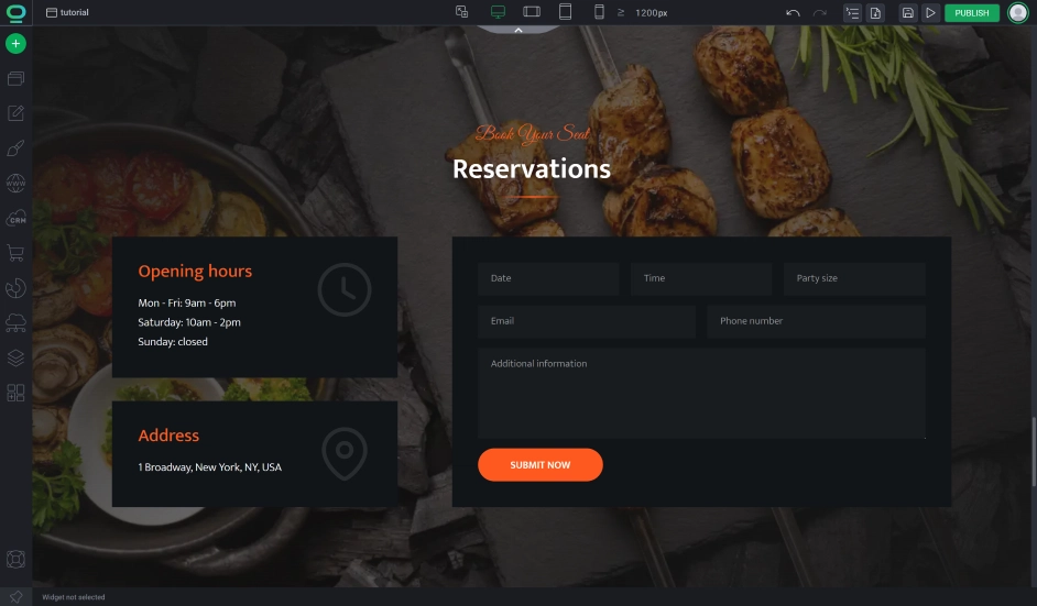
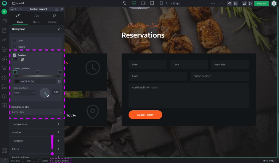
Click on widget styles.
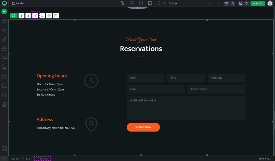
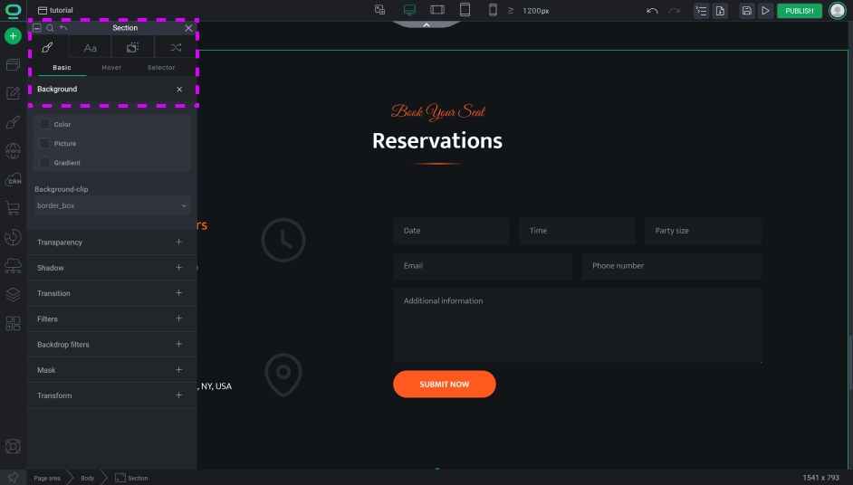
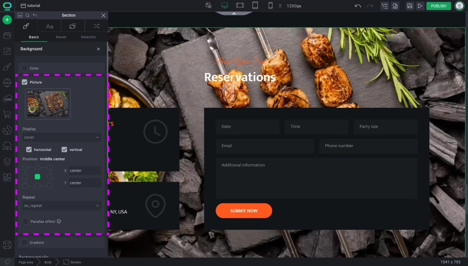
Remember:
Great! Now your background image is set. This solution is usually used as a page banner or as a shifting focus towards an important widget, like a newsletter. However, this method is picture-dependent, and sometimes the content of the picture can be obscured by the picture itself. For this, we have two possible fixes:
💡 Fix #1: Edit your image in a graphic application to have a darker/lighter mask (best if the color of the mask matches the color scheme of your branding)
💡 Fix #2: Add another container before dropping all of your content and use it as a mask by setting its size to cover 100% of the parent container and giving it a semi-transparent background color. This solution is most commonly used by applying it to the section container since all sections are made with two containers: section and section content. Just add a background image to the section and add the mask to the section content, et voilà!
Remember:
Method 2: Use mask in widget image settings
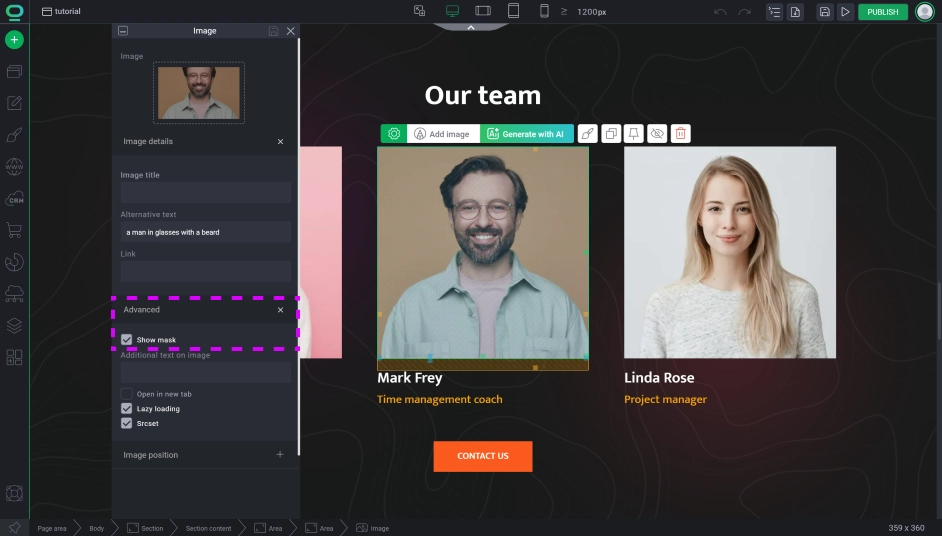
The second method is simply using the widget image and switching on its mask settings. This will create an additional container taking the space of the entire picture for you to use for dropping any widget you want. The canvas created this way is entirely dependent on the size of the picture and can create restrictions on how many elements you can fit in but it’s a good method when you want to create a hover effect to promote a product/service or show a short description of your partners/employees.

Go to the Image Widget Settings.
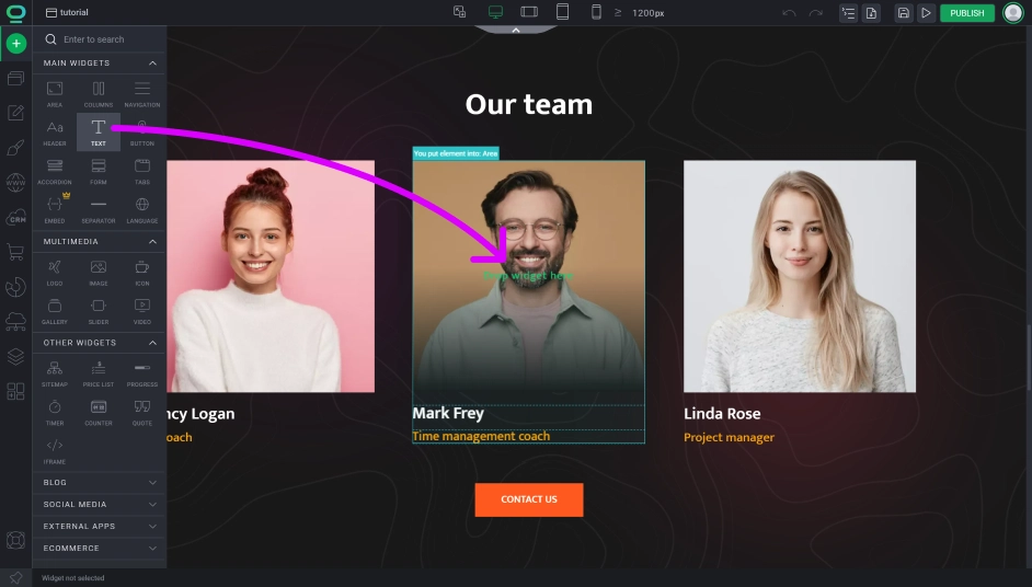
How to apply an image layer mask
Remember:
Method 3: Set image widget to an absolute position
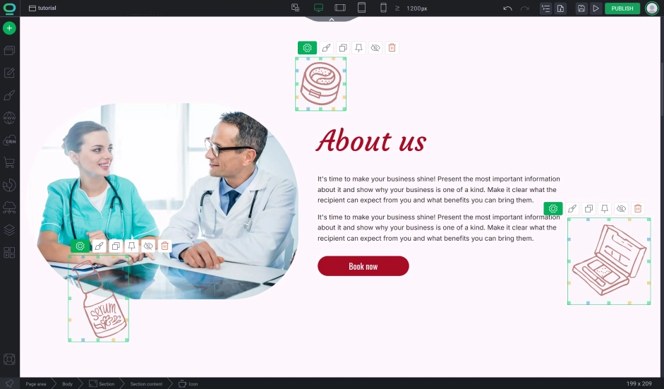
Using absolute positioning is a very delicate process. Be mindful of this because absolute can initially move your element in unpredictable ways or disrupt your container size. An element using this positioning is no longer automatically responsive and needs to be manually checked on every resolution. Relative is a safer option providing responsive behavior and better SEO score.
Relative and Absolute Positioning
Go to widget styles and open Positioning Tab.
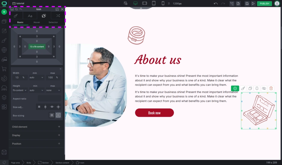
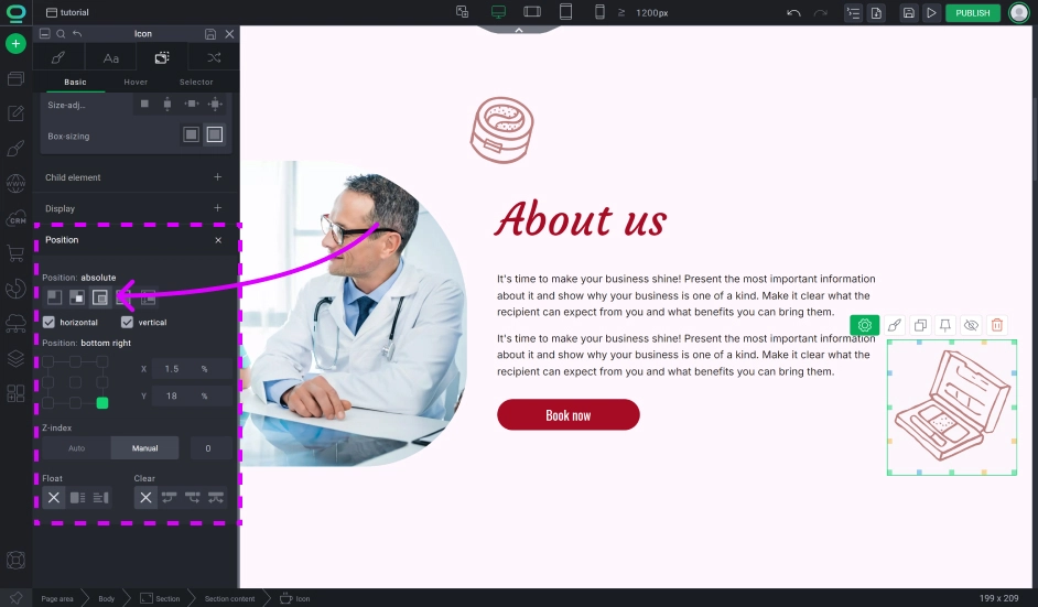
Remember:
In the absolute positioning elements stop respecting their siblings and are no longer dependent on them, meaning that changing siblings won’t affect our absolute element’s position as well as the element itself won’t affect the size of the container it’s inside of (unlike with the relative positioning).
Tips:
- The absolute method is best used to add simple graphical decorations to your website like geometrical shapes, confetti, or bubbles. It’s not used to promote the main content but to beautify around it.
- If you set the offset of your element to be for example 600px from the left, then on phones with a 400px wide screen this element won’t be visible. Remember to adjust values on other devices.
- Offsets don’t have to be always in pixels from the left. You can always use % units for more dynamic and flexible placement and depending on the situation you might want to switch position to be counted from the right.
- Changing something to absolute can make it so this element covers other content. This is because of `z-index` which is changed to 1, while the default value for the rest is 0. If you don’t want your content to be covered over, you need to change its z-index to a higher number (it’s easier to group elements in a container outside of an absolute element and change the z-index on said container).
- DON’T OVERUSE THIS METHOD! Almost everything can be built relatively and this should be your first method for everything, just when something REALLY CAN'T BE DONE without absolute positioning, then you can try this method.. Changing everything to absolute can quickly get out of hand and you could lose control over your page esthetic
Adding Background

