Did you know that 71% of small businesses have a website? What's more, as many as 92% of small business owners consider the website to be the most effective marketing strategy.
It seems you should at least consider creating a website for your business. But you don't even know how to start?
Relax. This article will guide you from creating a site from scratch, through showing what to do at each stage to effectively attract a lot of customers, to finally publishing a brilliant website online.
Don't waste your time and let's move on to the details...
Start Here!
What does a small business need a website for?
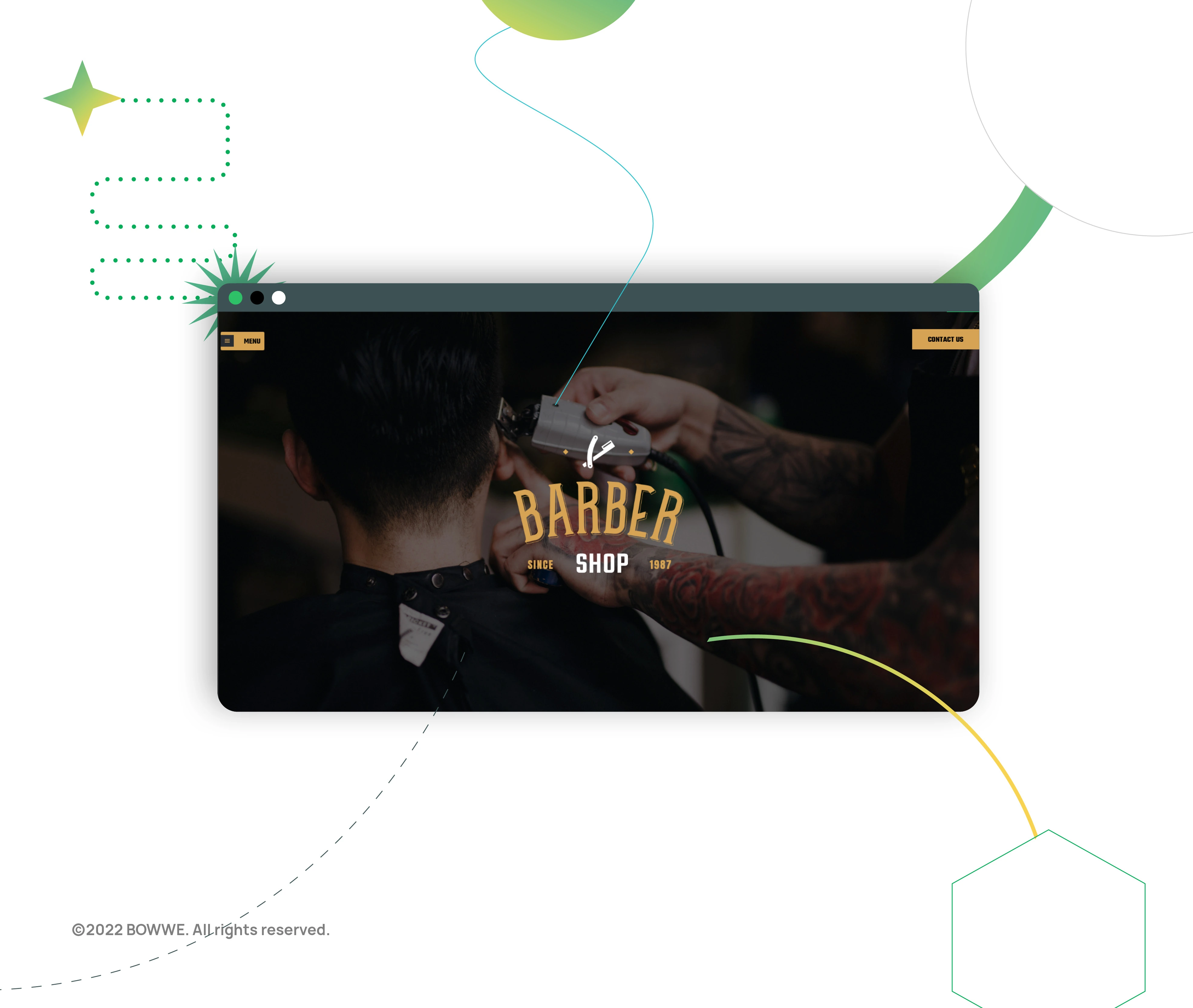
It is possible that you haven't yet created a website for the company because you considered it, for example, an unnecessary expense. However, it is worth seriously considering the issue of a website because it can bring many benefits to your business! In the case of a website, it doesn't matter whether you have a small or large business. Having a website gives you enormous opportunities that you absolutely must take advantage of. So what are the benefits of having a website for small businesses?
a) offer presentation - this is one of the most important pieces of information for each recipient looking for a given product or service. Therefore, placing the details of the offer on your website will make it easier for your recipient to get to know it and increase your credibility. Due to the lack of easy access to your offer, you will only lose the possible influx of new customers.
b) generating leads - through contact forms or subscribing to the newsletter, you will start building the contact base of your potential customers faster. You will be able to contact them quickly, and it will be easier for you to convince them to take advantage of your offer.
c) increasing the business's reach - by starting an online business, you gain access to new forms of promotion and a larger group of recipients. Thanks to this, you can gradually increase the company's recognition while gaining new customers.
These are, of course, only some of the many benefits that you will get after creating a website for your business.
Best website for small business - how to create it?
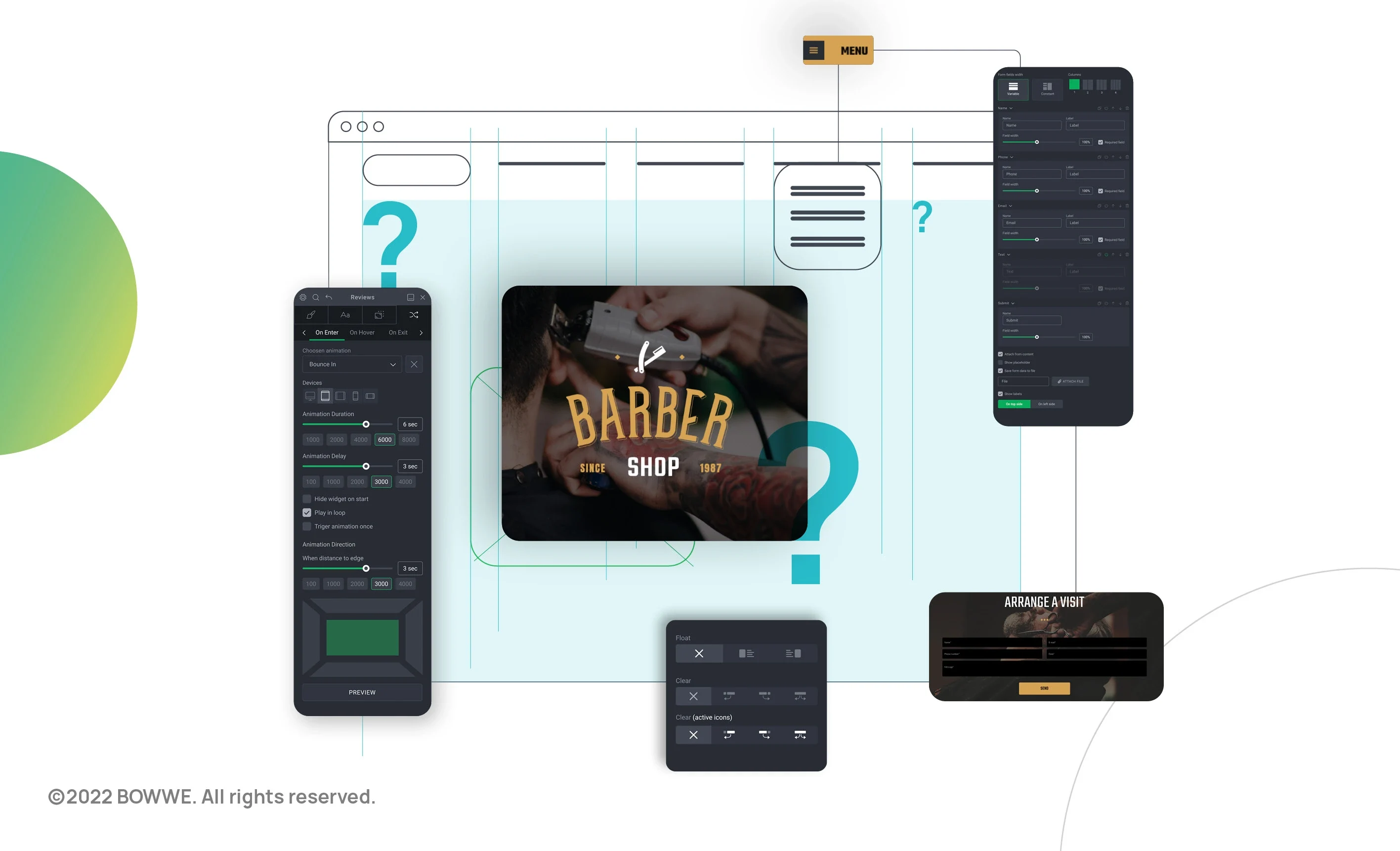
A small business website must effectively present the offer so that as many people as possible can use it. But how exactly such a website should look like, and what should it contain to turn out to be profitable and effective? It's worth starting from the very beginning.
1. Set goals for your website
Setting goals for your website from the beginning will make it easier for you to make decisions in the following stages of its creation. How best to define them? Look at the industry in which you operate and your offer. Think about what will be the most important goal for you?
Let's say you own a boutique. It is a small shop in a medium-sized town with several loyal customers. On the one hand, these clients provide you with a stable income; on the other hand, you want to increase your sales and reach a larger group of recipients. You decide to create an online shop for small business - what goals should your website have in such a situation? The main goal will undoubtedly be to transform potential customers into those who will benefit from your offer. However, this is not possible without driving traffic to your website. People must first find you and be interested in your offer. Without it, you won't get your main goal of high conversion (sales in this case).
Once you've set clear goals for your website, it'll be much easier for you to plan the next steps for your website's creation. You will know that you should focus on making your website easy to find, presenting its offer well, and having everything you need for an online store (e.g., photo gallery or various payment methods).
1.1. Small business website goals:
a) Building trust - by far the most crucial goal of any website for micro, small and medium-sized companies. The small business website is proof that this one exists and functions on the market. But just having a corporate website is not enough. People visiting it should get the impression that they are dealing with professionals and that it is worth considering using their services. Trust will allow you to acquire new customers without getting involved in advertising activities. When you build it - you will also be able to obtain higher margins than your competition and efficiently implement projects - when the clients feel that they have entrusted the work in good hands, they will not interfere with your projects.
b) Being found - thanks to the company's website, users will learn about the existence of your business. For example, you can reach a new group of customers or acquire business partners.
c) Providing information - the website must state what you do and what problems you solve, who you are, how to find you, contact you or place an order. Basic information is necessary because users must understand what you are doing for someone to take advantage of your offer. By providing all the information they need, you also benefit from saving time - once the customers find out everything they need to know, you won't have to spend time answering their questions.
e) Educating - Your website should allow users to learn more about your products/services. You can publish valuable content on your blog, organize webinars, offer e-books for download - think what form of communication will be appropriate for your target group.
f) Converting - the website should be built so that as many people as possible would decide to send a request for an offer, fill out the contact form on the website, generate valuable sales leads, or book a visit.
Top 8 Website Goals [+ Ways to Achieve Them]
2. Make your website user-friendly

You want your customers to feel good about your services. They must feel that they have chosen the right person and that you will get them for what they pay. Similarly, you should want everyone who visits your website to feel confident about it. So that they could use it comfortably and efficiently find what they are looking for. Your task is to make it as easy as possible for him. To do this, make sure that your company website has the following features
2.1. Adapt your website to various devices
The times of browsing websites only on computers are over long ago, so you need a website that users can conveniently use from a mobile phone or tablet. The pace of life is faster and faster, and many are looking for interesting offers when they are at work, at home, and on the bus or the train. That's why you need a website that can be viewed in various circumstances.
In BOWWE, you can quickly and easily check how your website looks on devices other than computers. You don't even have to start editing your project for this. You need to change the view to a specific device with one click, e.g., a telephone in the menu at the top of the builder. Remember to always go through the preview from each device before publishing your website and check that everything looks as it should.
2.2. Create intuitive navigation
You already know that your website should be convenient to use. Well-designed and thought-out navigation should also serve this purpose. Its pillar is the menu visible on the page, but the navigation should also be placed in the footer. It is also popular to use tile navigation and the so-called hamburger.
2.2.1. What pages should a small business site contain?
Typical subpages for small businesses are Home page, Offer (Products, Services), About us (About the company, Team), Portfolio (Projects), Price list, and Contact. However, this doesn't mean that such tabs should be included in your Menu exactly.
Look at your competitors' websites and think about what subpages are specific to your industry. For example, in the case of restaurants, it will be Menu, and in the case of hotel facilities - Rooms. Think about what might entice your customers and what your competitors rarely do. The Tourist attractions subpage will undoubtedly be very encouraging if you run a guesthouse.
Before designing navigation, be sure to think about what content your website should contain to convince potential customers to use your company's offer effectively. The content should form a coherent story leading the potential customer from the first hearing about your company, through getting to know its offer, the value you offer, the way you deliver it to the purchase, i.e., turning a potential customer into an actual customer!
2.2.2. Why is the menu on the website important?
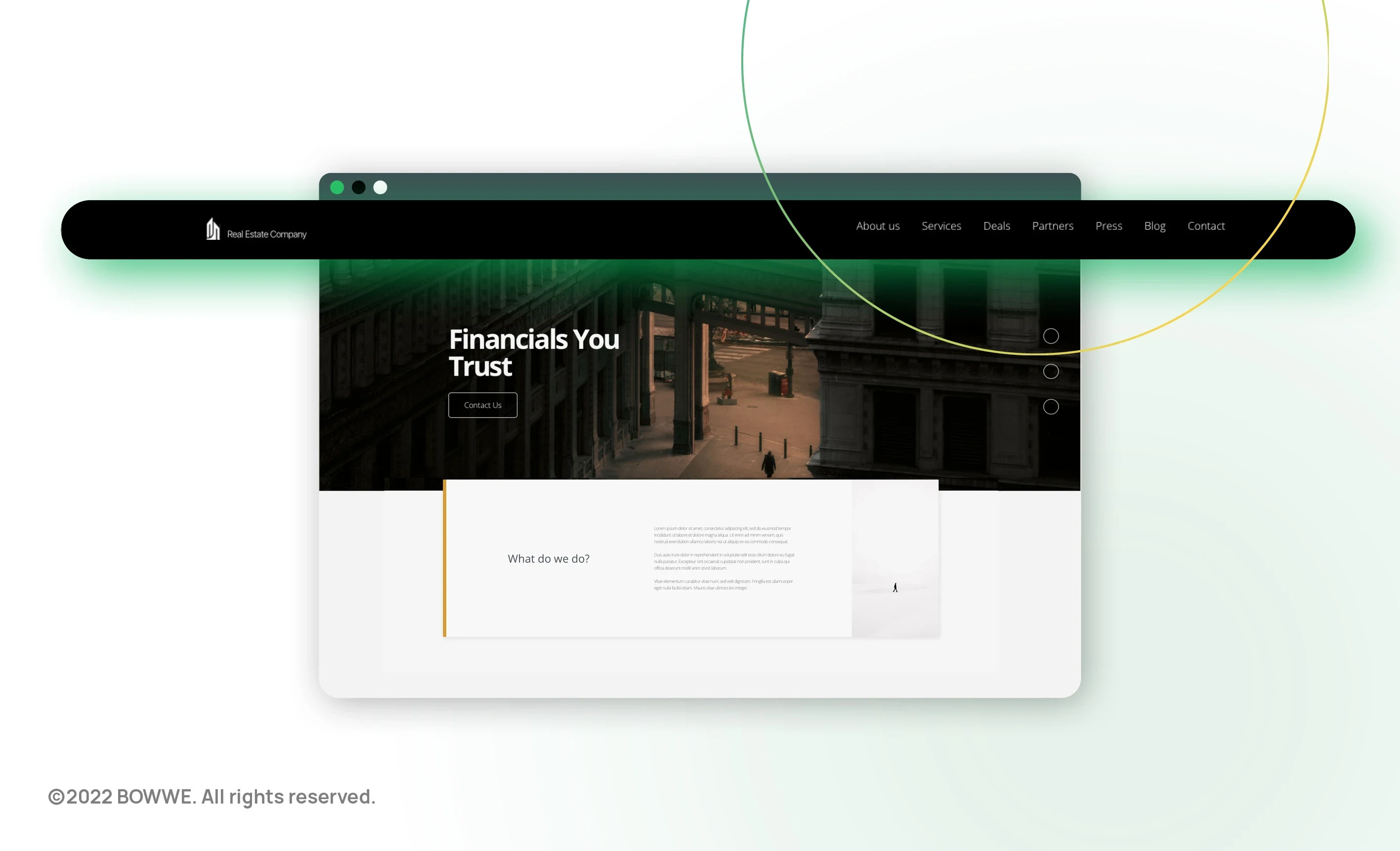
The purpose of the menu is to show the page's content or at least its most essential elements. Its purpose is to enable quick access to the most important information on your website and ensure easy navigation and return to the home page. Usually, a clickable company logo is placed in the menu, which takes users to the home page. Small business sites tend to have a horizontal menu, but you may also find a vertical menu.
If you design your site navigation well, users will spend a lot of time on your site, and that's what you care about. You want users to visit various tabs on your website to learn about your offer or pricing and become convinced to use your services. The longer time spent on a website also means a better position in search results.
Your website is used not only by your potential customers but also by Google robots. The better the menu structure and linking on your website, the better it will be assessed by them, and the better position in the search results will be awarded to you. To sum up: good navigation effectively supports positioning.
2.2.3. Website menu - how to plan it?
Take a piece of paper and a pen and plan the menu. You can also ask your website developer for their opinion, but it is much better to go to them with an outline of what you are planning. Use the exact names of subpages in the menu to know what type of content they will find in a given tab.
The order of the items in the menu is essential. In the beginning, there should always be a home page (you don't need to include it as a menu item if your company logo is linked to it). Usually, this is followed by the About the Company subpage, then the Offer subpages, then Portfolio, Blog, and Contact, which is always at the end.
Don't put too many items on the menu. If you use more than 7, the menu may become unreadable. Do you have a lot of material you want to put on your website? Relax. Not all of them may be included in the menu. A widespread practice is, for example, the use of a submenu, e.g., placing subpages with individual services in the Offer tab. You can also publish your site links as a list on the associated subpage.
It is also worth placing a company phone number and e-mail address above the menu. This way, you will make it easier for users to contact you.
3. Take care of a professional website layout
3.1. Create a professional and modern website
Your website must be created according to web trends if you want potential customers to treat your company seriously and use its offer. If you don't stick to today's website standards, you will easily be dragged by the competition that is better presented than you.
In turn, if you have had a website for several years, verify that it aligns with the current trends in creating websites. You are probably used to its appearance, and you don't want to change anything, but it is worth looking at it in the context of what good websites look like today. Check out the competition's websites, including foreign ones, and see what the website templates for companies in your industry look like. Pay attention to what sections they contain and what they look like. This will help you decide how you want your services, portfolio, opinions, or booking section to be presented.
Get Started Free!
No coding experience required.
3.2. Balance is the most important thing
Your website should give the impression of balance. The balance is to be kept, among others, in texts and accompanying visual elements or the colors used. The website's colors should match the company's logo and its visual identification (be consistent with the branding). The point is for customers to associate your company quickly - based on the name, graphic elements, and colors.
It is a mistake to use too many colors or use colors that look bad when combined. However, these mistakes can be easily avoided. There are color palettes that designers use when creating a website design. Ask for the person to whom you will entrust the creation of your website to present you with several suggestions of such pallets before the project is completed. You can also tell in advance about your preferences and the impression you want to make on your website visitors (proximity, warmth, distance, seriousness, prestige, etc.) and provide the designer with the elements that make up your company's branding - first and foremost, the logo design.
Simplicity is an essential quality of graphic designs, so it's best to avoid using too many elements, colors, styles, or fonts on one website. A properly defined and applied hierarchy of components will help to maintain transparency. For example, a banner, headings, slogans, menus, and buttons should be clearly visible. It is worth listing the arguments for taking advantage of the offer and, above all, contact details and the so-called CTA (call-to-action) - i.e. direct phrases expressing what action you expect from your website visitors to perform (e.g. that they call you, fill out the contact form, come to your office).
3.3. Legible company website and clear message
Readability is also critical. The texts on the website should be legible and convey what you want to communicate. The following paragraphs should create a coherent message in which you will state what your company does, what it offers, and why the user visiting the site should use your services.
The sections should be visually separate and not too long to avoid a "wall of text" effect that no one will read anyway. After a section that includes a background image or icons, it is usually best to present a minimalist section, e.g., consisting of text only on a neutral background. It is a good practice to alternate areas on neutral and colored backgrounds.
The font used should be "easy to read". You don't want users to have to "decrypt" the content. The text cannot be too small, and the headings' size should be well-matched to show the hierarchy of elements and draw attention to essential information. In addition to the text, line spacing and paragraph spacing are also important because the empty space gives the impression of clarity and makes reading easier
4. Match the website to the industry
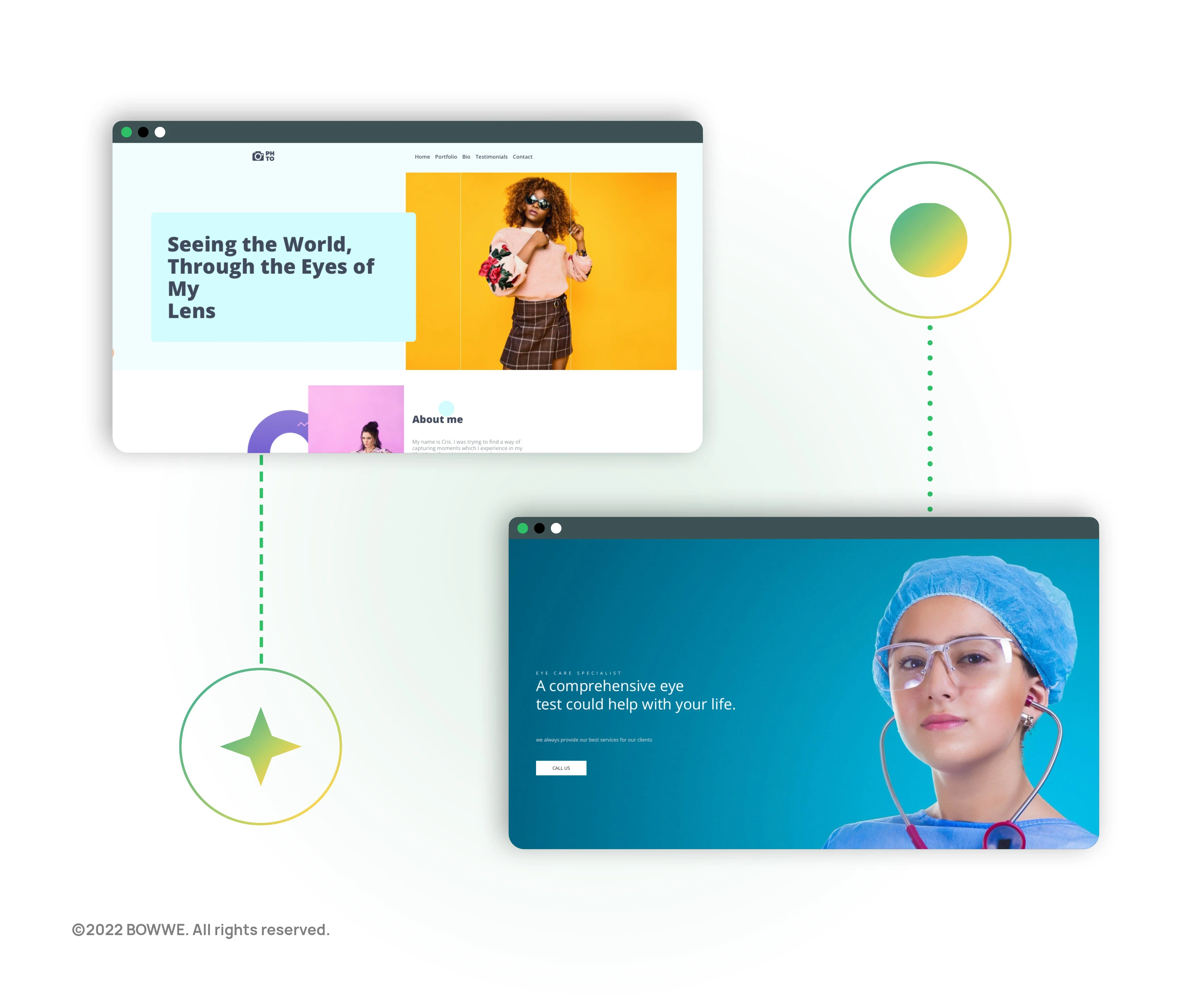
There are general guidelines for all websites, but the company's industry for which your website is built is also of great importance. The kindergarten versus the production company website will have completely different characters, colors, graphic motifs, sections, and subpages.
Think again about what subpages should be placed on the website. Think about what you can show your potential customers valid and what content will make you present yourself as an expert and build trust. In the case of a physiotherapist, a good idea will be, for example, the Exercises subpage, containing videos on how to take care of the correct posture and advice on what forms of physical activity to choose to stay healthy.
The impression of the coherence of the content, the visual layer, and a good selection of the website structure to the offer works to the company's advantage. Users visiting a website usually spend only a moment on it. If they judge that the website is not related to the services they are looking for and their appropriate level, they will leave it very quickly.
BOWWE offers access to over 200 professional website templates. They were preceded by in-depth industry analyses to meet each business's requirements. Not only do they contain sections necessary for specific industries, but they also have a design tailored to them. However, the templates can be freely modified according to your needs. You can check out the page templates from BOWWE here.
How to increase the effectiveness of your website?
You already know what goals your website should achieve and you have learned the general features it should have to make it attractive to users. Now it's time for the details.
Find out which sections should be placed on your website
1. Set goals for your website
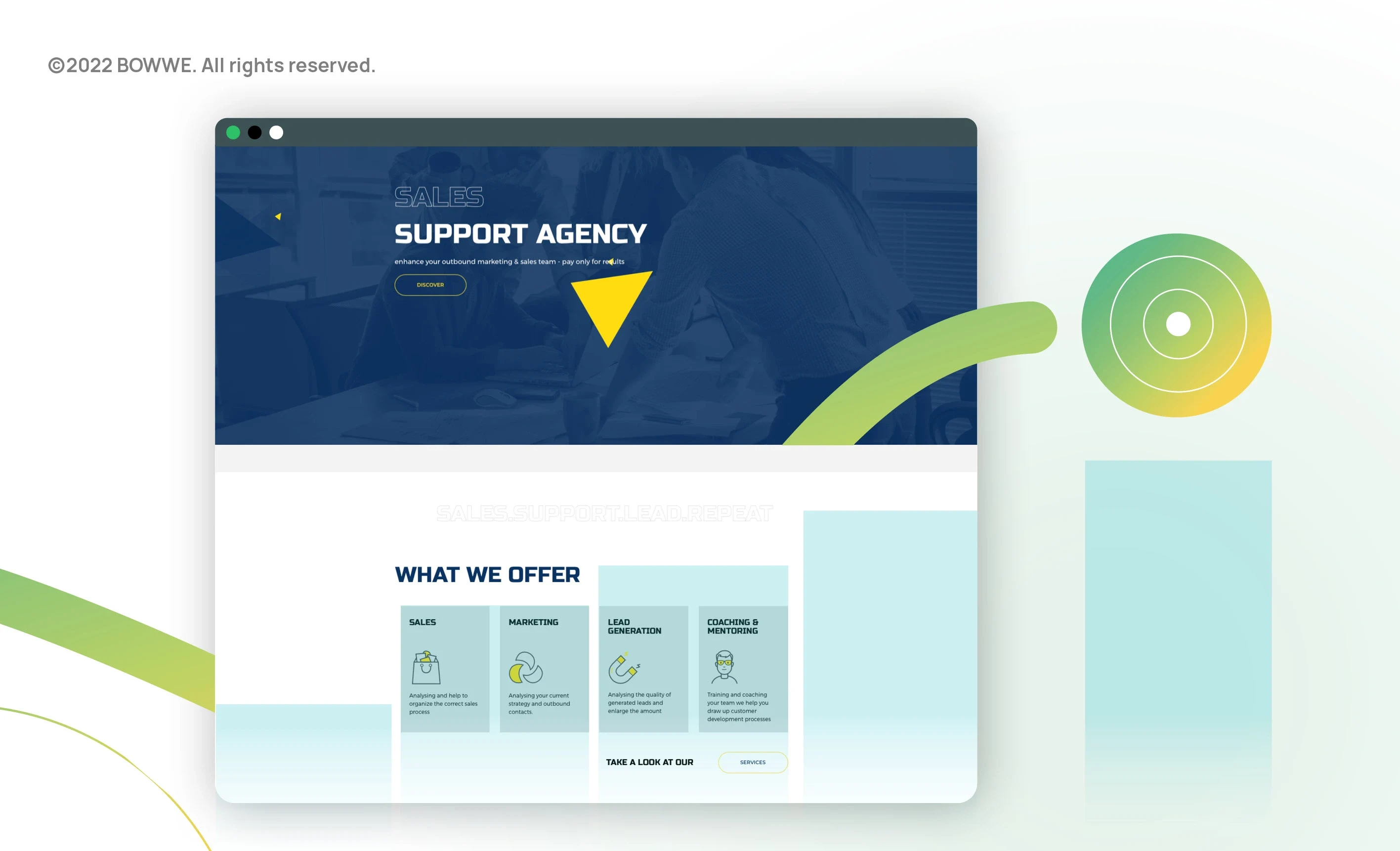
There is a promise behind every business. Someone who decides to use the services of a specific company must be convinced that this promise will be fulfilled. If they feel insecure - you can quickly lose a client to your competitors.
You can't let that happen. Instead of letting the customer go, give them a reason to use your services. Offer your recipient something they are missing or need. Communicate this on your website so that this information is clearly visible. Include a headline on your home page and mention the promise in texts on other pages.
Examples of company promises from various industries:
a) Optician: ensuring the good vision and aesthetic appearance
b) Store: Your pet's well-being and health
c) Laptop repair: your computer will recover, you will be able to use it freely and save money deciding to repair, not to buy new equipment
d) Cafe: Aromatic coffee and delicious cakes that you eat in a cozy place and pleasant atmosphere
Remember that these are all words, and think about how you will prove to the client that you are delivering on your promise. You can choose from the portfolio, before and after photos, customer reviews, diplomas, and certificates.
2. Information about your company
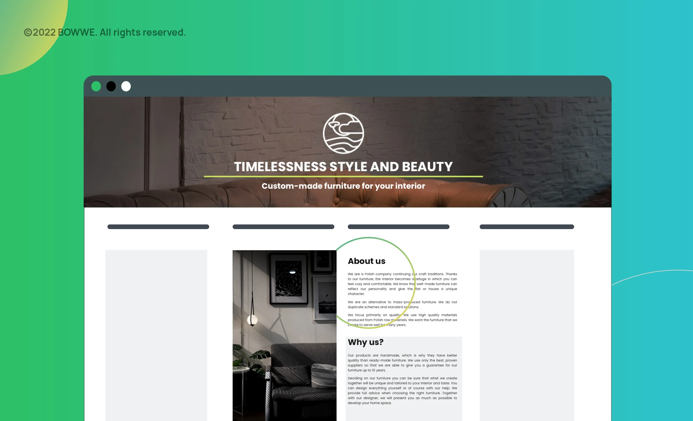
A company is not an impersonal entity but the people who create it. When you show this, it will be much easier for you to build trust with people looking for services like yours. Show your face, write who you are, your goals and mission, and what you would like to deliver to your clients. If your work is your passion, it is worth showing your clients, preferably in some subtle and non-intrusive way - the website is a great tool to show it, then pay enough attention to it. Often it is worth publishing photos of leaders, and perhaps also of team members, especially if they are people who have contact with the client and have a significant influence on delivering everything necessary to your company in the context of client relations.
If you run a business in a specific place, show them. Showcase the interior of the premises inside and out. Often, even if customers never appear there, just place of your work can show them a lot, and you can gain a lot of trust from it. Publish a map and directions to help reach you on the Contact page. Show me how you work. Consider whether it can be presented in video form. If you are a physical therapist, you can make a video of how you massage. If it takes some time to complete the order, show the work steps. It is worth presenting them in the form of icons accompanied by descriptions.
By showing who you are and what you do, you build trust. Try to present your business uniquely that will make you remembered. Customers tend to visit many corporate websites, and it is challenging to keep their attention and memory. Think about what story you can build about your business. Are you a continuator of several multi-generational family traditions? Or maybe you quit your job in a corporation to start earning money on your passion and fulfill your dream of starting your own business?
3. Your distinguishing feature
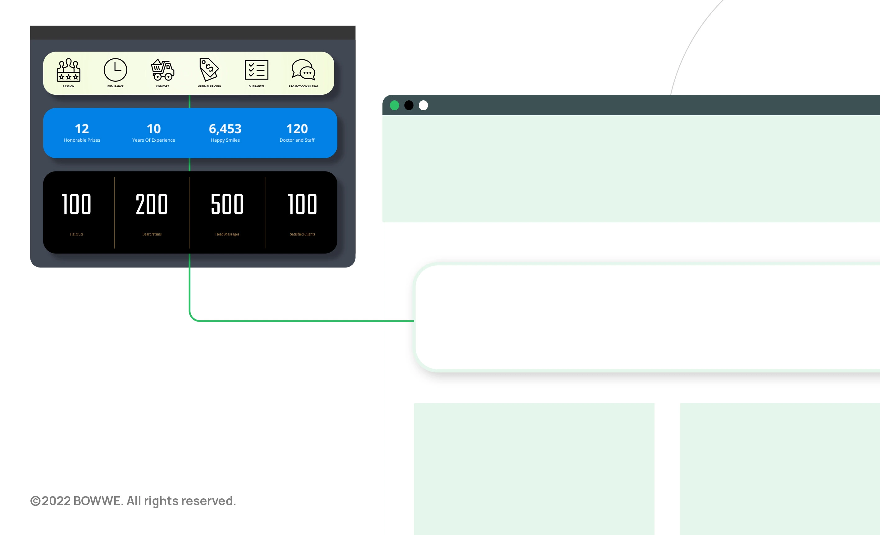
Is your offer unique? If so, you are in a tiny group of businesses. Usually, many small enterprises often provide similar services, but the only difference is in the area in which they operate. In this situation, how to convince customers to choose you and not other companies from your or a neighboring region? Show and prove your competitive advantage.
Here are some examples of things that can make your company stand out:
a) High quality and professionalism
b) Owner's passion
c) Dedicated customer manager
d) Short order execution time
e) Very quick response to inquiries
f) Presenting a specific, very detailed valuation
g) Favorable prices and the possibility of obtaining a discount
h) Top-quality products (e.g., with high durability, tightness) and services
i) A wide range of products and services
k) Narrow specialization (also can be an advantage, especially when there is a broad market)
Show not only what you offer, but the value you give. Communicate the advantages of your products, services, service, premises in texts on the website. You can also create a folder presenting your offer and link it to your website, e.g., in the footer. Marketing guides often tell business owners to emphasize the uniqueness of their business. This is important, but be careful not to overdo it. Be approachable instead. Your goal is to make your client feel unique and confident using your offer.
4. Answers to questions that have not yet been asked
4.1. Why should your website answer customer questions?
Remind yourself of the frustration you feel when you visit the company's website whose services you are interested in and cannot find the necessary information. Try to make your website answer questions that your potential customers may have.
Many internet users are lazy, and if they cannot find information on your website, they will not make a phone call or write an email. They will sooner visit the websites of other companies in your industry, and you will lose customers to the competition.
4.2. Where to post answers to questions?
It is good to create a FAQ subpage with a list of frequently asked questions and answers. On such subpages, companies often write about how the order is processed and shipped, the purchase conditions, and how the cooperation with the company works. They provide specific information, e.g., who the services are intended for, their advantages, and answer questions directly related to their business.
However, creating a separate subpage with questions and answers is not always necessary. You can answer questions, for example, on the Price list subpage (e.g. What is included in service packages? How do you prepare a quote?), Offer (What are the stages of work? What do customers gain by choosing your company?), Contact (Does the company operate mobile or provide on-premises services?) and of course on the home page. The most important thing is that the person visiting the website receives a complete set of the most important information, thanks to which they will feel more convinced to take advantage of the offer and take the next step - they will call to make an appointment or send a request for a quote. Remember, people like to have something in writing - they feel safer, calmer, and more open to your offer.
4.3. How to check what customers are asking about?
First, list the questions that you most often get when talking to them. Ask your employees to write down the questions that customers ask them. You can also browse threads related to your industry on message boards and see what users are talking about, what concerns they have, and what they are looking for. Try to group the collected questions into categories and determine which of them are crucial, and the answers to them should appear at the very beginning of the FAQ or in a prominent place on the home page.
Secondly, you can check on Google what phrases related to your offer are being searched for. When you start typing any words in the search window, the suggestions related to your typed words will appear. This autocomplete will help you find out what your customers are looking for. Google displays suggestions in one more place. After entering the phrase related to your offer in the search engine, scroll the page, and at the very bottom (under the search results), you will see a list of similar searches.
Also, try Google Keyword Planner, which will identify related keywords to the ones you enter and show you their approximate monthly number of searches. It is best to prepare a list of key phrases related to your offer and separate its positions with commas. You will be able to check if they are being searched. The tool also suggests new keyword ideas (based on the key phrases you provide).
4.4. Website optimization for customer questions
Suppose you select the most frequently asked questions and provide satisfactory answers to them on your website. In that case, you will increase the chance of contact from customers and improve your visibility in Google search results. At this stage, you can still make changes to the planned structure of your website. Consider whether it is worth adding a subpage related to the queries you searched for.
Think about which key phrases you want the content to be related to on each page of your website. Write a list of such phrases and include them in the text's related words. Do not publish linguistically incorrect terms, even if they are included in key phrases. This can negatively affect your company's image. Also, remember that the content should sound natural, and the text should be easy to read.
Writing one blog entry related to one key phrase is an excellent practice. The article should exhaust the topic. If you write several texts associated with the same keyword, they will compete for a position in the search results.
5. Well-chosen photos
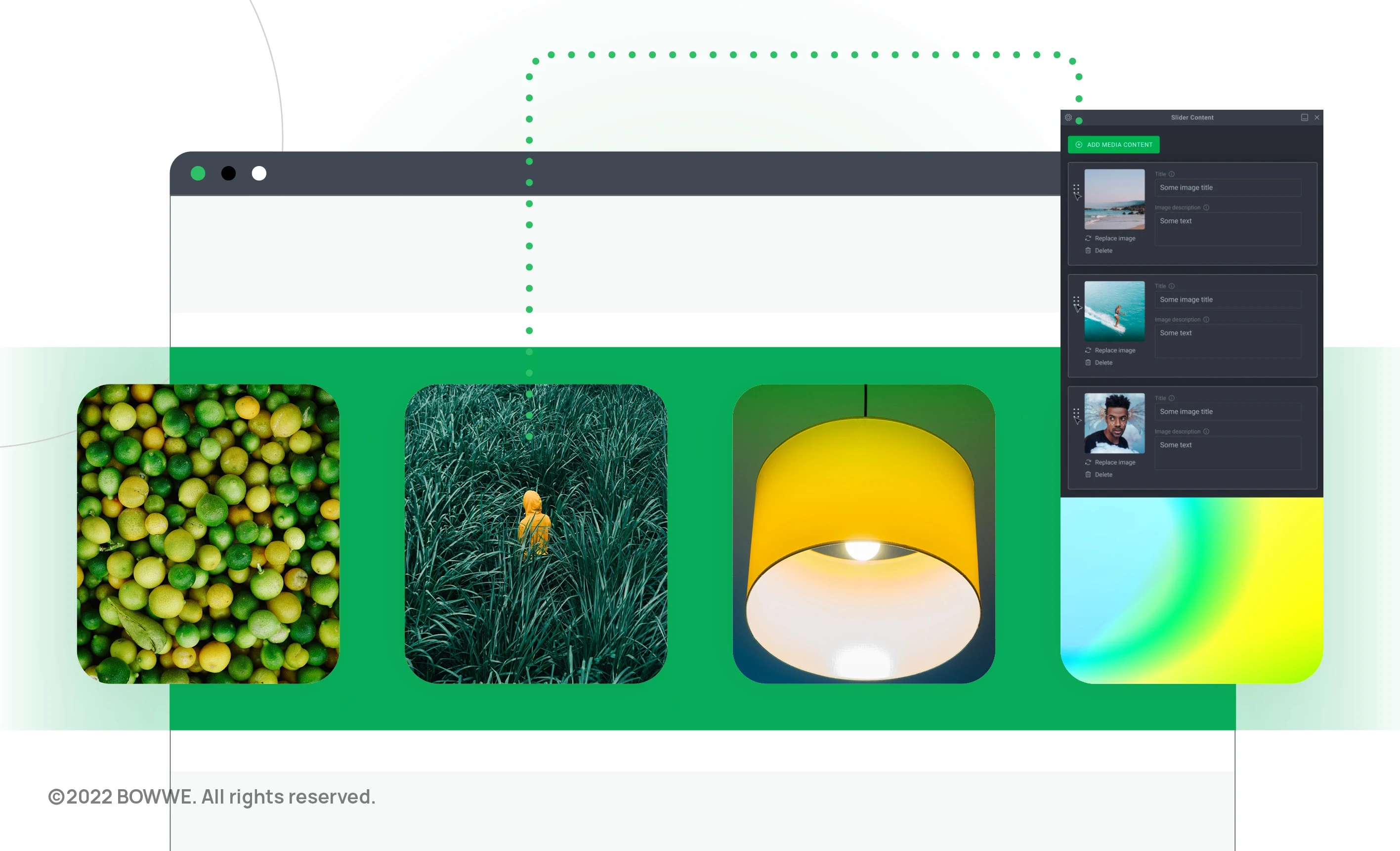
The visual aspect of a company website is of great importance and can be a decisive factor in whether or not you are selected. However, the layout itself, even if it is very well made and matched to your industry and activity, is not everything. It is easy to "spoil" it by posting poor quality or inappropriately selected photos.
5.1. What kind of photos do you need?
What photos you will need depends on what your business is related to. However, several types of images will work for many micro and small businesses.
Types of photos used on small business websites:
a) Pictures of you and your team
b) Photographs of the services you provide
c) Pictures of the products you offer
d) Photographs presenting the projects you have made
e) Photos showing the office
f) Photos e.g. taken during training and conferences you participate in or business meetings)
Think about what kind of photos your business needs. Or maybe another type of photography comes to your mind? In the case of some companies, photographs showing the effects "before and" after ", e.g. old and new hairstyle, makeup, change after aesthetic medicine treatment, change of the upholstery appearance after washing it, the image of a person before consulting a stylist and after shopping with a stylist will be very good or a change in the formation of the apartment after carrying out the works recommended by the interior designer. Showing the results of your work in this way is very appealing to the imagination and may mean that someone will choose your services.
In the case of repair and production companies, in the form of photos, you can present the stages of work, e.g., car washing stages or stages of furniture production. Some clients want to know exactly what will be done, and you will gain their trust by publishing such photos together with a description. In addition, by showing how the work in your company is carried out, you are transparent, you don't hide anything, which also increases trust in your company.
Get Started Free!
No coding experience required.
5.2. Where can you find photos for your small business website?
First, you can make them yourself. If you have a good quality camera and are interested in this field, you know how to set up the equipment and the rules of composition - this may be enough. However, if you do not have such knowledge, use the help.
You can hire a professional photographer. Ask your friends for recommendations or search for a contractor who deals with business photography. Be sure to ask for a presentation of implementation for companies. You need to check that the photos are well prepared and look professional. Photo sessions are associated with costs, but you will be able to use the images taken on the website and, for example, in advertising materials and social media.
Yet another solution is the so-called stocks, i.e., websites with photos that you can use for free or for a fee on your website or in your publications. Be sure to pay attention to photography licenses. You are interested in those with the CC0 license. It is a type of Creative Commons license that allows for commercial use of a given photo without specifying its author, source, or license notice.
List of sample photo databases that you can use for free on your company website:
a) Unsplash.com
b) Pixabay.com
d) Pexels.com
In BOWWE, when inserting photos into a page, you have quick access to the Pixabay and Pexels photo library. You can use them freely, enriching your content on the website.
When choosing graphics and icons for a website, it is worth considering paid websites. They usually contain better quality graphics, and the cost of their use is not high for the entire website.
You can find paid images on:
→ EyeEm
On the other hand, the icons for the website can be taken from:
→ icons8
5.3. Choose authenticity
The photos should show the "human face" of you and your employees. Don't post passport photos or other photos taken for documents. Such images are distant rather than encouraging to make contact. Remember about a smile and a relaxed body position. You should look nice. So does your team. Nobody likes to be served by people who don't seem enthusiastic about their work. Show in the pictures that what you do is your passion, and that customer satisfaction is your priority. Remember about appropriate clothes - for you and your employees, and if you photograph your premises, make sure that it is tidy.
What if you decide to use stocks? Many photos show people adopting studied poses. You don't want these photos on your website. Instead, choose the ones in which the depicted characters look natural.
5.4. Reduce and compress photos
The photos on your website should be light so that they load quickly and be displayed correctly to every user, including those who use the slow internet. Tempo of website loading also impacts its position in search results - Google rewards sites that load quickly in search engine results.
The weight of all photos published on one subpage should not exceed 1 MB. The Portfolio subpage may be an exception, but it is also worth optimizing. For the photos not to be too heavy, you need to reduce their size before placing them on the website because both the images from the stocks and those you will take yourself or a photographer will take for you are very large.
When you outsource your website, be sure to talk about the graphics guidelines. Some website design companies do not care whether your website loads quickly. They only want to complete the order as quickly as possible (at the lowest possible cost). Check if you are dealing with a reliable contractor who will prepare the photos properly before placing them on your corporate website.
5.5. Complete the ALT and title attributes
Google robots cannot read what is in the graphics, but some attributes can be used to describe the pictures. The ALT attribute (alternative text) was created so that the content of websites was accessible to the people with disabilities because there are special programs that read this attribute. Thanks to this, people with eyesight problems can find out what is in the pictures. Since Google's goal is to reward those sites that are accessible to these users, the ALT attribute has become one of the ranking factors in determining the order of pages in search results. Text placed in the ALT attribute doesn't appear on the website but is visible in its code.
On the other hand, the title is the auxiliary text that displays in the "balloon" when you hover the mouse cursor over the image. The completed title also impacts how well your website will be displayed in the search results.
Remember to include in the ALT a description of what is actually in the images, e.g., phrases related to your offer. Try not to duplicate picture descriptions. Be sure to discuss this with your website designer. You can make an appointment with them to provide a list of phrases to be included in the ALT and title attributes of images, and they will insert them into the page. How can you check if it was done? The title will be displayed in a "balloon" visible after hovering over the image with the mouse cursor and ALT. You will see alt = "alt expression" in the website code when you right-click on the image and select "Inspect" from the list.
6. Prove your worth
How do we make decisions when we are not sure what is the right choice? We very often follow what other people do. It is similar in the case of choosing the company whose services we are to use. We ask friends to recommend a competent professional; we check the opinions on the Internet.
6.1. How to use social proof of equity on a website?
A client looking for a service provider knows that there are better and worse companies on the market. They is probably afraid that they may find a dishonest company or that the work will be improperly performed. They also wants to find out if the offered products are worth the price, so they checks the experiences of other customers who have already cooperated with a given company.
It is your job to ensure that you become a recommended company on the Internet because your reputation can tell about the success or failure of your venture. How to do it?
When you set up a page in BOWWE, you will be able to embed an application with customer reviews on your website. These will be statements from your actual customers confirmed by the Honaro certificate. Thanks to this solution, you will be sure that your competition will not give you negative opinions, and people visiting your website will have a guarantee that it is not you or your employees who wrote them. In addition, you will gain an adequate place of defense against negative opinions issued by unverified people, e.g., on Google, Facebook, or in many other sites. Having such a tool, when someone publishes a negative review for you, you can thank them politely and invite them (and all others who review reviews about you) to a place where only real customers give their opinion, i.e., to Honaro. This is the best answer in such a situation. On the one hand, you show that you care about your reputation by responding. On the other hand, you will redirect all future customers to reliable opinions about your company.
You can also establish cooperation with, e.g., local bloggers, Instagrammers, or YouTubers who will test your products and services, describe their impressions, and you will be able to quote a fragment on your website. However, remember that such cooperation is associated with costs - bloggers earn money by cooperating with companies. Be sure to include the influencer's photo and a link to the published review.
We trust experts in a given field. In addition, such people may have their "fans" or observers who take their opinion very seriously and are likely to be interested in the products they recommend. Think about which expert could recommend your services.
For example, the Montessori kindergarten could publish an opinion of a child psychologist on its website that would praise such education methods and show that they have a very positive effect on the child's development. In turn, dietary catering could be recommended by a dietitian and an exercise equipment store by a personal trainer and a physiotherapist.
Perhaps you have experts in your network of friends or their friends. All you have to do is ask people around you if they don't know someone's specific profession. Or you can search the internet for specialists from your region and ask if they are interested in recommending your products or services. Check LinkedIn to see if you have any mutual friends who could introduce you to an expert.
Expert testimony will be even more convincing if a photograph accompanies it. If you decide to put photos of experts on your website, ask if they have high-quality business photos ready. If so, you will need to organize a photoshoot. So the experts should live in the region you do so that the whole process can be organized and that customers who also live in your area take advantage of your offer.
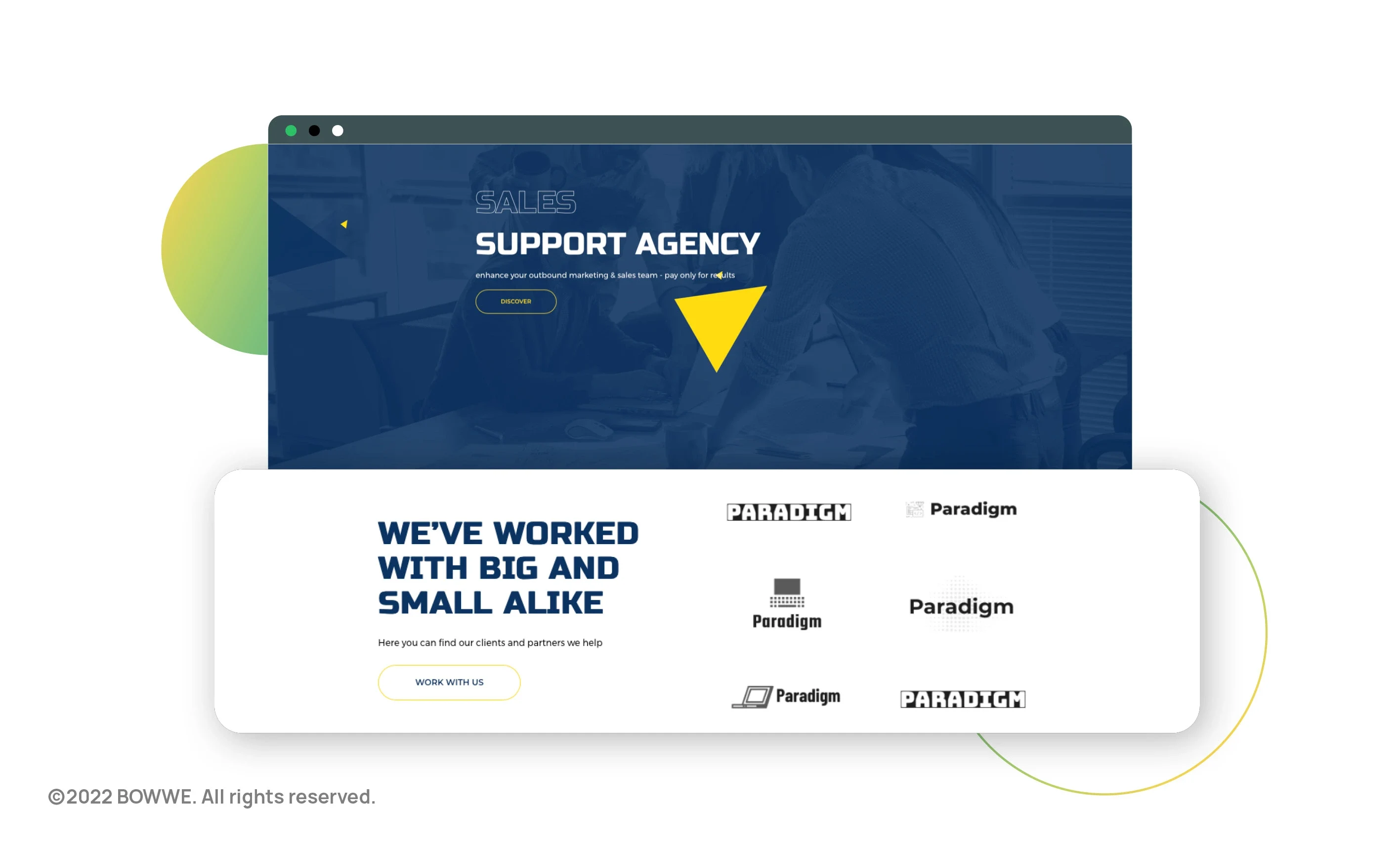
"Since these companies have started cooperation, I can too" - such an impression is made by the section "Partners" or "We work for", in which the logos of the companies are visible. This is a great way to create an impression of professionalism and instill trust, especially if they are logos of recognizable companies.
However, remember one thing before you start placing logos on your website. You must always have the official consent of the person managing the company to use the company's logo on your website. If you do this without the company's knowledge and support, you may run into problems. It is not enough for the rank and file employee to reassure you that you can do this. It is best to get written consent to use the logo on your website - it will secure you for the future.
"If they have been assessed so well, their services are surely good" - such a conclusion naturally comes to mind. The rewards work similarly: "if someone granted them, they probably had a reason for it ". So if your company is well rated on Facebook or the Google My Business profile - show off the number of stars you received on your website. Restaurants or hotels can link to your TripAdvisor reviews.
Find out if there are any industry or local business contests. You can register to participate in the poll and encourage your regular customers to vote for you. Sometimes even a nomination in a referendum can make your company famous, and you will benefit from it because more people will hear about your business and will want to try out your services.
Also, show off your diplomas from completed training and courses related to your business. Confirming your skills by other people and institutions builds your credibility as a specialist and inspires confidence that you will perform the service well.
It seems that case studies are the domain of large companies. However, they can also be used by small businesses.
Describe how you solved the client's problem and what the effects were. Outline the "starting situation", describe what you have done, and show what has changed. When people visiting your website see that other people/companies have succeeded or improved their situation thanks to you, they will start to think that they can expect the same effect.
For example, a financial advisor can tell you what the client's situation was, the state of his debt, and how the problem was resolved - the choice of a consolidation loan that significantly reduced the number of monthly installments.
Get Started Free!
No coding experience required.
The fact that others have used your services and can see its effects - is another social evidence that works to your advantage. It is best if your website has a visible portfolio (projects). If you include a file from your portfolio in a PDF document, anyone can download it, but many people won't. The appropriate place to present the implementation on the website is the Portfolio or Realizations subpage or the Gallery.
Show your best projects on it. You don't have to and even shouldn't disclose works that you are not fully satisfied with because, for example, you made concessions to the client and implemented a project closer to his vision. Think about whether you can divide your projects into categories. For example, a renovation and construction company may have categories that show built houses, renovated restaurants, hotels, renovated individual rooms (bathroom, kitchen, living room, etc.), fences, and paving stones. It may also be a good idea to add works from a given project to the portfolio divided into stages (e.g., preparation of the site and foundations, the stage of building the first and subsequent floors of the house and subsequent stages until the home is ready to move in). Nice and detailed photos of your work at each location will clearly show that you are always doing your work with the utmost conscientiousness).
With BOWWE, you can quickly add a Portfolio application to your website. You can add photos and their descriptions very quickly in a few minutes by logging in to Honaro, and you will be able to update at any time. You will also be able to modify the look of the portfolio by editing the widget's appearance. Create an account at BOWWE and create your own business website that you can conveniently manage.
7. Attracting by price
7.1. Negotiating prices
7.2. Applying coupons
Coupons effectively encourage people who don't know you yet to take advantage of your offer. Always limit the time a coupon is valid - this will motivate customers to visit you and take advantage of the coupon, which they will download immediately. If they don't, they will likely feel missed an opportunity. You can also introduce additional restrictions, e.g., one person can only use one coupon. Think about what you will be giving the discount on. It can be, for example, one of the more expensive services, their entire package, or a new service.
When you set up a website in BOWWE, you will add discount coupons to it. All you need to do is log in to Honaro, a platform integrated with BOWWE, add photos to appear on the vouchers, enter information about the amount of discount you are giving and when the coupon is valid. Such a created coupon can be quickly published on your website in BOWWE by inserting the Coupons application on it.
7.3. Gift vouchers
7.4. Loyalty program
You can also create a loyalty program that allows customers to collect points for purchases made on your website. Use such a point-to-$ converter to be sure not to be a at loss. It is worth building long-term relationships with customers so that they don't leave for the competition. The loyalty program will make your recipients more attached to you.
What to give a discount to gain? Think carefully about what you can give a discount on. You don't want to be a loss. A rebate can be an intelligent way to sell more, such as providing a refund on an extra service. You can also give a discount on those items with an end-of warranty or post-season warranty. A good option may also be to offer a discount for subscribing to your corporate newsletter.
Examples of discounts that companies from various industries can give you:
a) Pension: Lower prices for accommodation in the dead season
b) Language school: Additional holiday activities at a lower price for school students
c) Dentist: Dental package: scalling with polishing and fluoridation
d) Optician: Discount on contact lenses for people who order them regularly in the optician's shop
Don't forget to provide information about discounts on your website. It is best to do it in a clearly visible place that stands out graphically. You can also create an additional subpage to publish information about bargains and discounts and a subpage with information about vouchers.
You can also create an additional subpage where you will publish information about bargains and discounts and a subpage with information about vouchers.
What if you don't take care of the effectiveness of your website?
Whether your website will contain elements that increase your credibility, build trust with recipients, and persuade them to take advantage of your offer may determine your success or failure. Don't lose the chance to increase the number of customers and increase your sales.
Don't settle for a mediocre site that won't benefit you, and make sure it's built to maximize your profits. Otherwise, you will incur the costs of creating a website, and they will not be returned to you. Worst of all, you will lose referrals and a lot of time reassuring your customers that you know what you are doing and will have to lower your bids.
Website that will help your small business thrive
As mentioned in the introduction to the article, as many as 64% of small businesses have a website. What does this mean for companies without a website? Indeed a smaller number of customers and less recognition among potential recipients. It is worth considering creating a website for a small business for these reasons.
The article presents the most critical issues related to creating a website for a small company. Sticking to them will help you create a website that will enjoy high traffic and conversion rates.
Remember - if you are looking for a way to make a professional and, most importantly, effective website, use the tool from BOWWE. This way, you will not only create your website quickly, but it will also have good SEO, which will increase your chances of attracting new customers!
Start Here!
Small business website - FAQ
How do I create a small business website?
2. Research your competitors' sites
3. Plan the content of the website and its navigation
4. Take care of a professional website layout
5. Make your website responsive
6. Distinguish your business's best feature
7. Include information about your company
8. Create a FAQ
9. Add opinions, reviews, etc.
10. Take care of SEO aspects
How can I create a website for my business for free?
How much does it cost to create a website for a small business?
Where can I find small business website templates?
What's the best small business website builder?

Karol is a serial entrepreneur, e-commerce speaker m.in for the World Bank, and founder of 3 startups, as part of which he has advised several hundred companies. He was also responsible for projects of the largest financial institutions in Europe, with the smallest project being worth over €50 million.
He has two master's degrees, one in Computer Science and the other in Marketing Management, obtained during his studies in Poland and Portugal. He gained experience in Silicon Valley and while running companies in many countries, including Poland, Portugal, the United States, and Great Britain. For over ten years, he has been helping startups, financial institutions, small and medium-sized enterprises to improve their functioning through digitization.


