Display tab - control how to display elements on you website
How to use the Display tab in BOWWE?
Main display properties
Overflow X & Y - How does it work?
Manual - How to align and justify elements on your website?
Display property is like choosing different puzzle shapes to make your website look just the way you want it. It defines how the components are going to be placed on the page and is one of the most important properties for controlling layout.
Below you’ll find out how to use it in BOWWE and apply to your project.
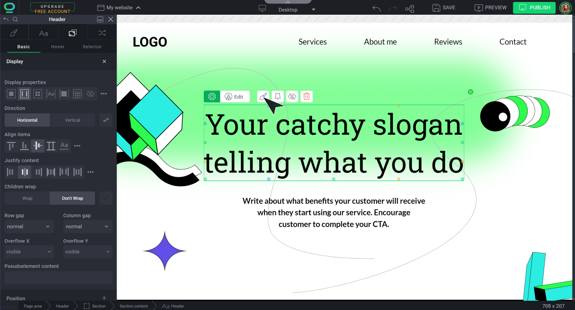
How to use the Display tab in BOWWE?
- If you want to use property flex - find its container on the Hierarchy Bar or Widget Tree (element higher in the hierarchy) and click on it
- For other display properties - click on the element directly
Open Widget Styles and go to the Position tab.
Remember about:
Main display properties
Block
You should use this property when you want the element to always start from a new line and occupy the full width of the container while still being able to set the width. Some of the most common uses of block display:
- creating a page layout
- adding headings and paragraphs
- building tables
- creating lists
Example of display block*:
*green dashed line informs about how much space the element occupies

This is your heading
Flex
If you want to create a flexible container that can dynamically adjust its child elements' sizes and positions, choose the flex display. It allows you to align and justify the elements inside the container and provides an easy way to distribute child elements evenly across a row or column. Select flex property for:
- creating a responsive design
- aligning items
Direction:
Row
Column
Align items:
Flex-start
Flex-end
Center
Justify content:
Flex-start
Flex-end
Center
Space-between
Space-around
Space-evenly
Inline
Use the inline property if you want the elements to take up only as much space as necessary, and stay in the same line if there is enough space. Elements will be displayed inline with the surrounding content, use it for:
- adding small elements such as buttons, icons, and labels
- images with surrounding text
- horizontal lists, such as navigation menus or product listings
- styling fragments of text differently from the rest paragraph.
Example of display inline*:
*green dashed line informs about how much space the element occupies
INLINE TEXT
With our
Inline - block
Value inline-block is useful in situations where you want to create a block-level element that sits inline with other elements on the same line, while also being able to set a width and height. Some common uses are:
- creating columns of text
- adding inline images with captions
- building horizontal navigation menu
Example of display inline-block*:
*green dashed line informs about how much space the element occupies

This is
your caption
None
Select none to hide elements without deleting and recreating them. It turns off the display of an element so that it has no effect on layout (the document is rendered as though the element did not exist). All descendant elements are also hidden.
Note
If you want to bring back the element to your website, find it in the Widget Tree and change the display property. Remember that this change will transfer across other screen devices due to inheritance mechanism.
Learn more about inheritance here
Overflow X & Y - How does it work?
If the content inside an element is larger than the element itself, it will overflow. To control how content that exceeds the dimensions of an element is displayed, specify the overflow property. Use it if you want to:
- prevent content from overflowing outside the container
- create a scrollable area within a container
- hide content that exceeds the dimensions of an element
Example of overflow scroll*:
*green dashed line informs about how much space the element occupies
Title
Read more

Title
Read more
Overflow X controls the horizontal overflow of content, while overflow Y controls the vertical overflow. Here's how each property works:
visible - the content is not clipped and is visible outside the element's box
hidden - anything beyond the container's dimensions will be hidden
scroll - the overflow is clipped, and a scrollbar is added to see the rest of the content
auto - if the content overflows outside its box then that it will be hidden whilst a scroll bar should be visible for users to read the rest of the content
initial - uses the default value (visible)
inherit - element inherits this value of this property from its parent element
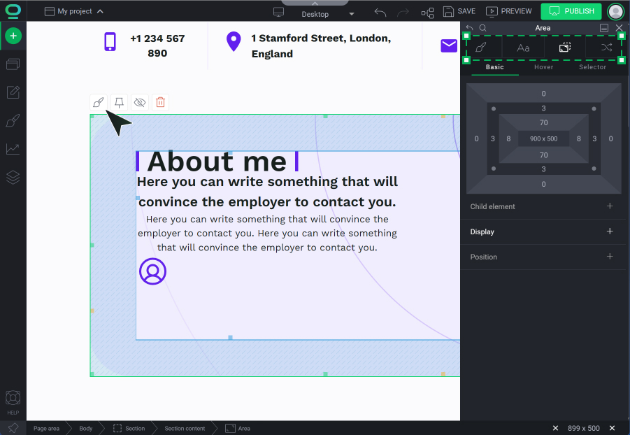
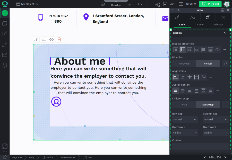
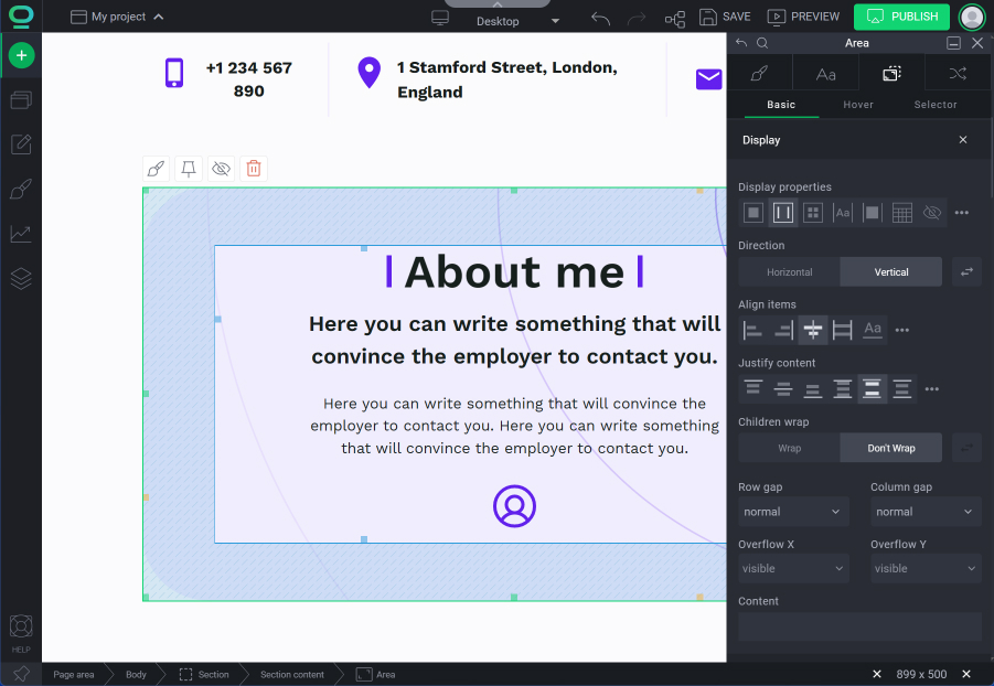
Manual - How to align and justify elements on your website?

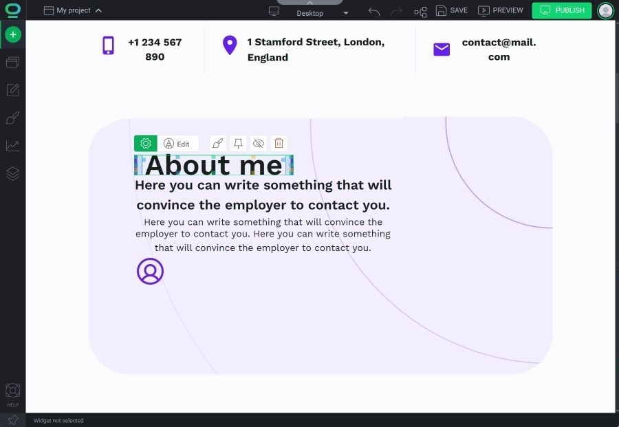
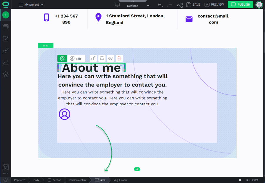
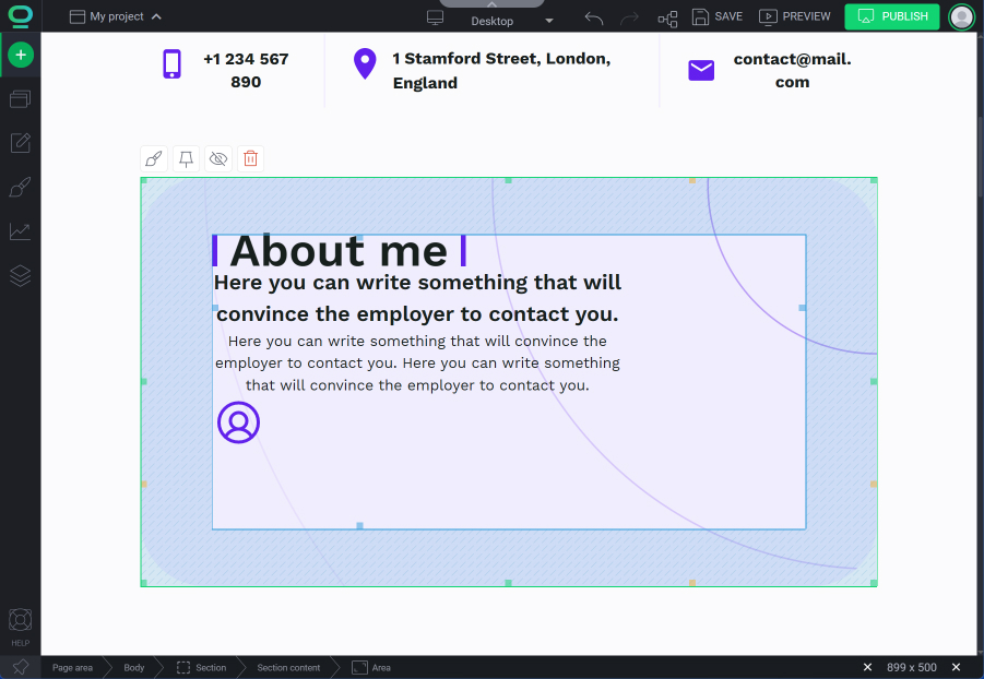

Congratulations!
Remember about:
- Be aware of the impact of display on the document flow: Changing the display property of an element can have an impact on the document flow and the layout of other elements on the page. It is important to test the impact of any display changes and adjust other elements as necessary.


